
Spring 2026 ACC Viscom Grad Portfolio Show
Project Details
Spring 2026 Event Branding
Deliverables:
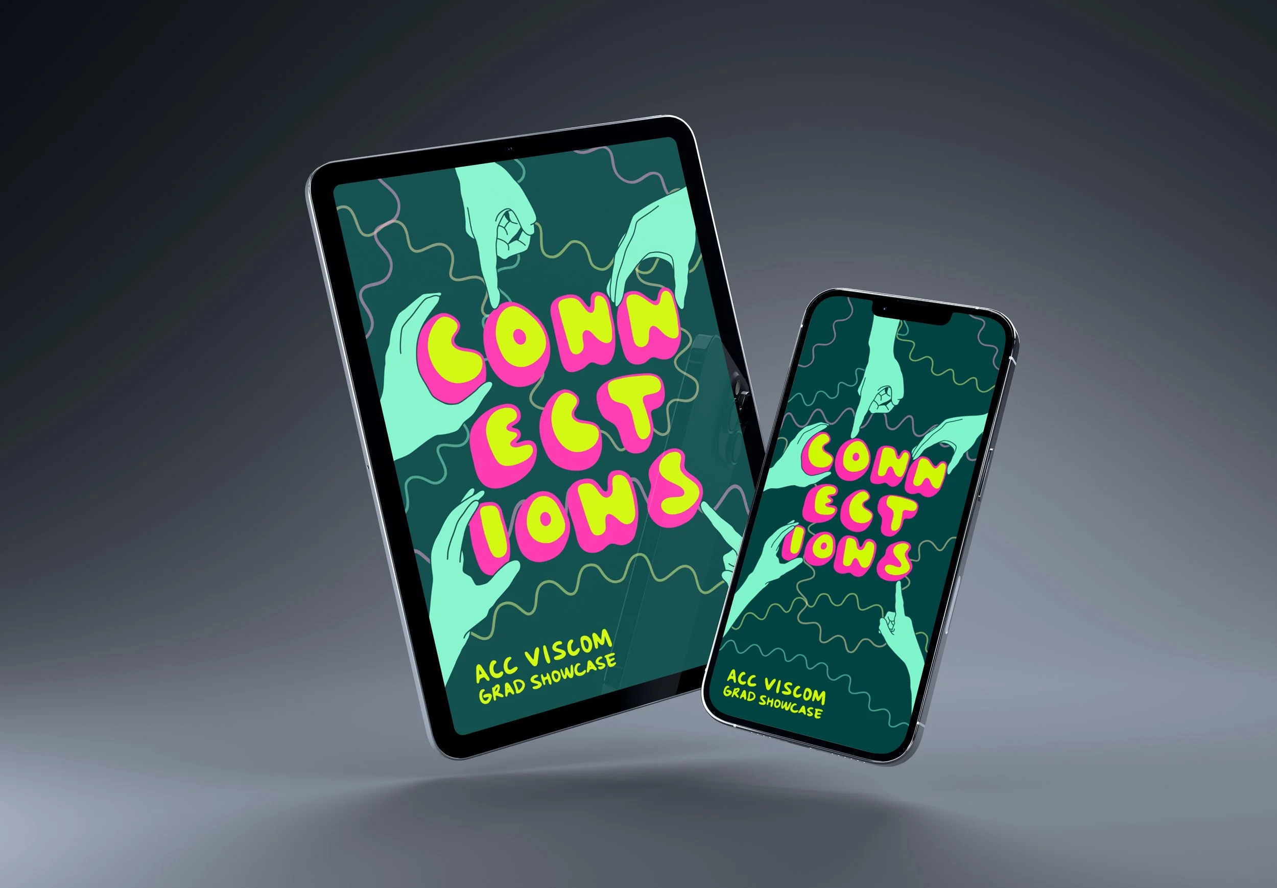
Poster
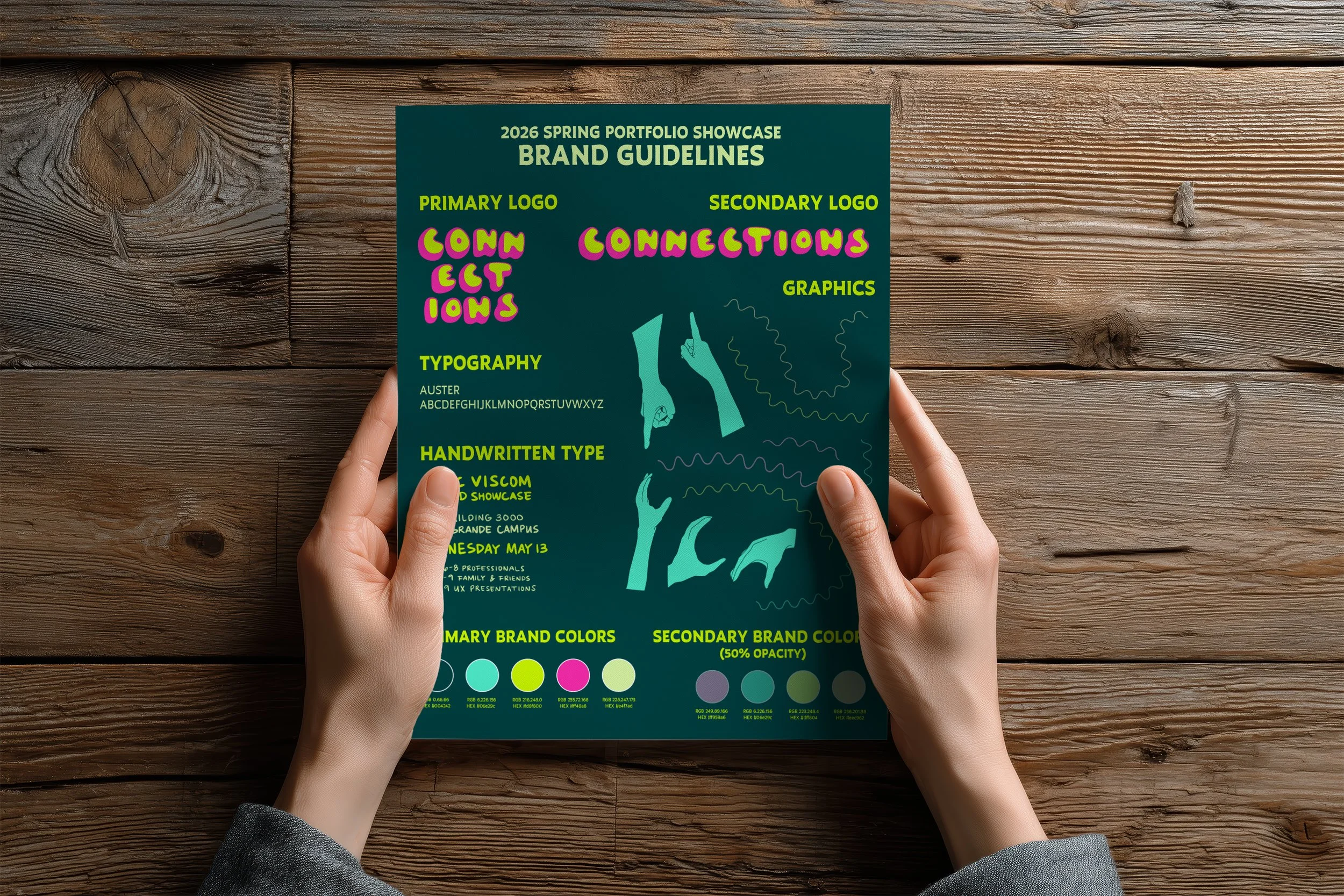
Brand Guidelines
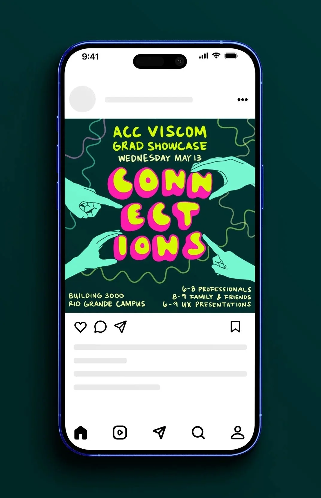
Square Social Media Post
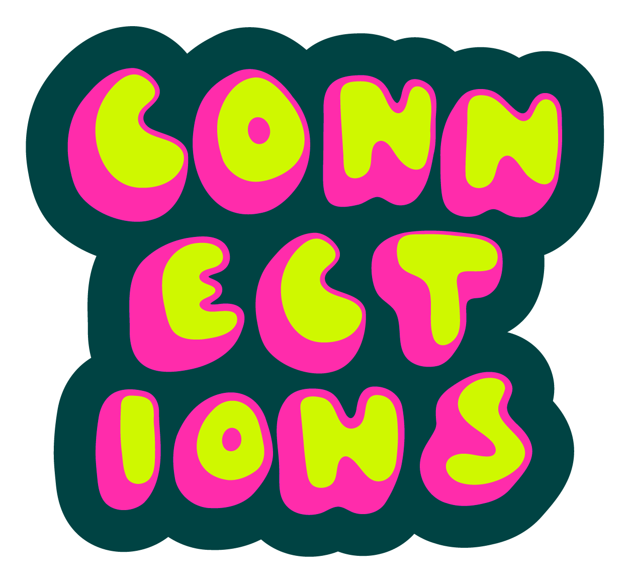
Commemorative Sticker
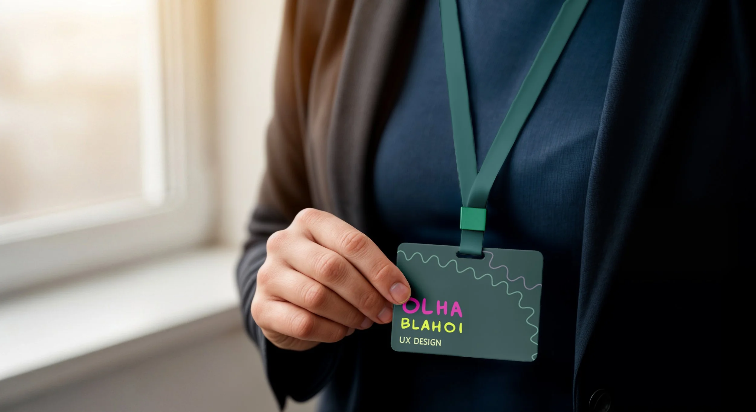
Name Tags
Summary
I collaborated with another student, Faith Do, to develop the branding and collateral for the Spring 2026 Visual Communications Grad Portfolio Show at Austin Community College. Working with faculty and program staff, we created a visual direction that would appeal to both local design professionals and current students, while building a cohesive and engaging identity for the event.
The project centered on developing a theme rooted in our experience as design students, using that perspective to shape a visual system that felt thoughtful, inviting, and distinctive across all materials.
Discovery
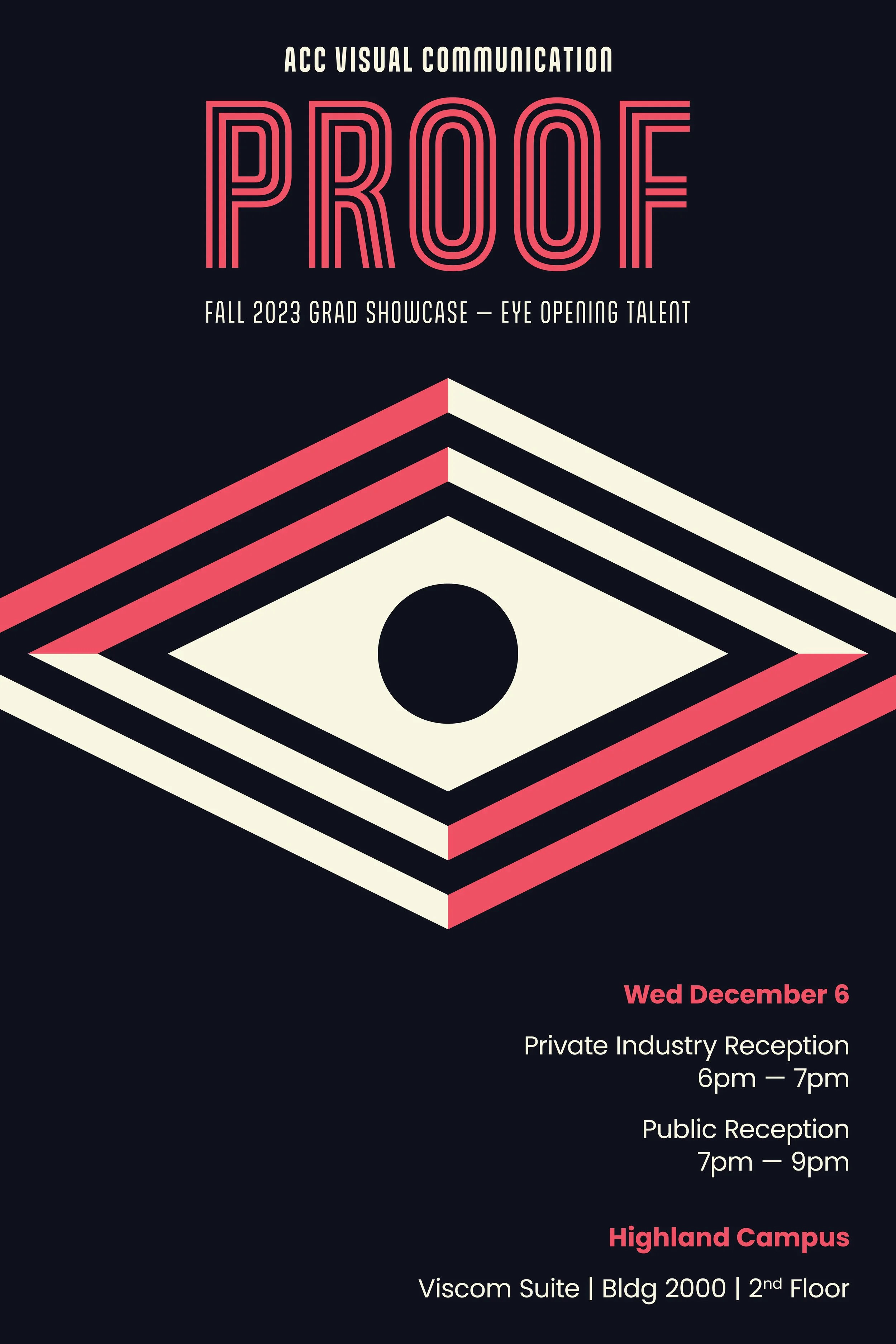
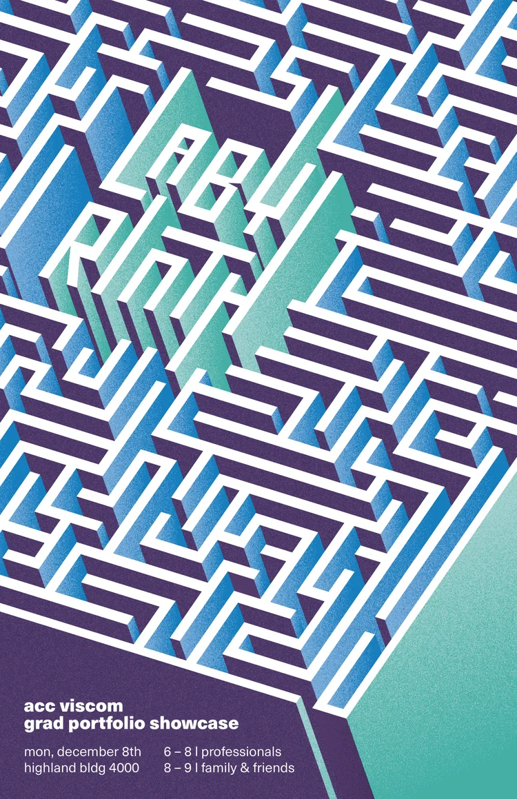
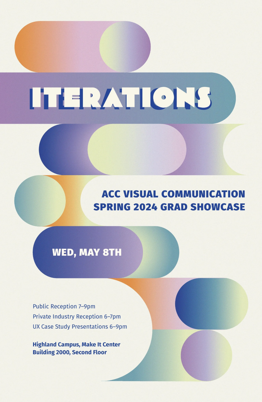
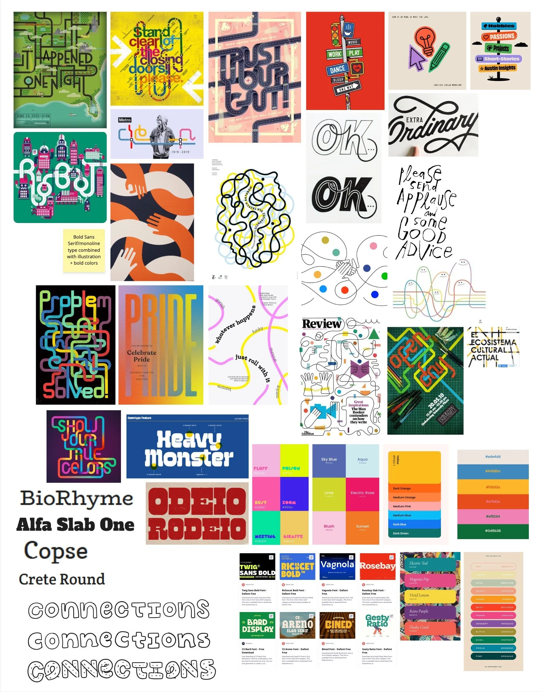
We began our discovery process by looking at branding from previous portfolio shows, using it as a point of reference while intentionally pushing toward something new and distinct.
Brainstorming
The biggest initial challenge was developing a strong, original theme before moving into sketches. With so many possible directions, narrowing in on a concept that felt meaningful and cohesive took time and exploration. To generate ideas, I used a mind map to quickly explore connections and themes, while my collaborator was also developing her own concept directions.
My Mind Map and Theme Ideas

Faith’s Initial Ideas

Mood Boards
After brainstorming on our own, we looked for overlap in our ideas and grouped them into three distinct themes, each with a corresponding mood board:
Connections/Common Ground
Space Between/Becoming/Interval
Clarity/Making Sense

Connections/Common Ground

Space Between/Becoming/Interval

Clarity/Making Sense
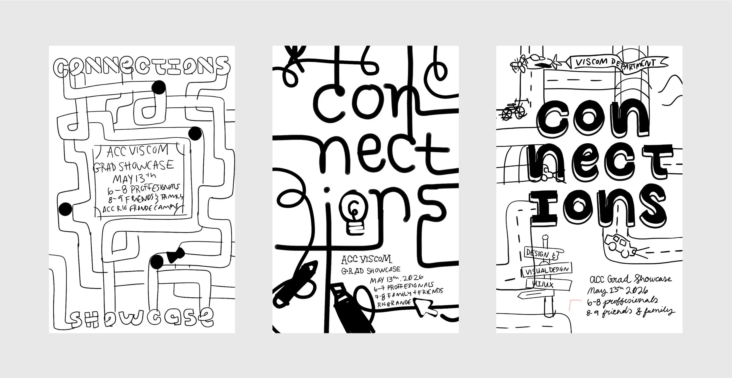
Poster Sketches Round 1
Using our three initial themes as a guide, we each developed a range of black and white sketches to explore different directions. This stage was focused on experimenting with composition and concept to see what felt most clear and compelling. Many of the sketches used lines as a graphic element.
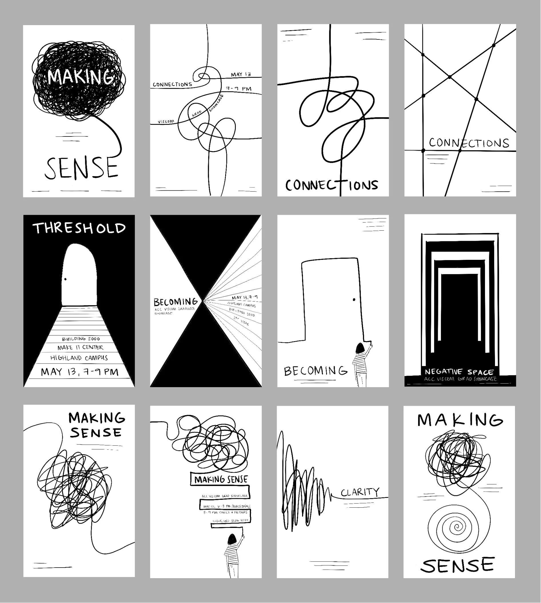
My Sketches
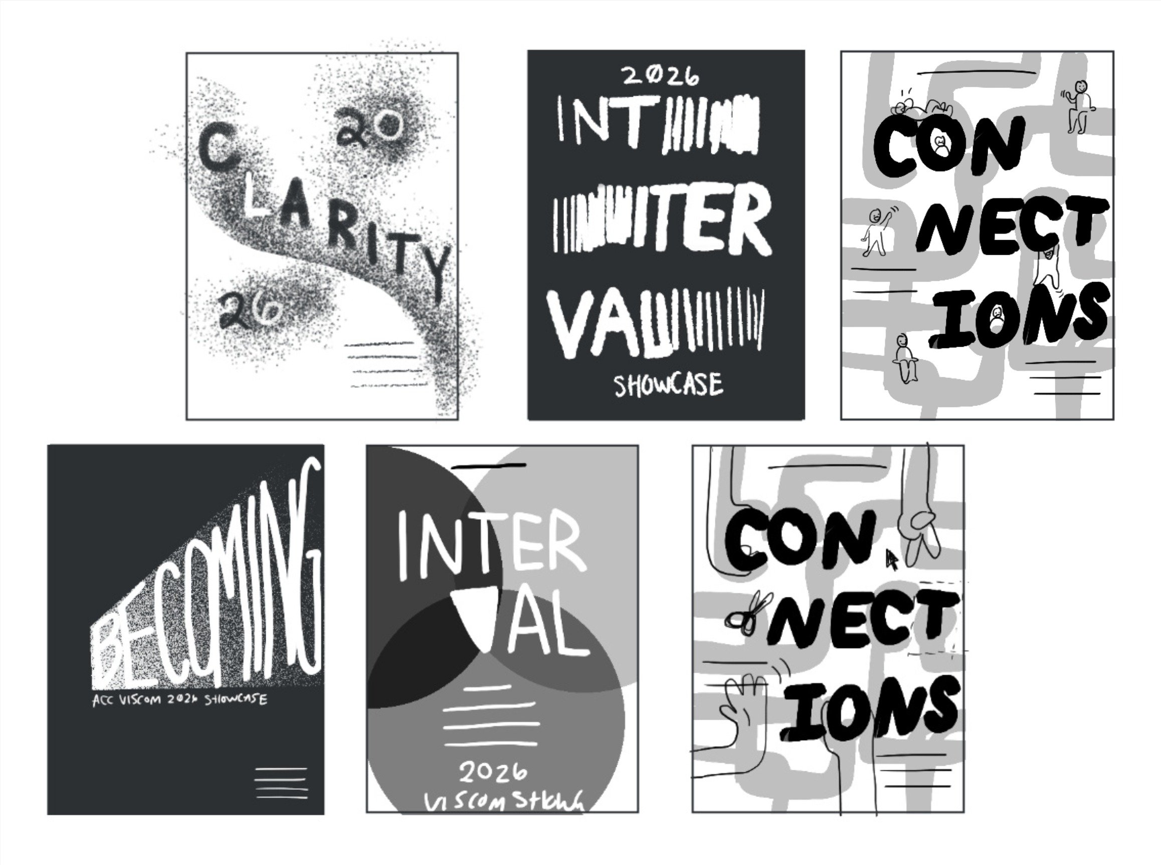
Faith’s Sketches
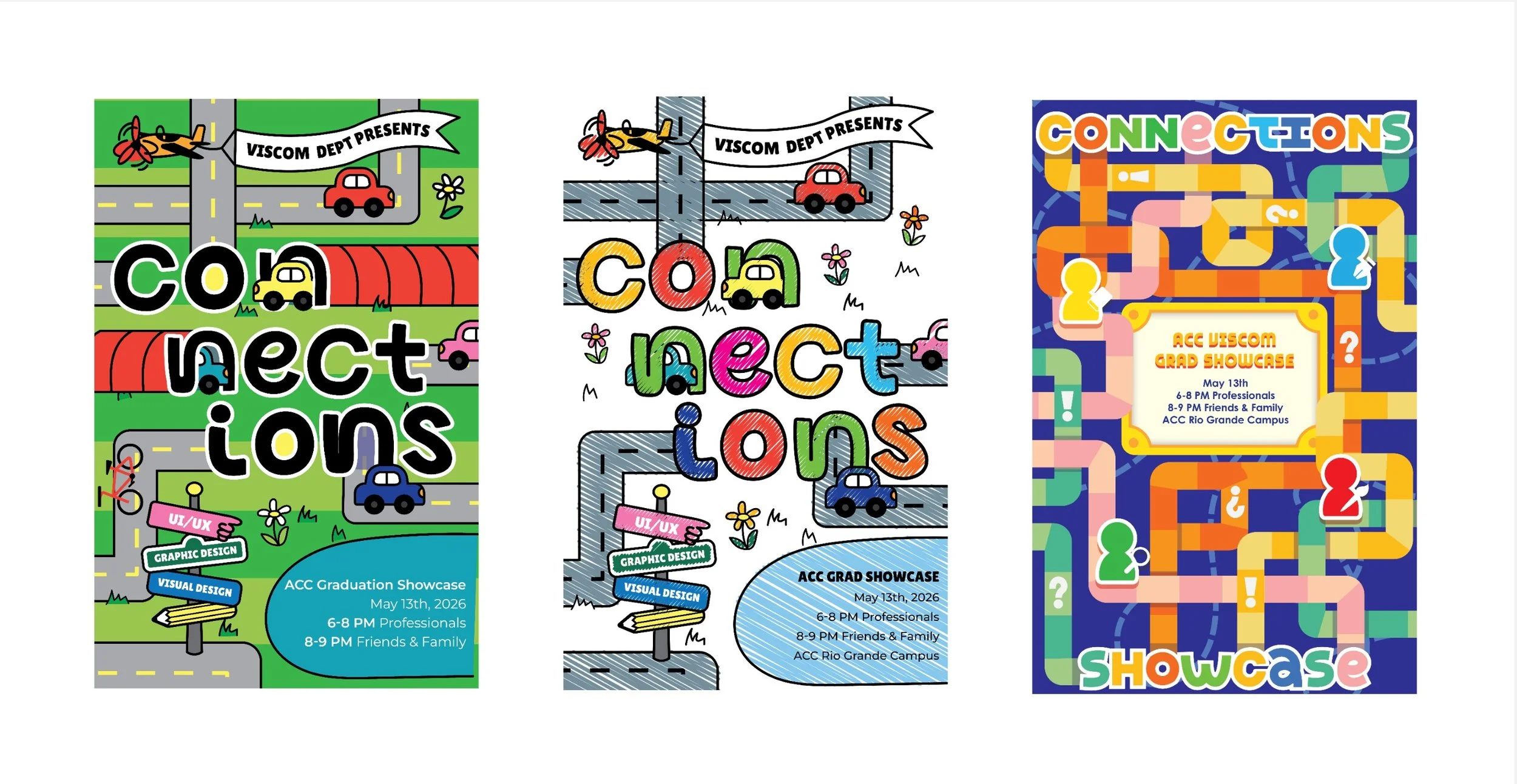
Typography and Color Exploration
After meeting with faculty, we decided to move forward with the theme of “Connections” as it was the most clear and developed direction. We also received positive feedback on the hand-drawn type and human elements, which led us to further explore unique hand-drawn letterforms. We also introduce a vibrant color palette to bring the posters to life.
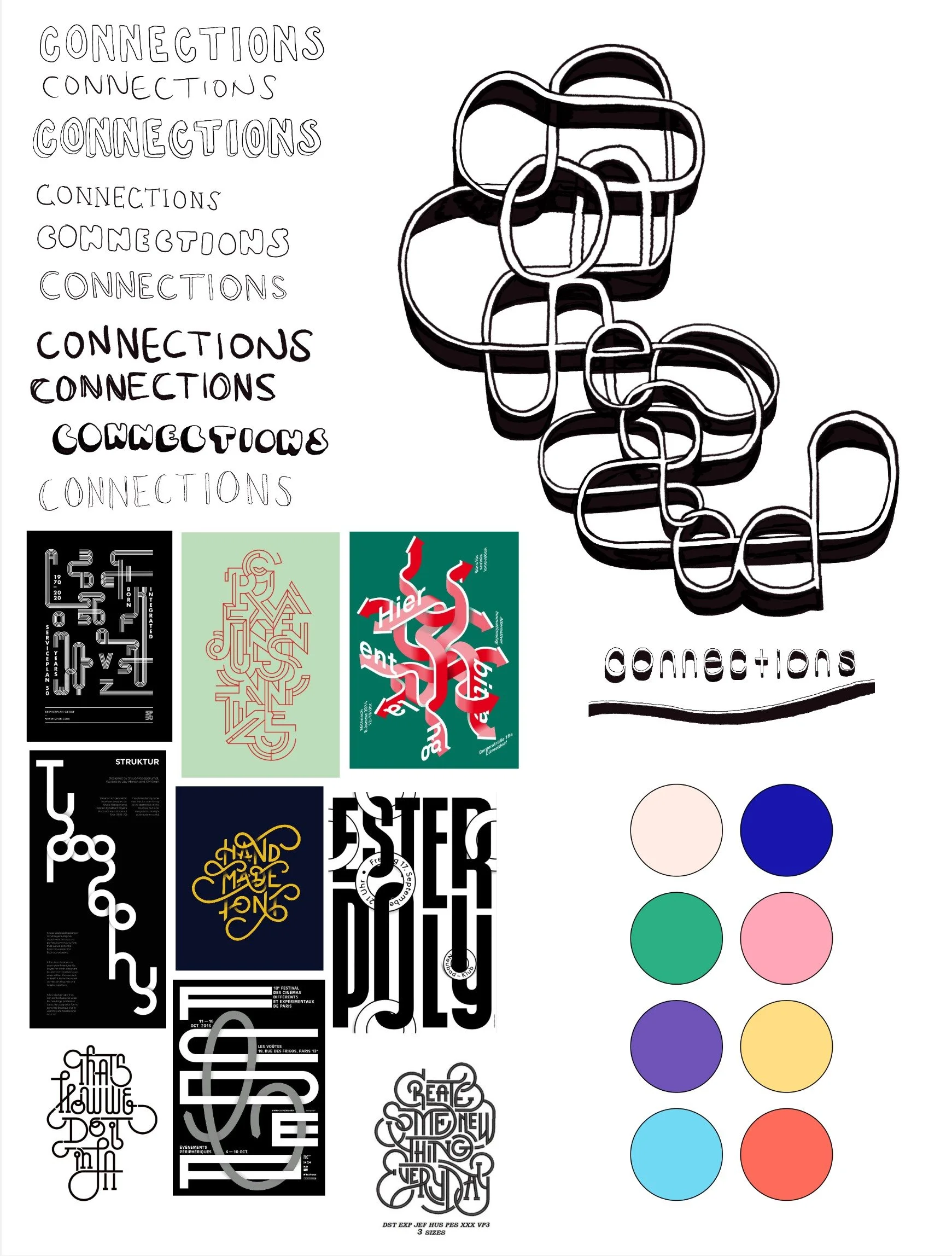
My Type and Color Exploration
Faith’s Type and Color Exploration
Poster Sketches Round 2
In this round, I focused on paths crossing and overlapping, along with connected letterforms. Faith explored similar ideas around interconnected paths. We both continued to incorporate hand-drawn elements to keep the work feeling human and expressive.
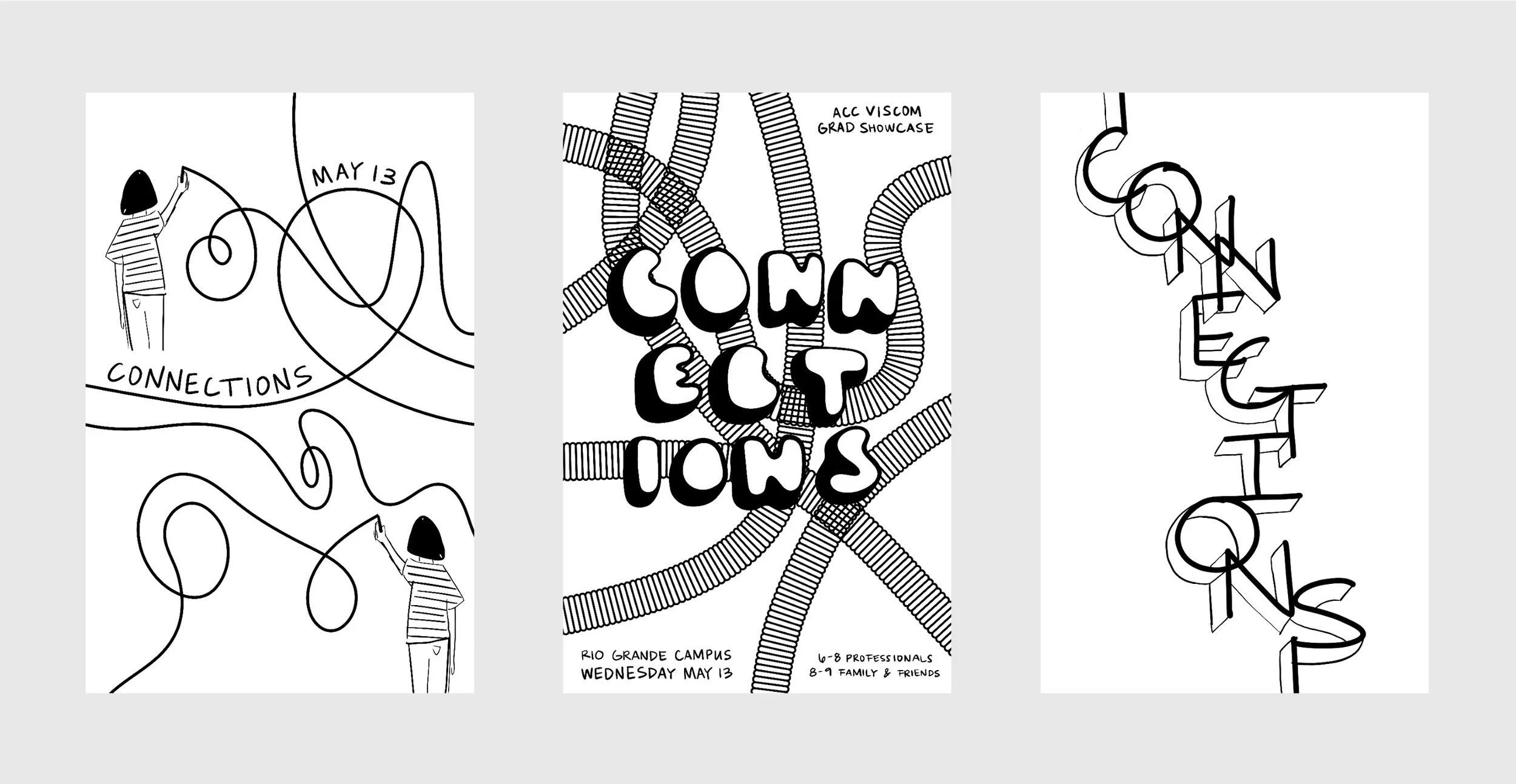
My Sketches
Faith’s Sketches
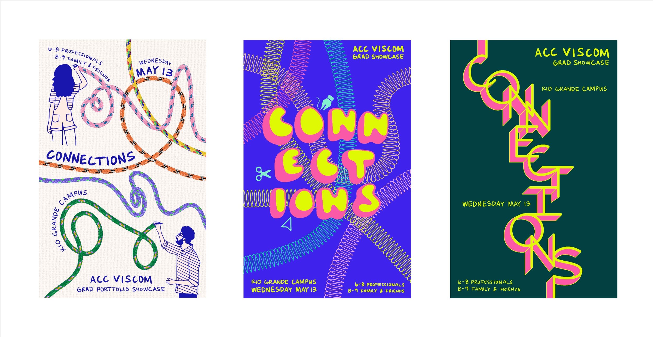
Digital Drafts Round 1
For the first round of digital drafts, I focused on vibrant color and hand-drawn type, exploring overlapping paths and the idea of creation in process. The feedback on this round of drafts was especially helpful in refining the direction, encouraging us to reintroduce human elements from earlier sketches to emphasize a clearer sense of connection between people.
My Digital Drafts
Faith’s Digital Drafts
Digital Drafts Round 2
This round brought back human elements from earlier sketches, introducing hands and figures interacting around the central title. The focus shifted toward showing connection more directly, with multiple people contributing to and moving around elements of the composition.
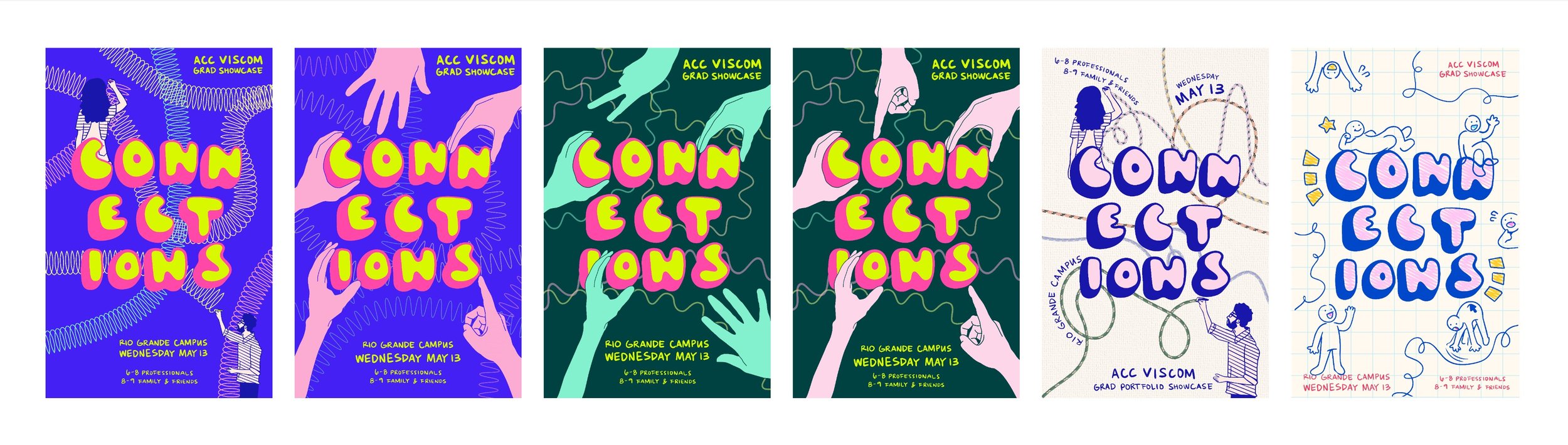
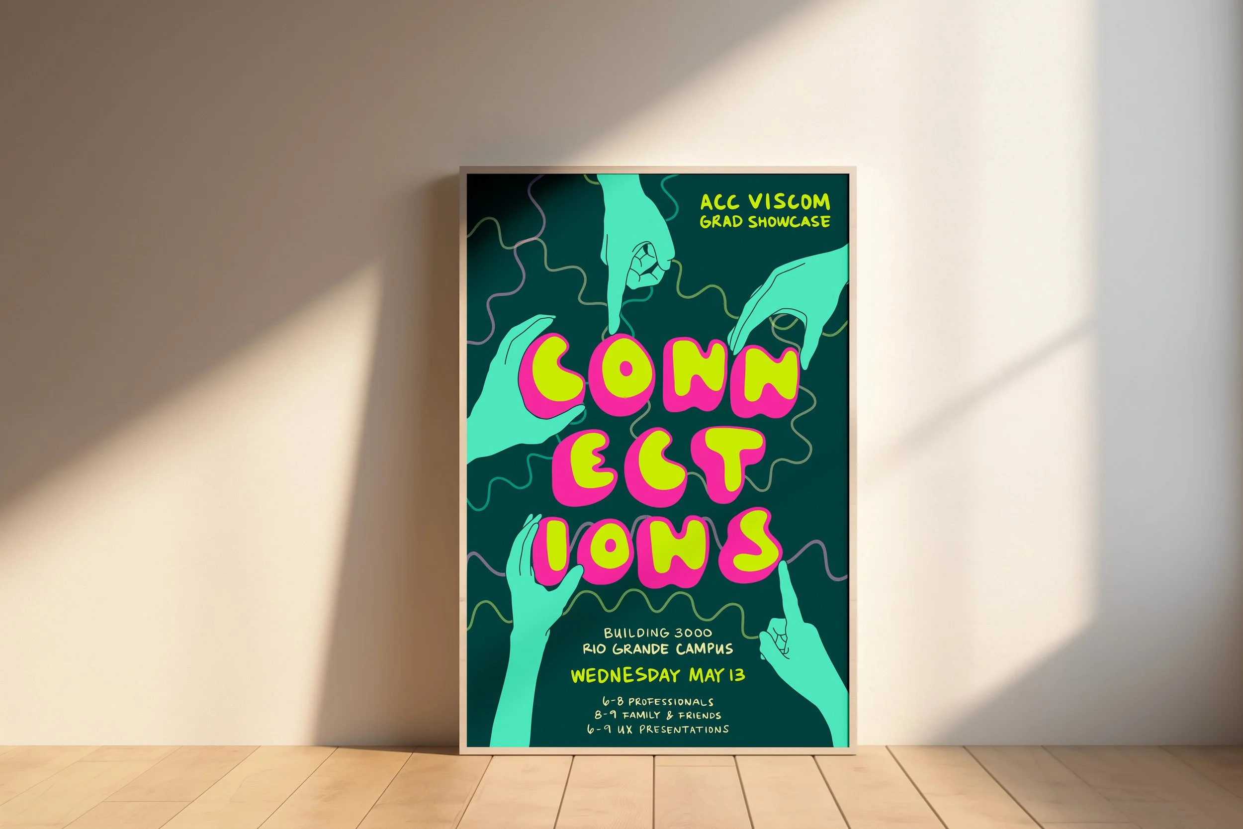
Final Design
The final design combines bold color, hand-drawn type, and human elements to communicate the idea of connection. The surrounding hands and background lines create a sense of collaboration and movement, while the central typography anchors the composition and keeps the information clear and readable. The result is energetic and expressive without losing clarity.

Reflection
This project pushed me to embrace more expressive, hand-drawn elements and to appreciate the excitement and personality they can bring to a design. It also strengthened my ability to collaborate, incorporating feedback and direction from both a design partner and stakeholders to refine the final outcome.
Nitro nectar packaging
Austin Woman