
Nitro Nectar Coffee

Project Details
Spring 2025 Branding and Packaging
Deliverables:
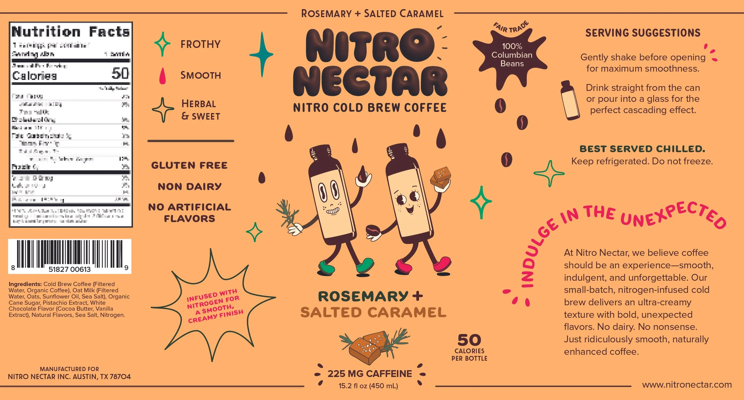
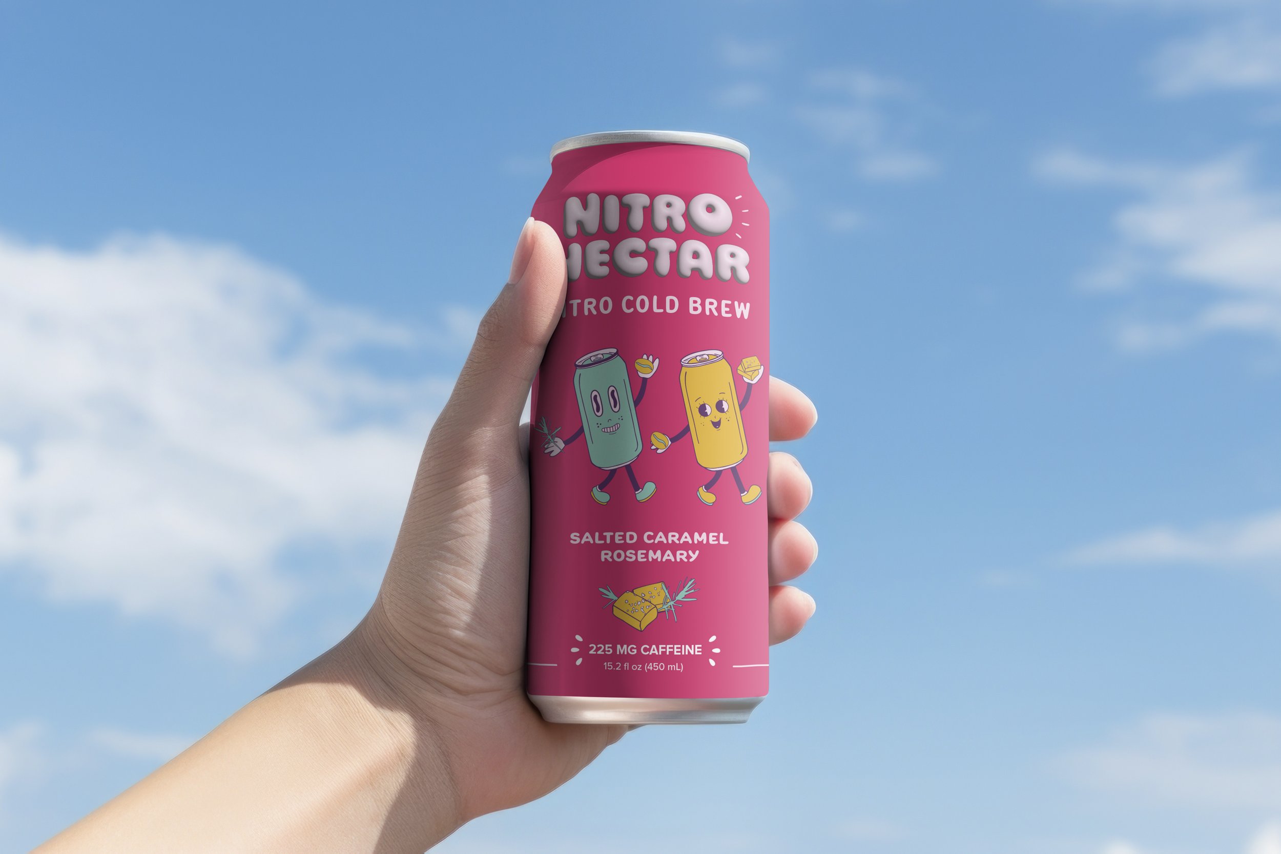
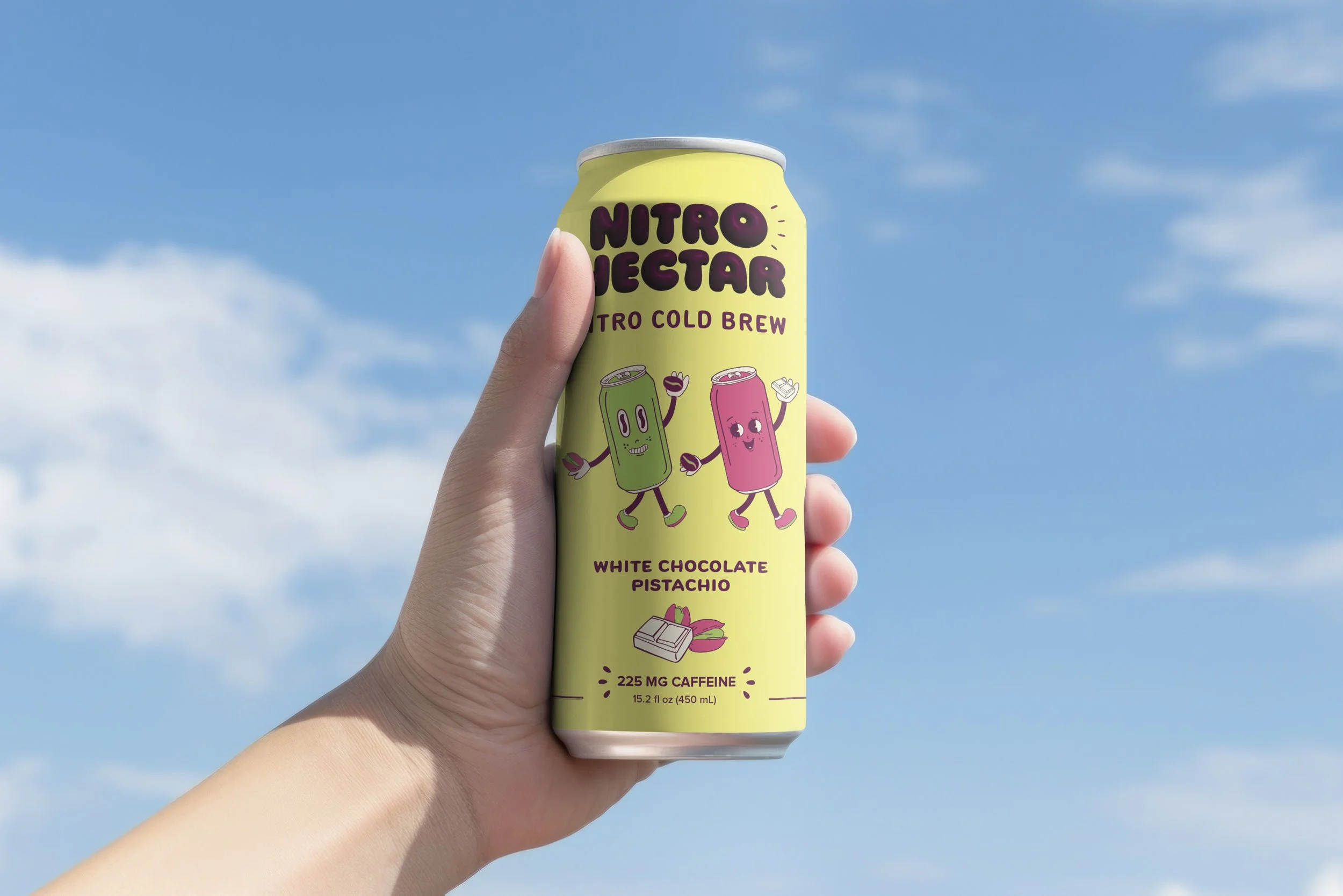
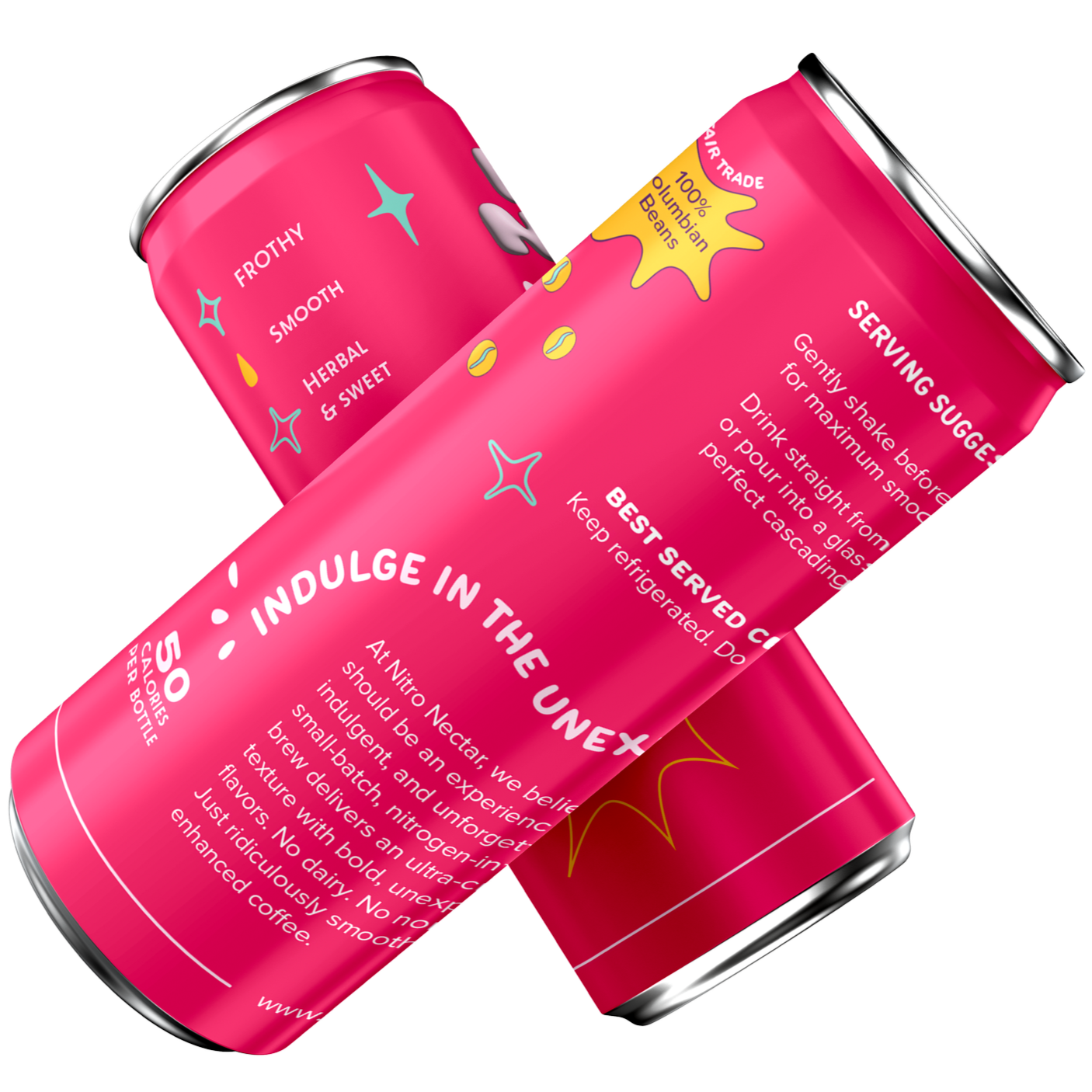
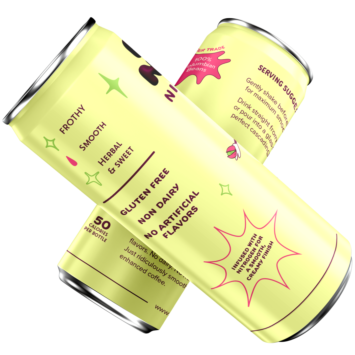
Coffee Can Packaging
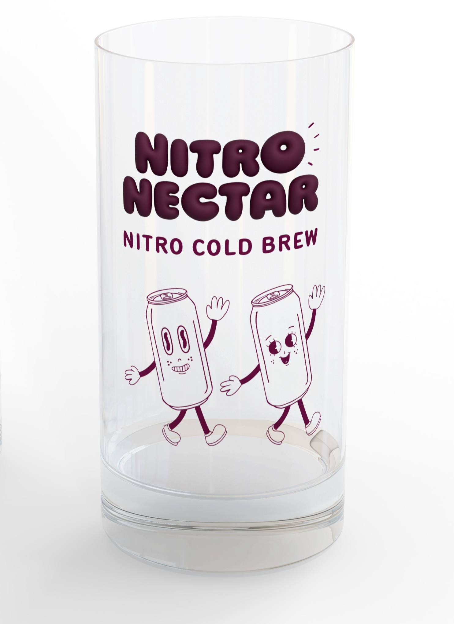
Branded Glassware
Half Page Print Ad
Social Media Ad
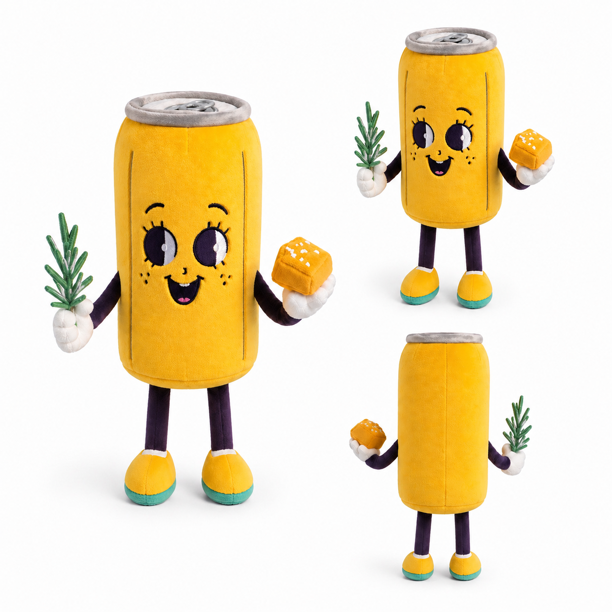
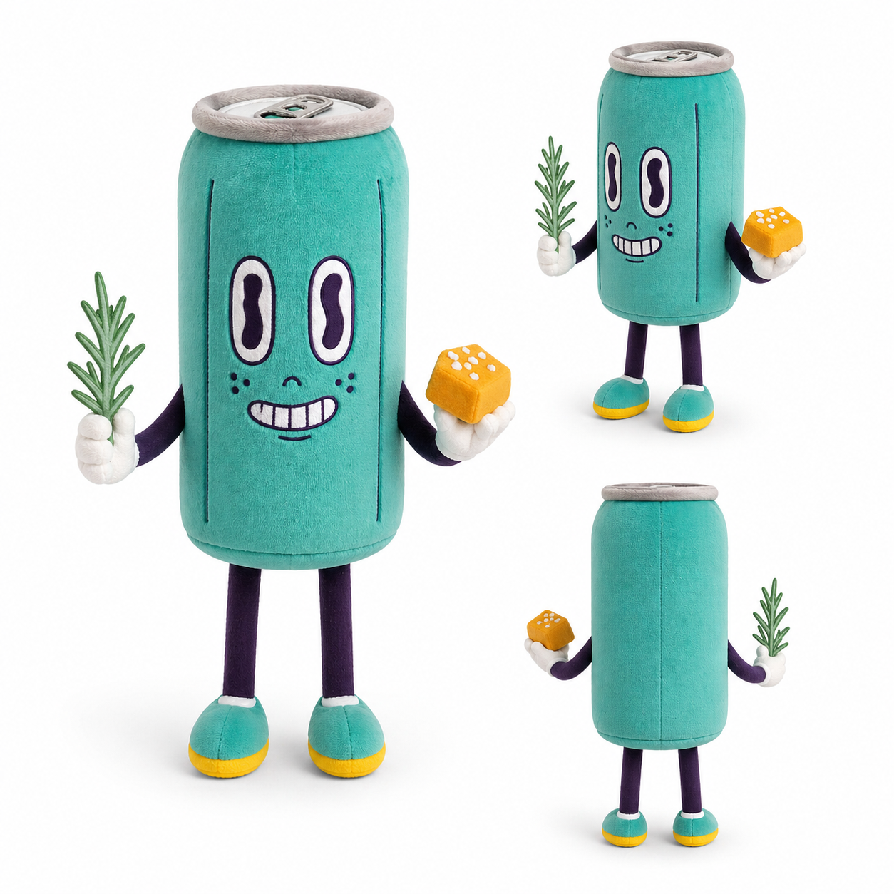
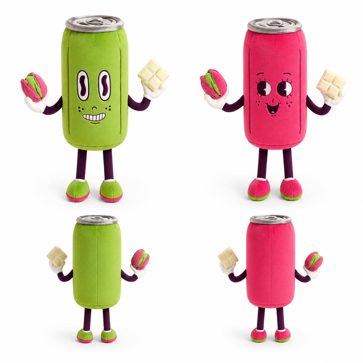
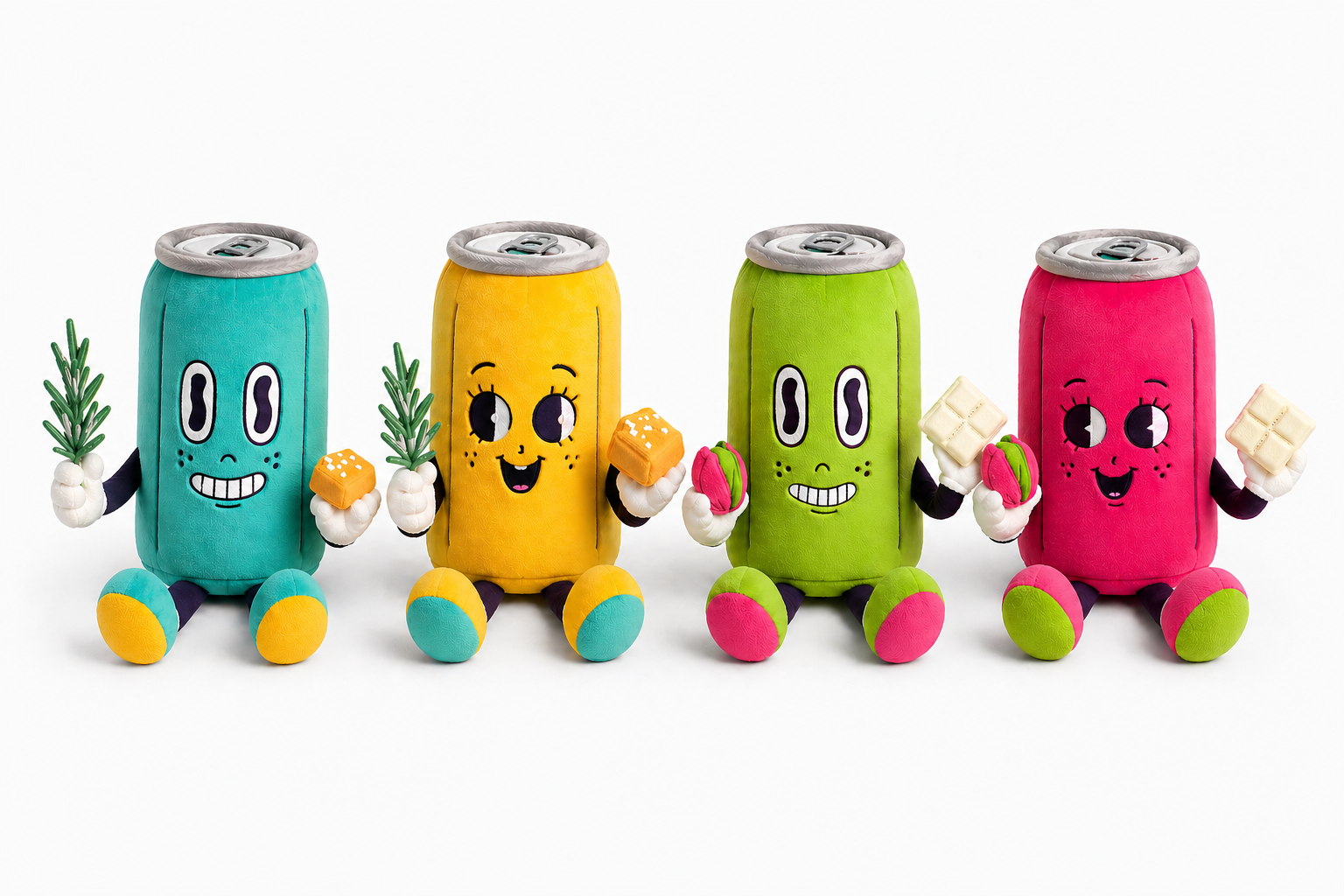
Collectible Plushies
Summary
Nitro Nectar is a concept nitro cold brew coffee brand featuring unexpected, gourmet-inspired flavors. Designed for those drawn to unique flavors and elevated daily rituals, the project pairs playful packaging with a cohesive ad campaign to make coffee feel more expressive and indulgent.
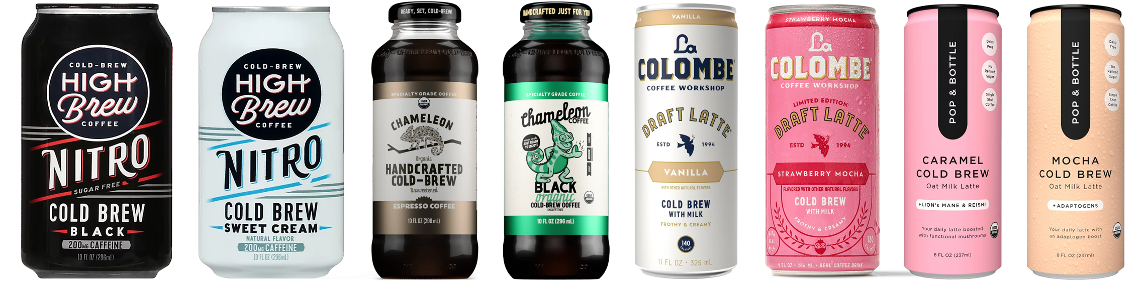
Discovery
Through research into the cold brew market and competitors like High Brew, Chameleon Cold Brew, La Colombe, and Pop & Bottle, I identified an opportunity to stand out through flavor. While many brands focus on simplicity, Nitro Nectar centers on bold, unexpected combinations and a smooth nitro experience to appeal to consumers looking a for more unique cold brew.
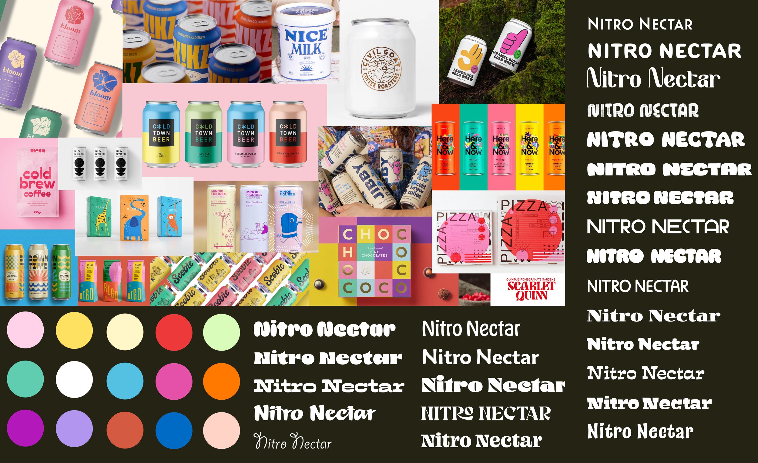
Mood Board
To capture a balance of indulgence and playfulness, I leaned into bold, saturated colors. Bright palettes, playful illustrations, and expressive type create a visual language that feels energetic and approachable while also highlighting the brand’s unique, unexpected flavor combinations.
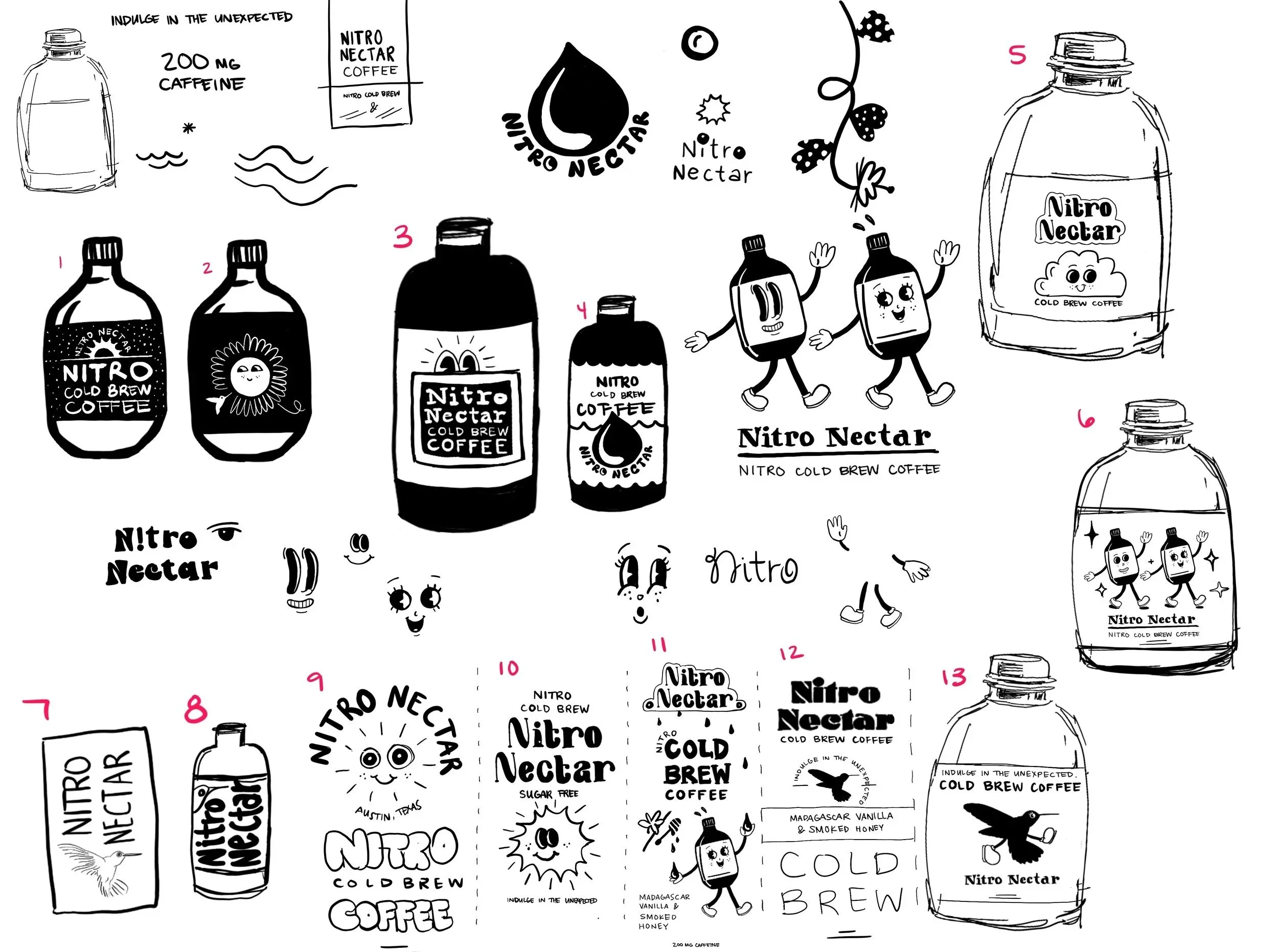
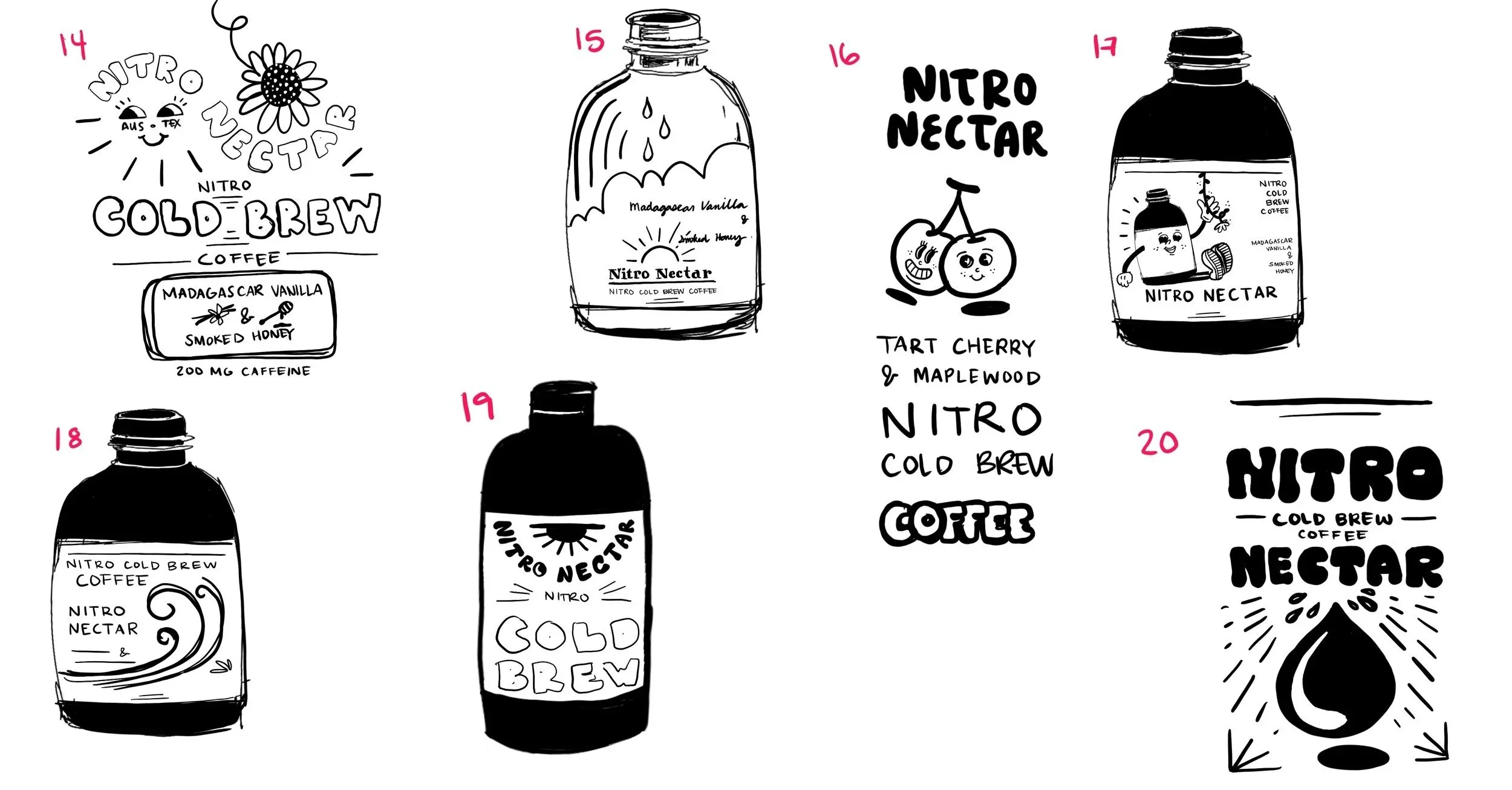
Sketches
In the sketch phase, I explored themes of natural nectar, morning energy, and dripping, fluid forms that hint at both dripping nectar and the smooth, foamy texture of nitro coffee. This is also where the retro-inspired illustration style began to emerge, adding a sense of whimsy that aligns with the brand’s playful flavor combinations.
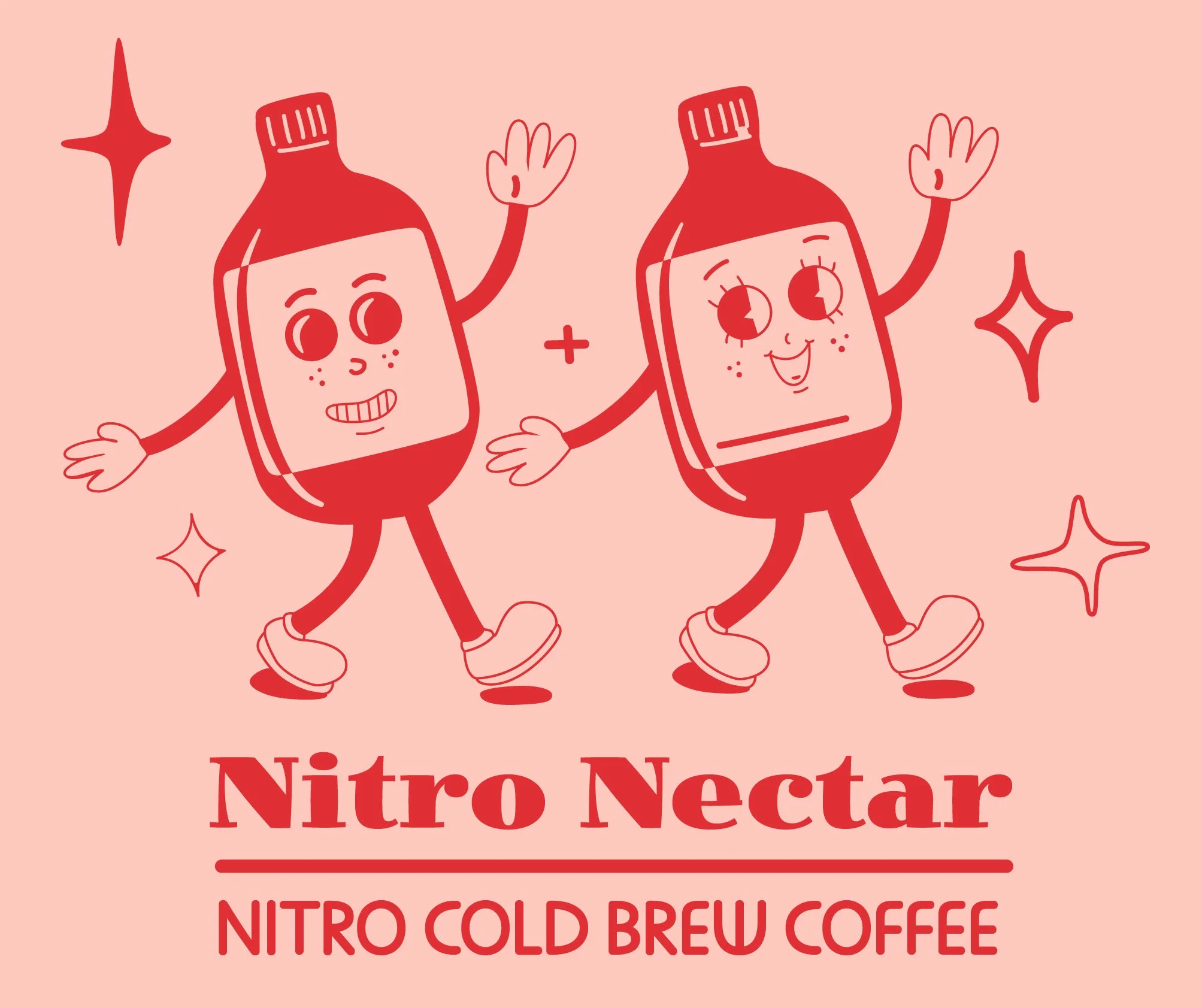
Digital Drafts Round 1
The pink and red retro walking cans emerged as the strongest direction from this first round of rough drafts. However, feedback pointed out that the color palette and bottle shape felt medicinal, prompting further exploration of form and color in Round 2.
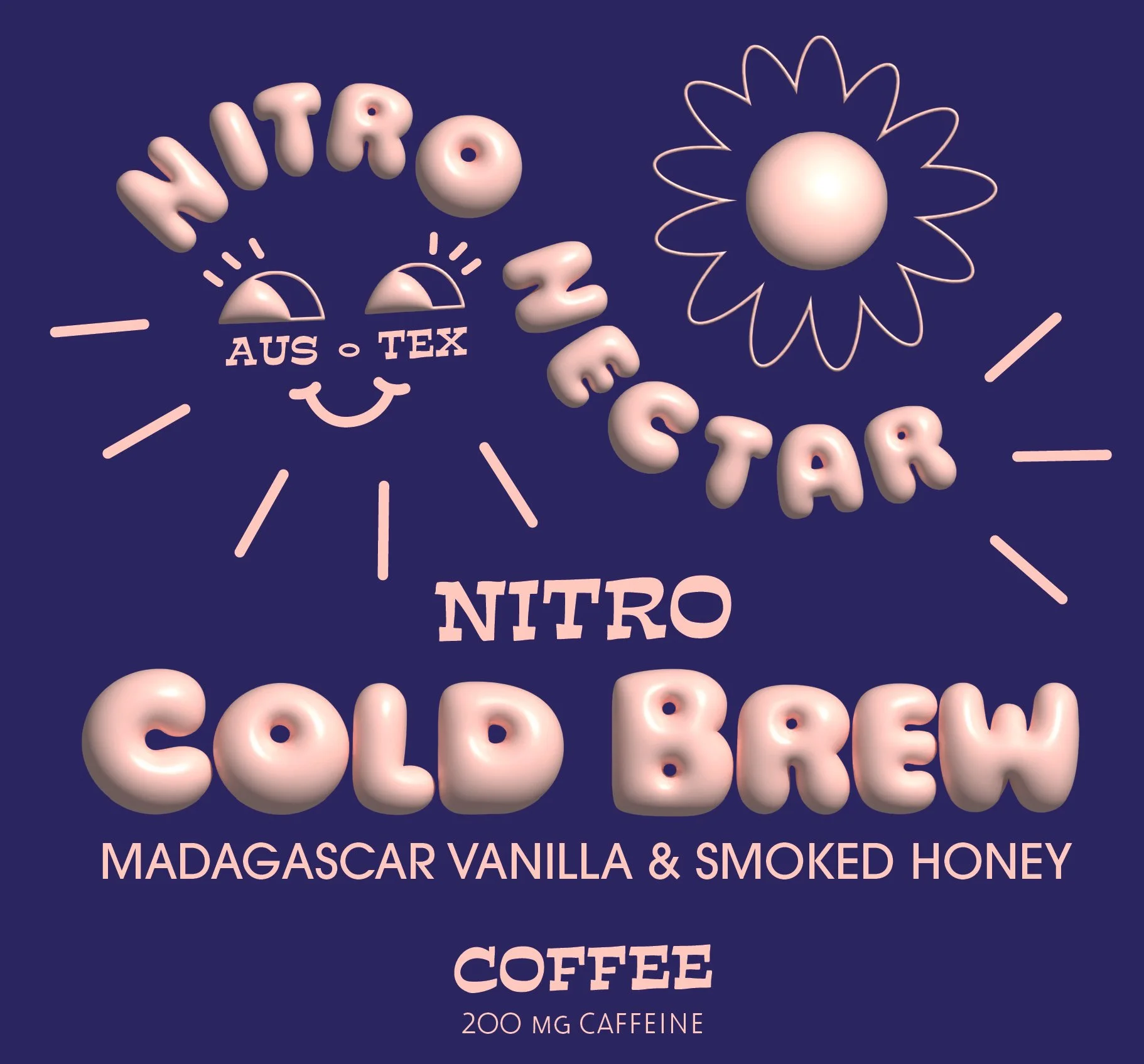
Digital Drafts Round 2
For this round of drafts, I designed at scale for the label and incorporated the full set of product information. I also introduced a wide range of colors. Feedback following this iteration focused on pushing the colors in a more vibrant direction and improving hierarchy, which informed the next round of revisions.
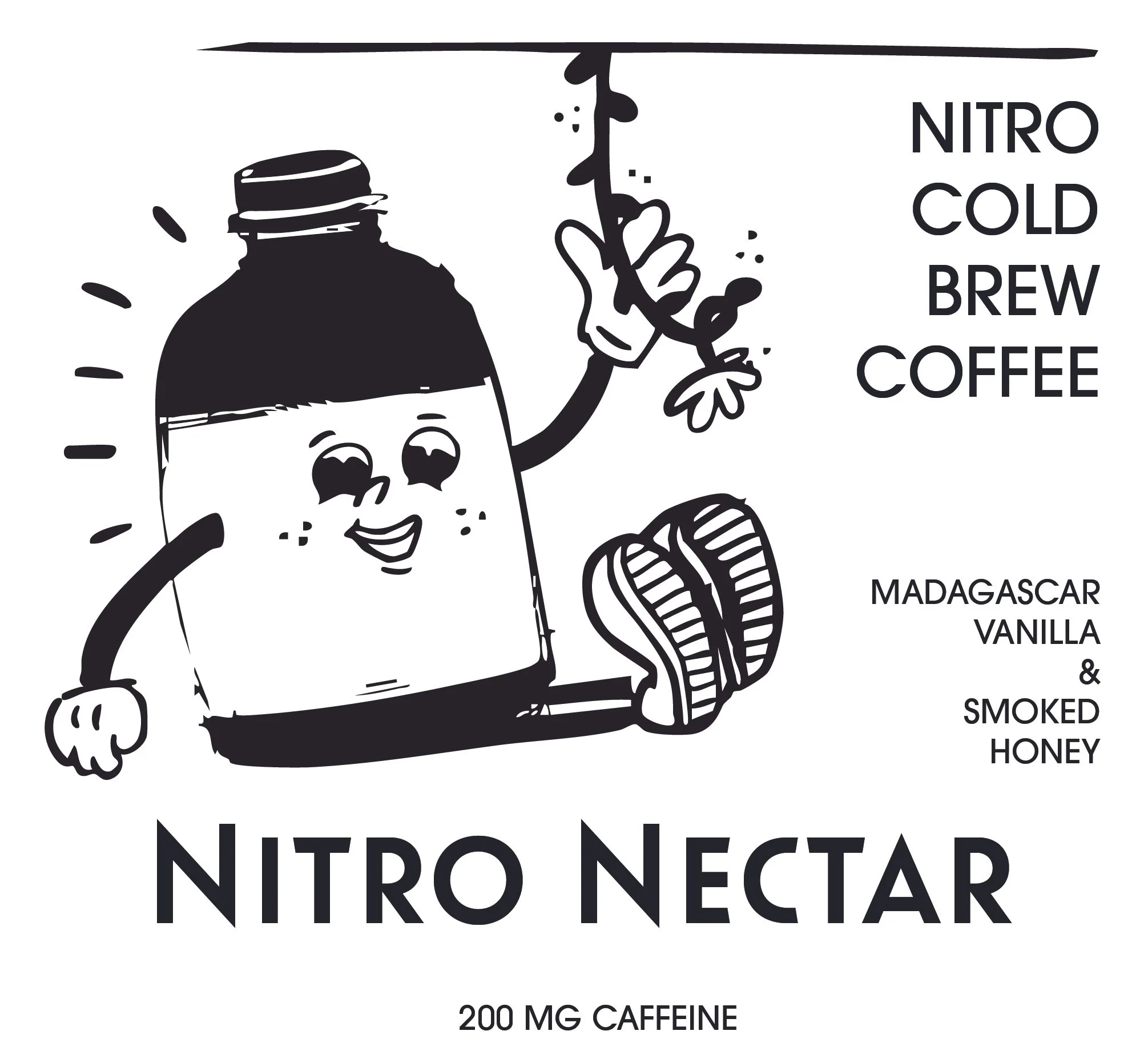
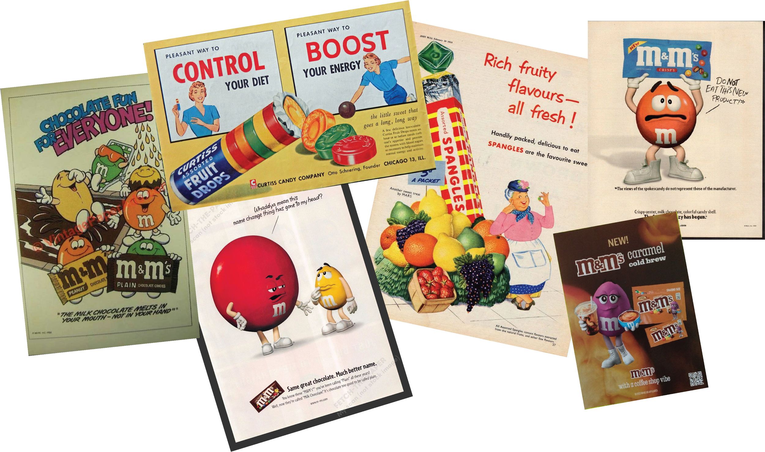
Print Ad Draft
For the magazine print ads, I continued the retro-inspired direction from the bottle label. I drew inspiration from vintage magazine ads and classic M&M’s campaigns, where products are personified and given a sense of character and story.

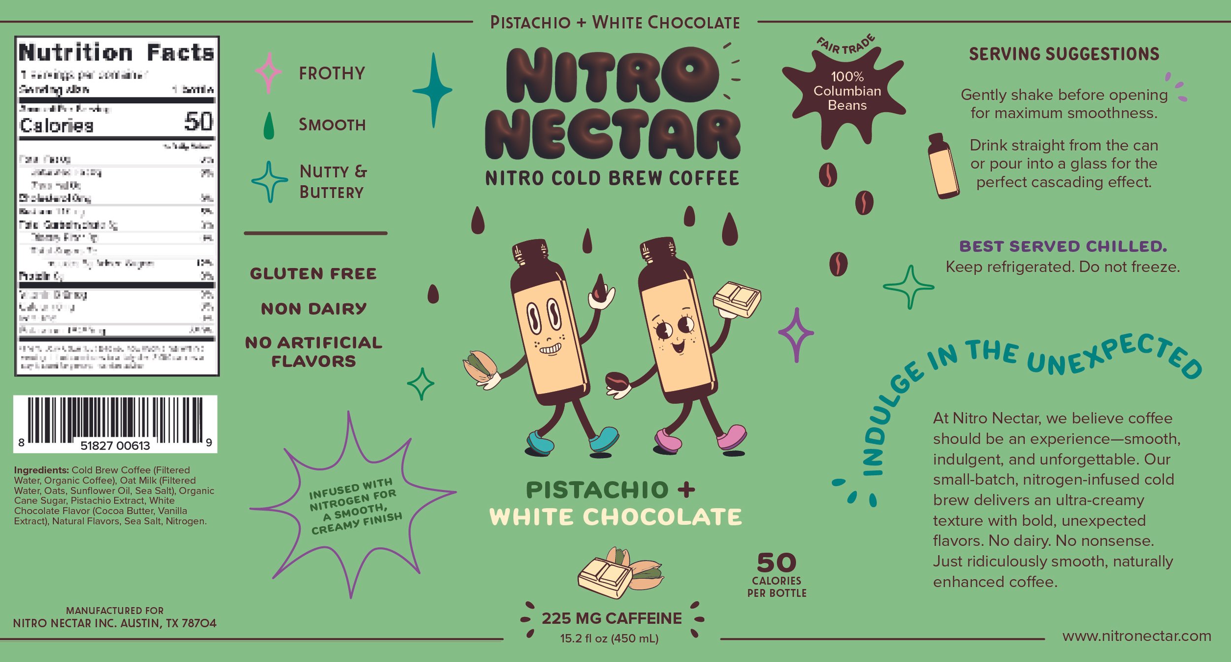
Final Design
For the final design, I shifted from bottles to cans, which better suit nitro cold brew packaging. I also introduced a more vibrant color palette and refined the hierarchy so ‘Nitro Cold Brew’ stands out more clearly than the flavor description.


Reflection
This project pushed me to build a cohesive brand across packaging and advertising. Iterating through feedback helped me refine hierarchy and colors while ensuring the design remained both playful and functional. My biggest takeaway was the importance of balancing bold visual expression with clarity, especially when working with vibrant color and illustrations.
Black bears in big bend national park
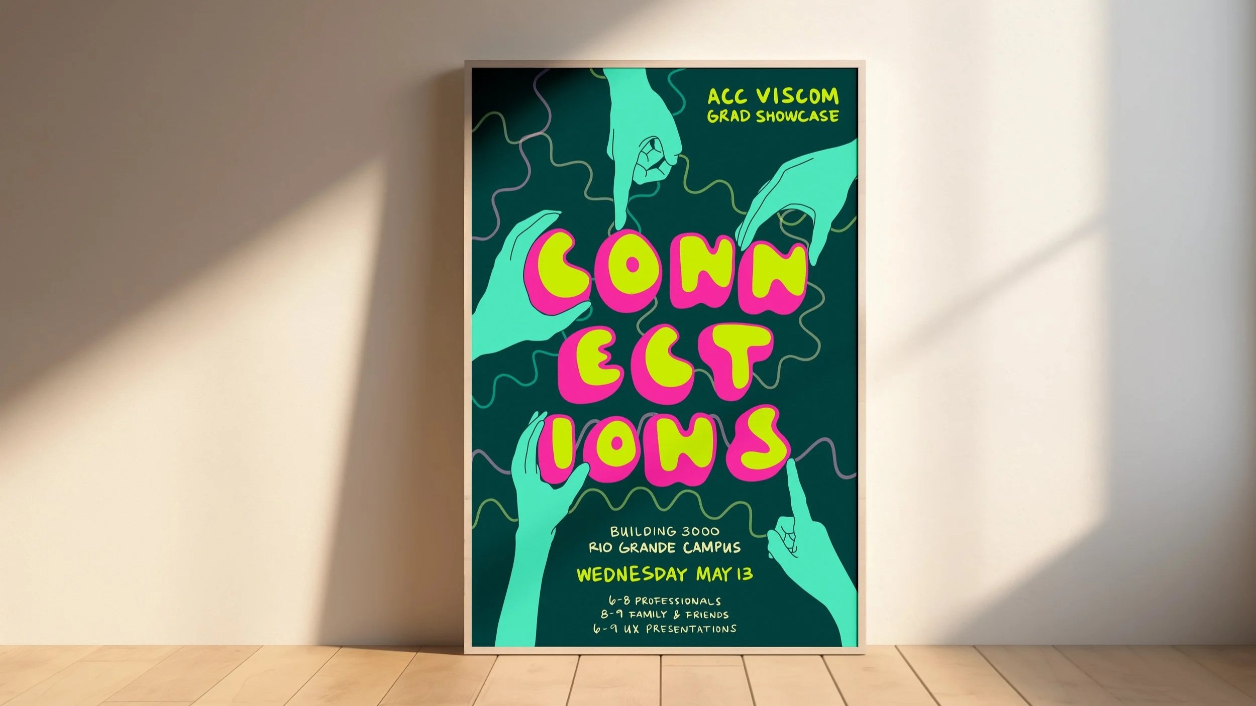
Acc viscom portfolio show