
Dept. of Speculation Book Jacket
Project Details
Fall 2024 Book Jacket Redesign
Deliverables:
Book Jacket
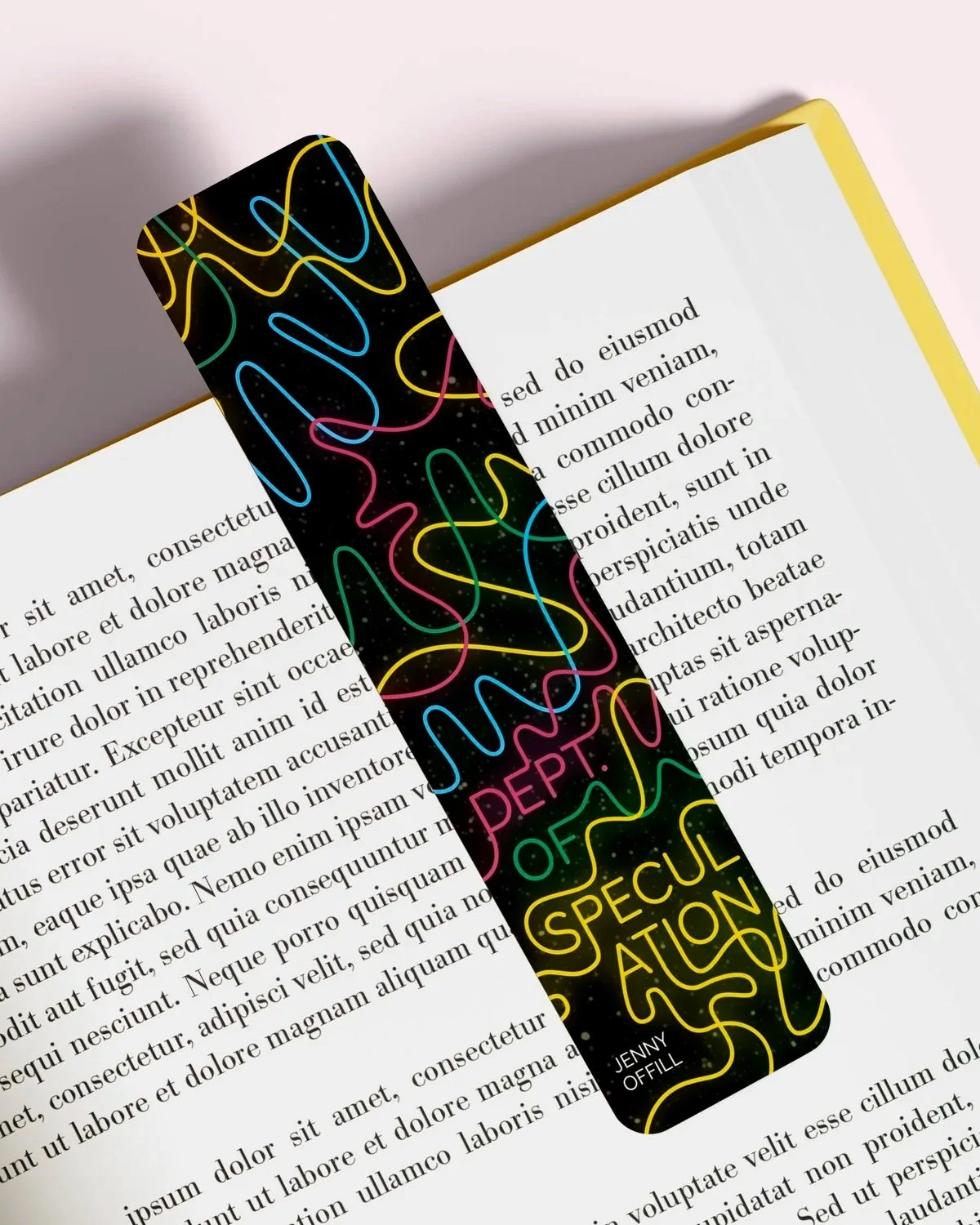
Bookmark
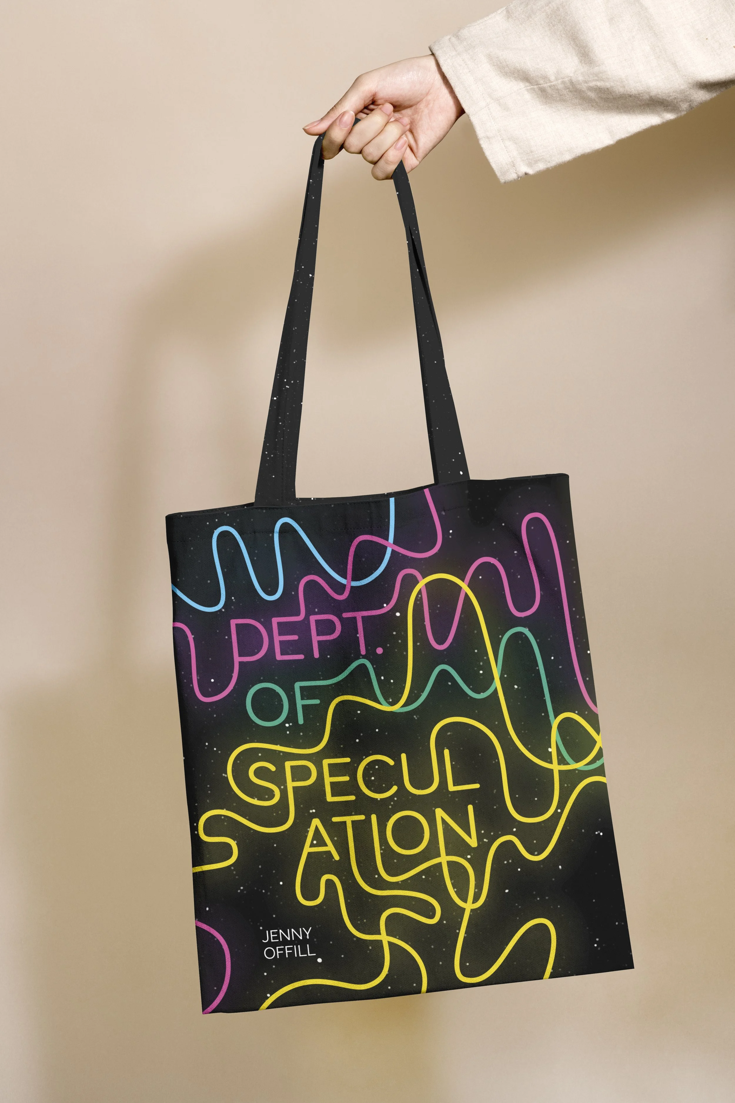
Tote bag
Social Media Teaser Video
Summary
A book jacket redesign for Dept. of Speculation by Jenny Offill, a novel that explores marriage, motherhood, and the tension between domestic life and creative ambition. Told through fragmented vignettes, the story moves between past and present, weaving together moments of intimacy, doubt, and reflection.
Rather than following a traditional narrative arc, the book builds meaning through accumulation, capturing the instability and nuance of long-term relationships. It explores themes of connection, distance, identity, and the quiet shifts that shape a life over time.
Challenge and Discovery
The challenge was to design a book jacket that captures the emotional depth of the story while standing out to readers of contemporary literary fiction. I aimed for something visually engaging and slightly unexpected, rather than overly literal.
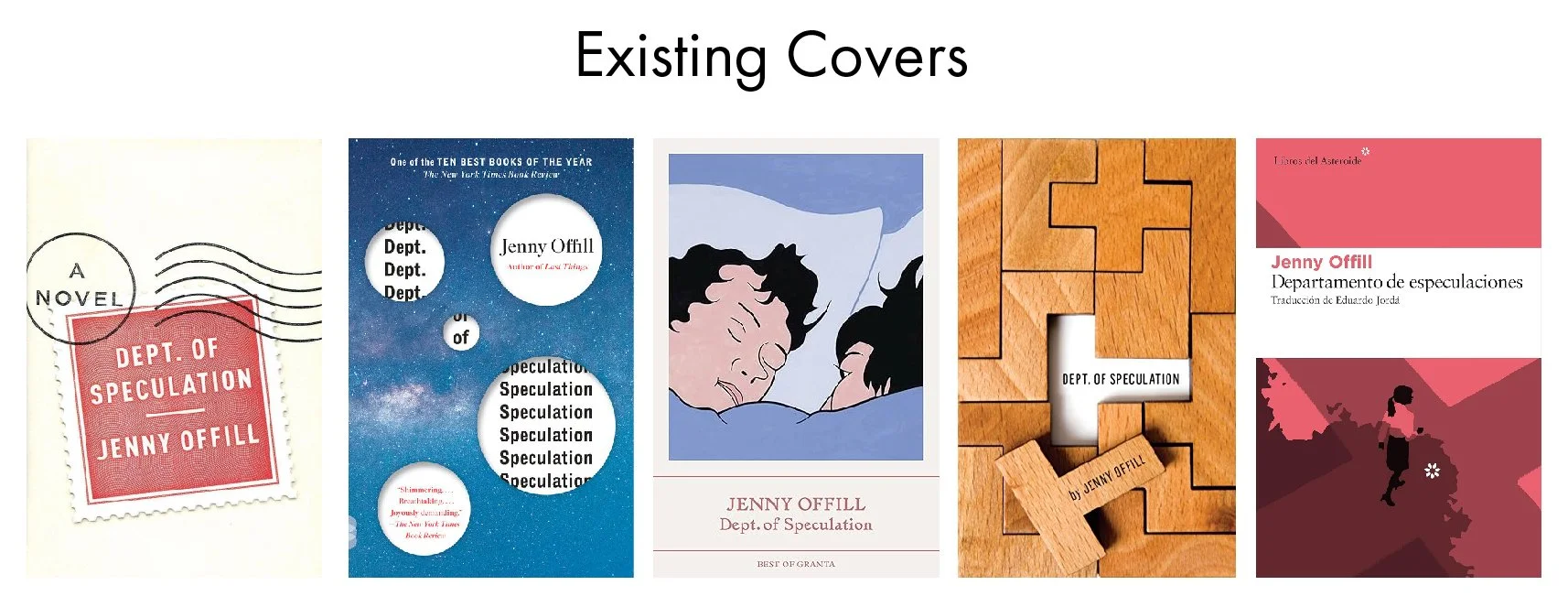
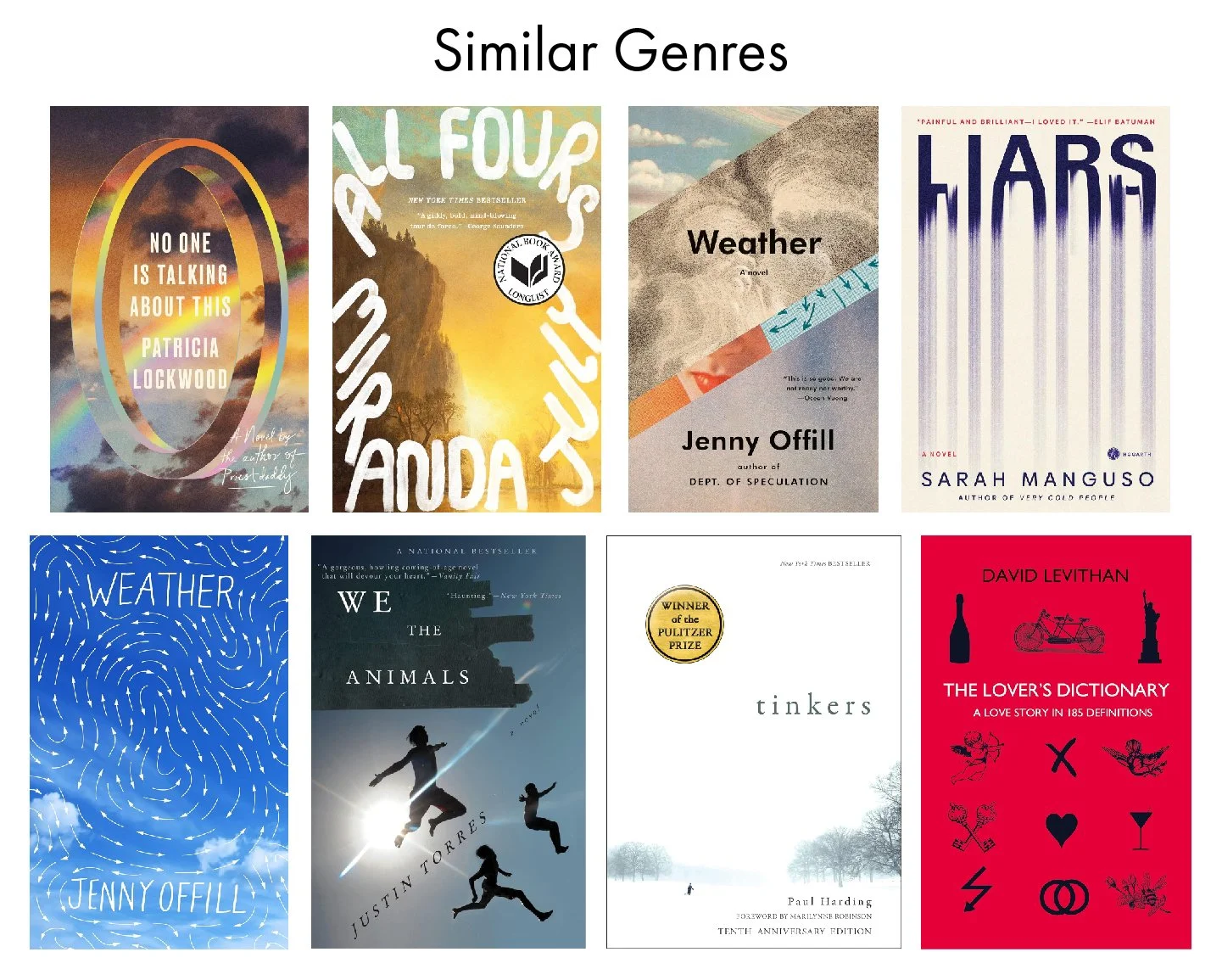
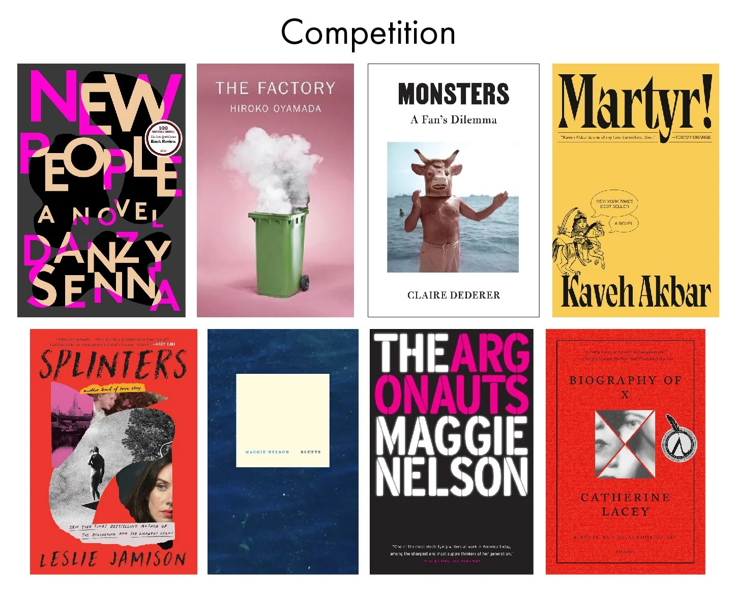
I started by researching existing covers for the book and similar titles to understand common visual approaches and identify opportunities to take the design in a new direction.
Process
While rereading the book, I documented recurring themes and symbols through notes and quick sketches. These explorations helped translate the narrative into visual ideas, forming the foundation for the first round of design concepts in the next phase.
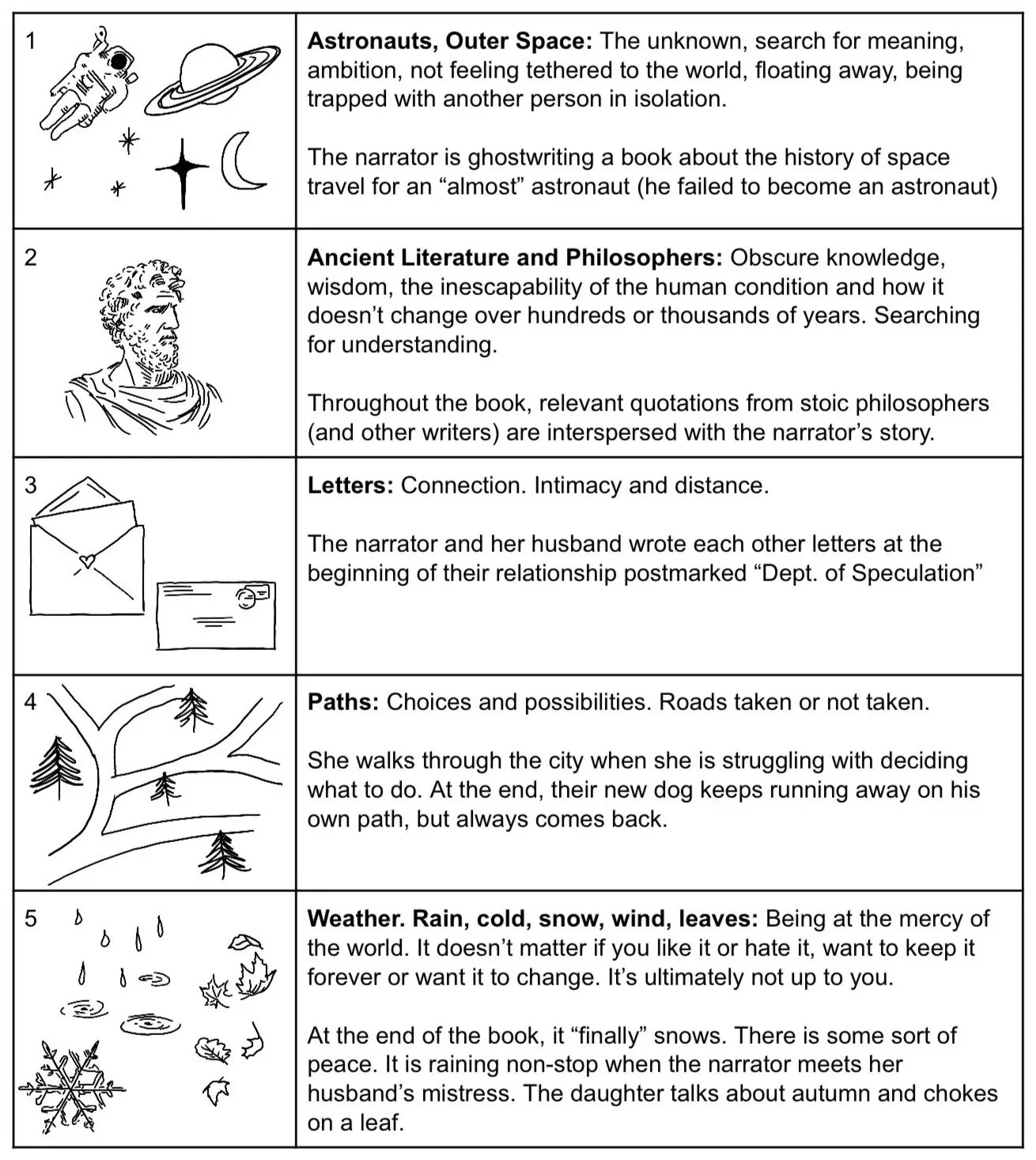
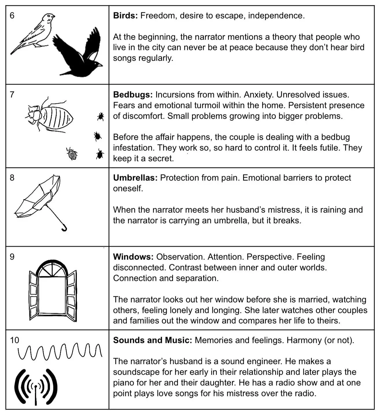
Sketches
These sketches explore visual directions based on key themes from the book. I experimented with a range of metaphors such as paths, windows, and weather to translate the emotional tone of the book, exploring how each idea could work across the front, back, and spine of the book.
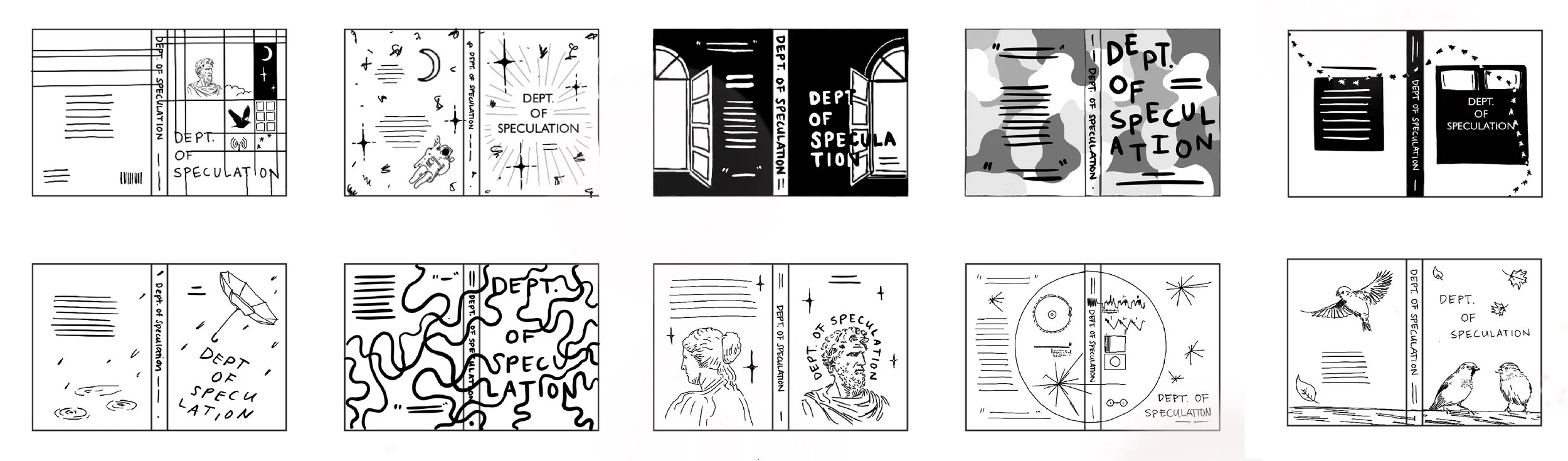
Digital Drafts
For the digital drafts, I began to introduce color and typography. Each concept had strong potential, but I ultimately made my choice based on how well it aligned with the tone of the book. While the bedbug concept was visually compelling, it felt too narrow for the emotional depth of the story. The rain-based direction was also a strong contender, but the reviews on the back cover really helped push me toward the third “paths” direction, as they clearly aligned with that idea.


Prototype
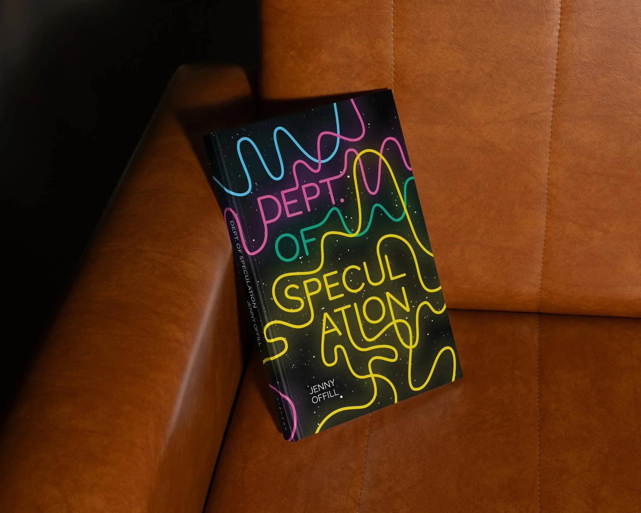
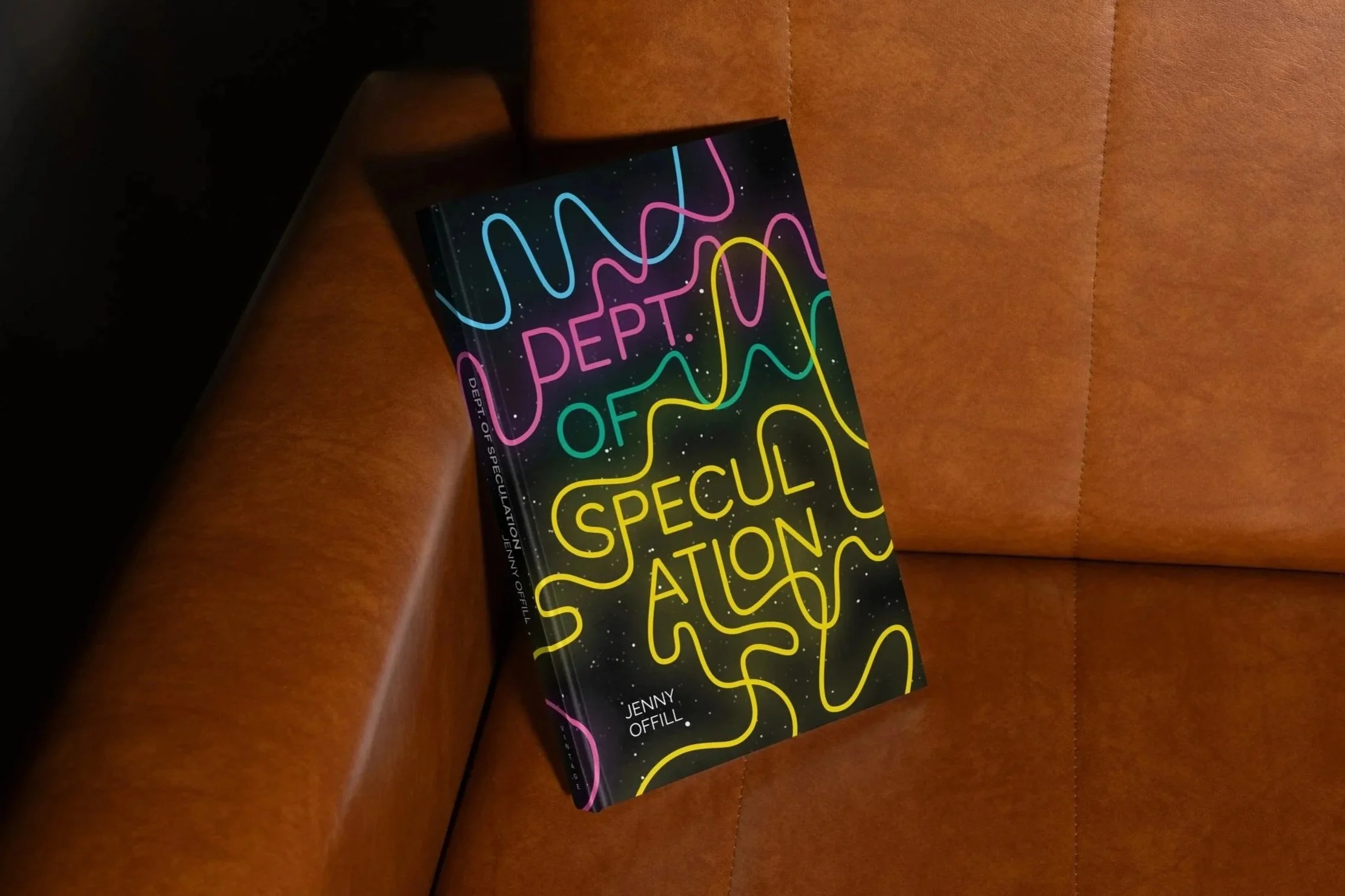
After choosing a final direction, I made a series of small adjustments that ended up making a big difference in how the message came through. The stars in the background nod to themes in the book and add a compelling texture, while the glowing type adds a softness that reflects its emotional depth.
It was really helpful to see the design printed at the proper scale. I noticed small issues that I was not noticing on the screen and I ended up making many tiny adjustments in line and star placement, type size, and spacing.

Final Design
In addition to small adjustments after printing, I refined the title typography by rounding the corners to better match the flow of the lines, and adjusted the kerning and leading to improve legibility. I also expanded the project to include a bookmark, tote bag, and a teaser video for social media.

Reflection
Capturing the essence of the book proved to be the most challenging part of this project. While I created several eye-catching drafts, none initially felt fully aligned with the story’s tone and complexity. Refining one direction through small, intentional adjustments made a significant difference in communicating the right message and brought the concept into focus. This process of printing and refining also reinforced the importance of attention to detail, especially in printed designs. The final design is visually compelling while holding layers of meaning that reveal themselves over time.
CROISSANT PACKAGING
Black bears in big bend national park