
Croissant Packaging
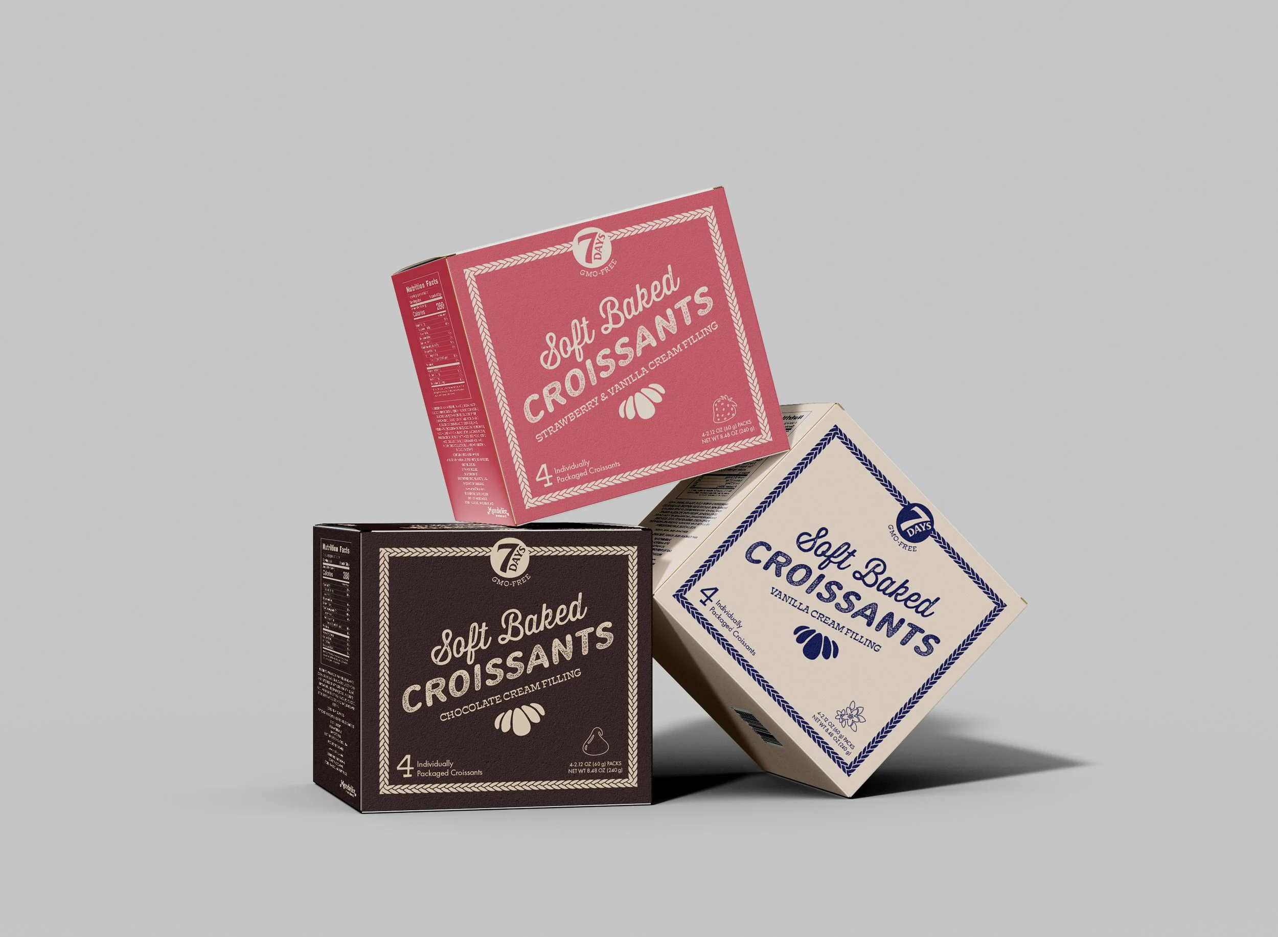
Project Details
Fall 2024 Packaged Food Design
Deliverables:
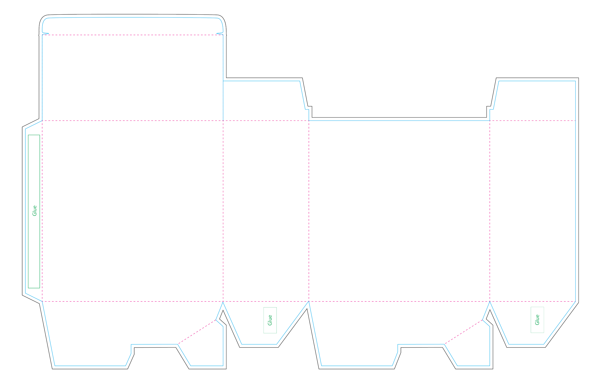
Croissant Box Dieline
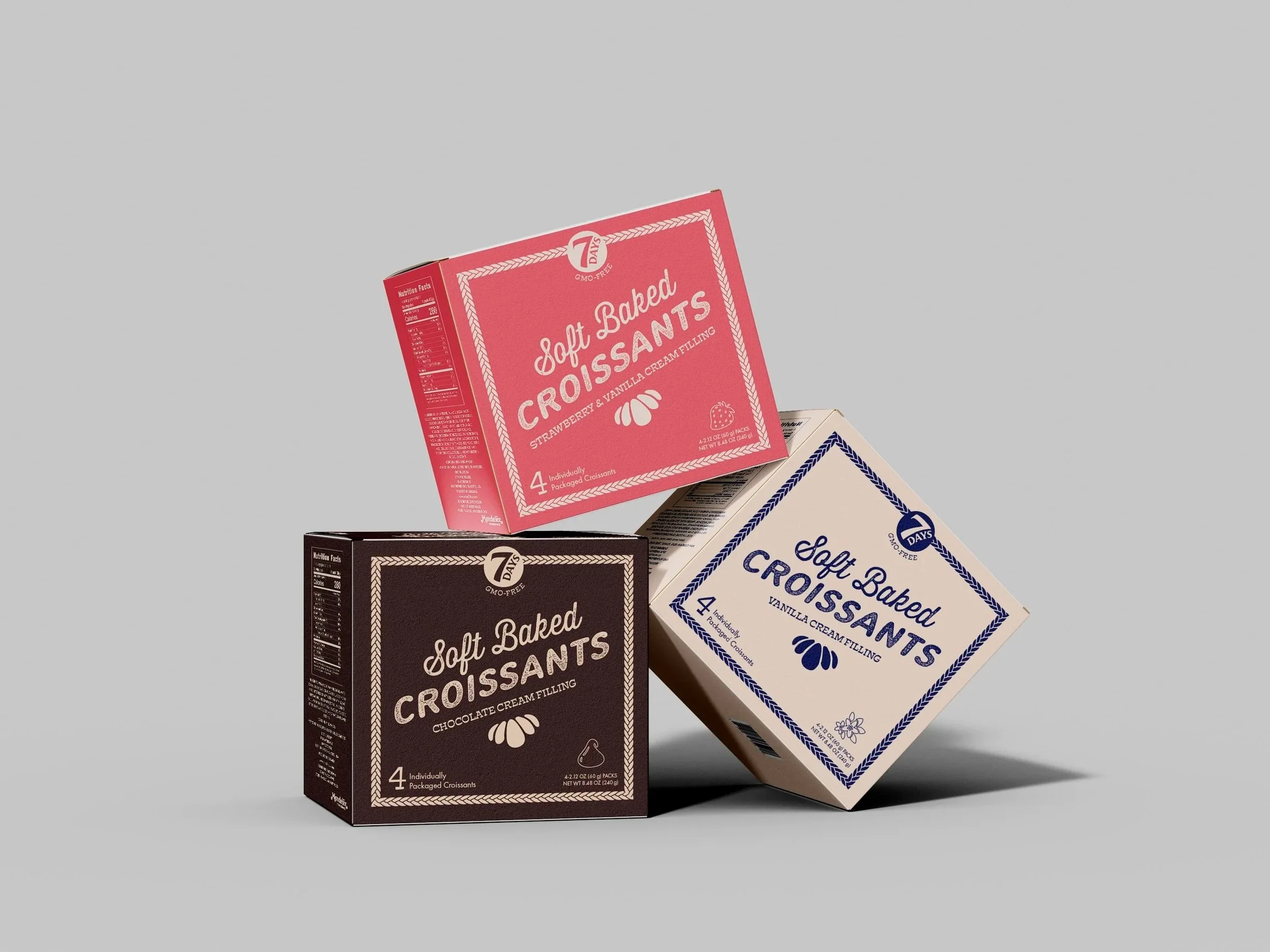
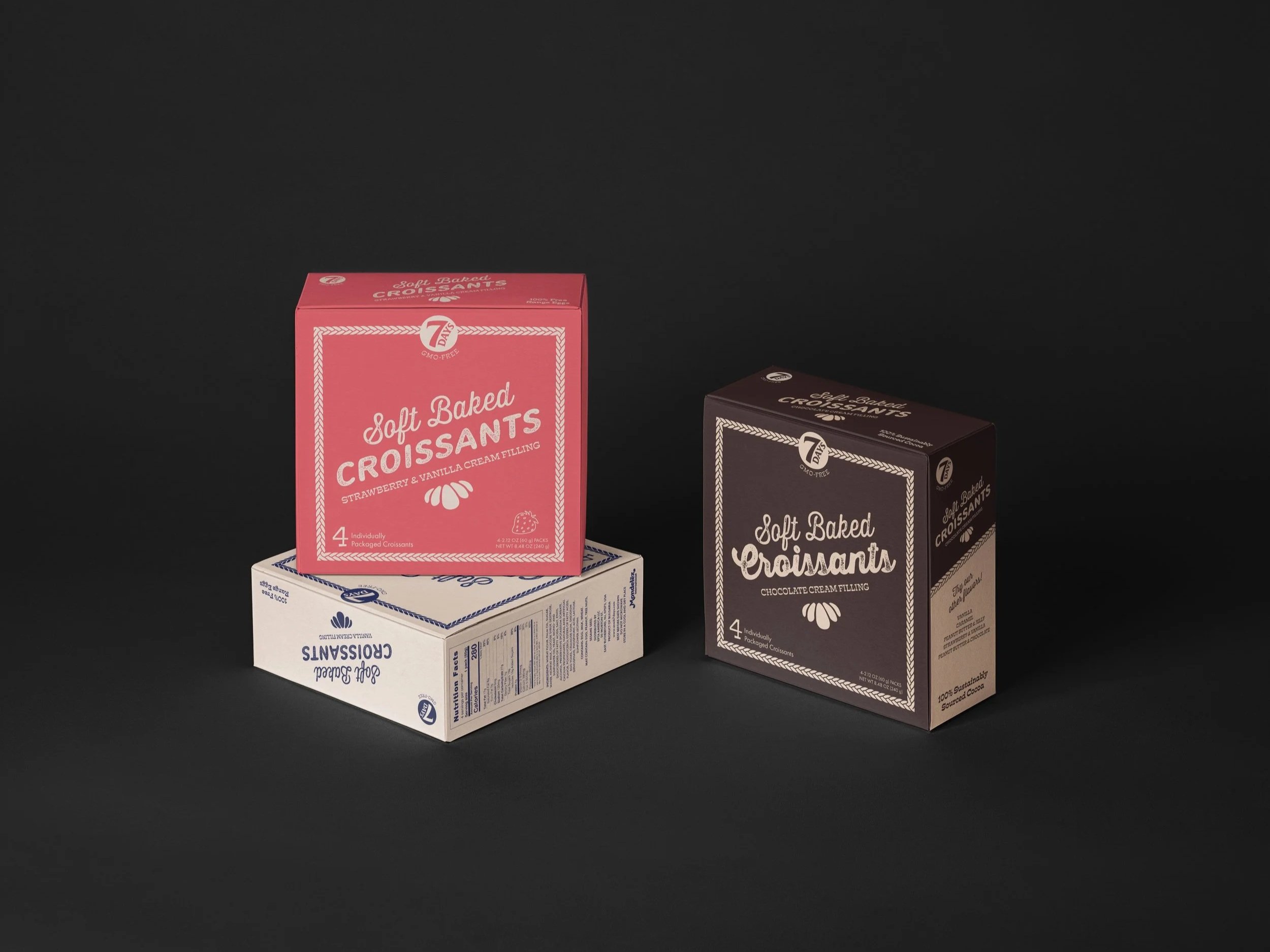
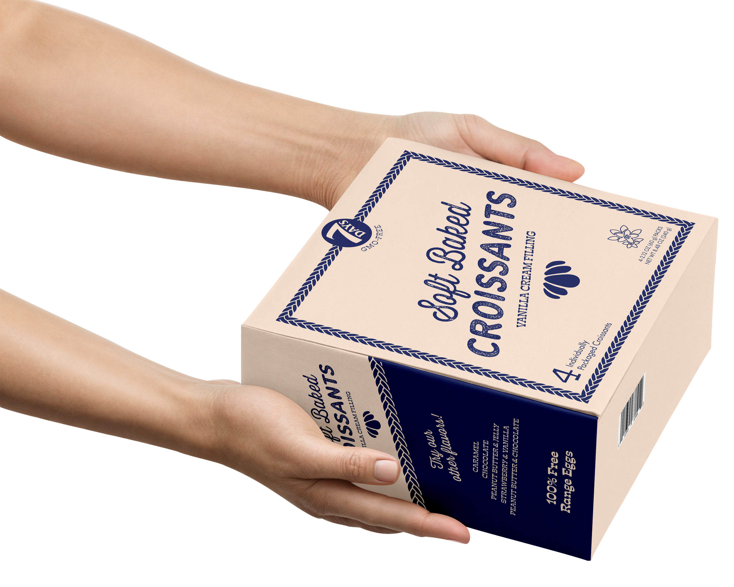
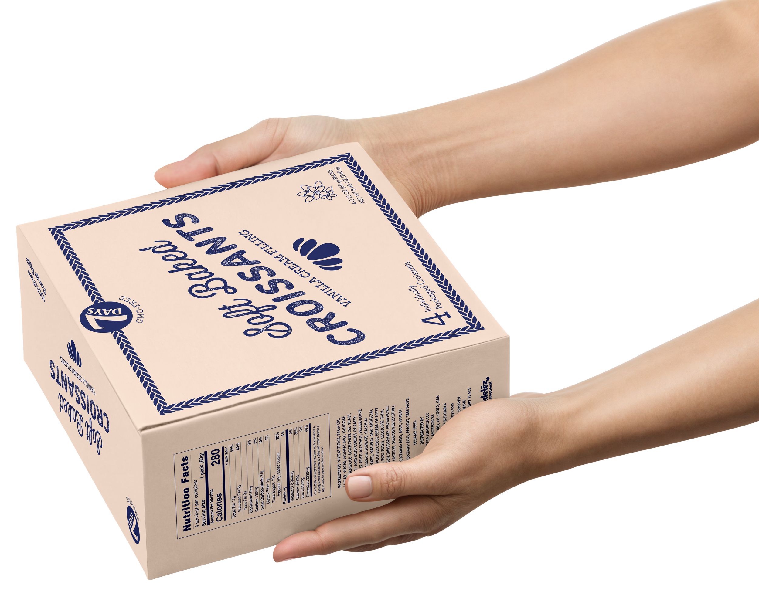
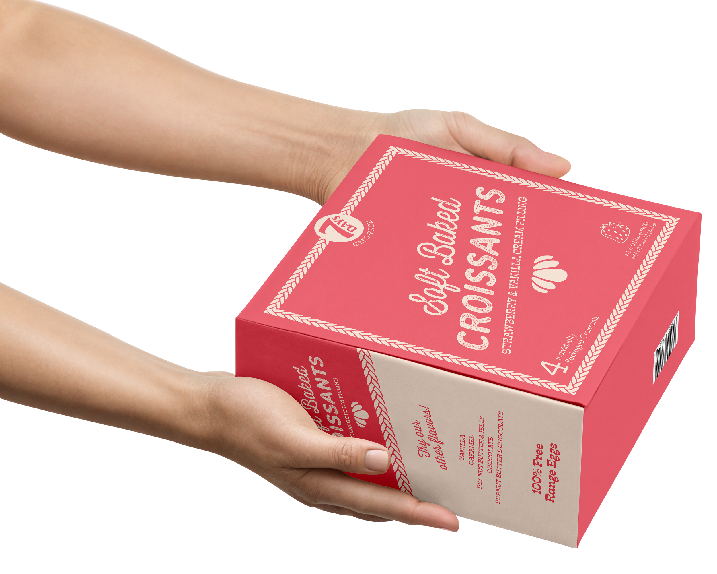
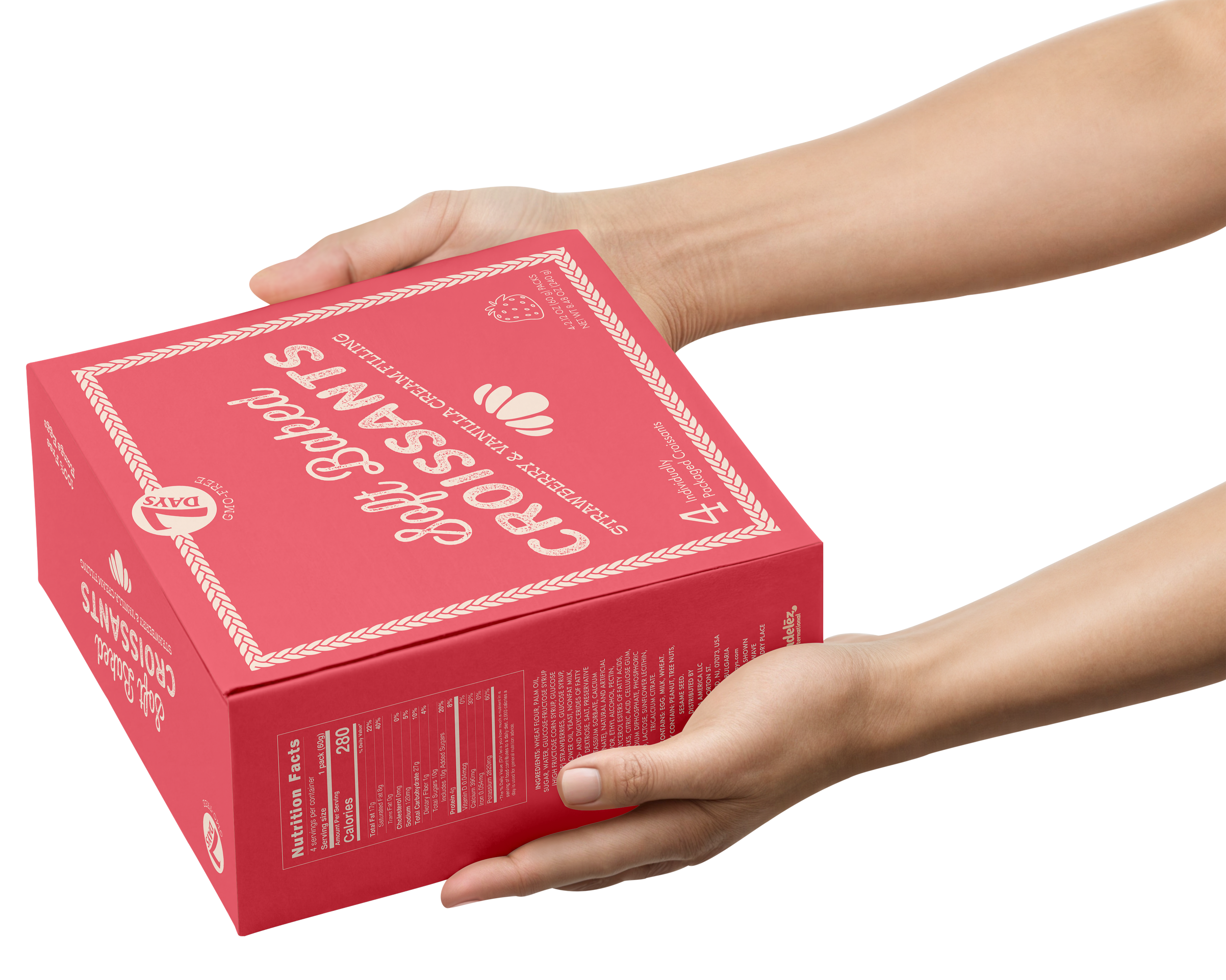
Croissant Box Design (Three Flavors)
Individual Wrapper Design (Three Flavors)
Summary
A packaging redesign for 7Days Soft Croissants focused on elevating the brand within a crowded snack aisle. The goal was to emphasize quality and joy while differentiating the product through color, typography, and clearer communication of flavor and ingredients.
Challenge and Discovery
7Days Soft Croissants sit in a crowded snack aisle surrounded by brands like Hostess and Little Debbie, but the current packaging blends in and lacks strong shelf presence. Positioned high on the shelf and visually similar to competitors, the product reads as a follower despite being slightly more premium.
Through research, I identified an opportunity to better communicate the product’s higher-quality ingredients. While the target audience is driven by ease and everyday enjoyment, I chose to lean into a more elevated direction, using design to better reflect the product’s quality and help it stand out on the shelf.
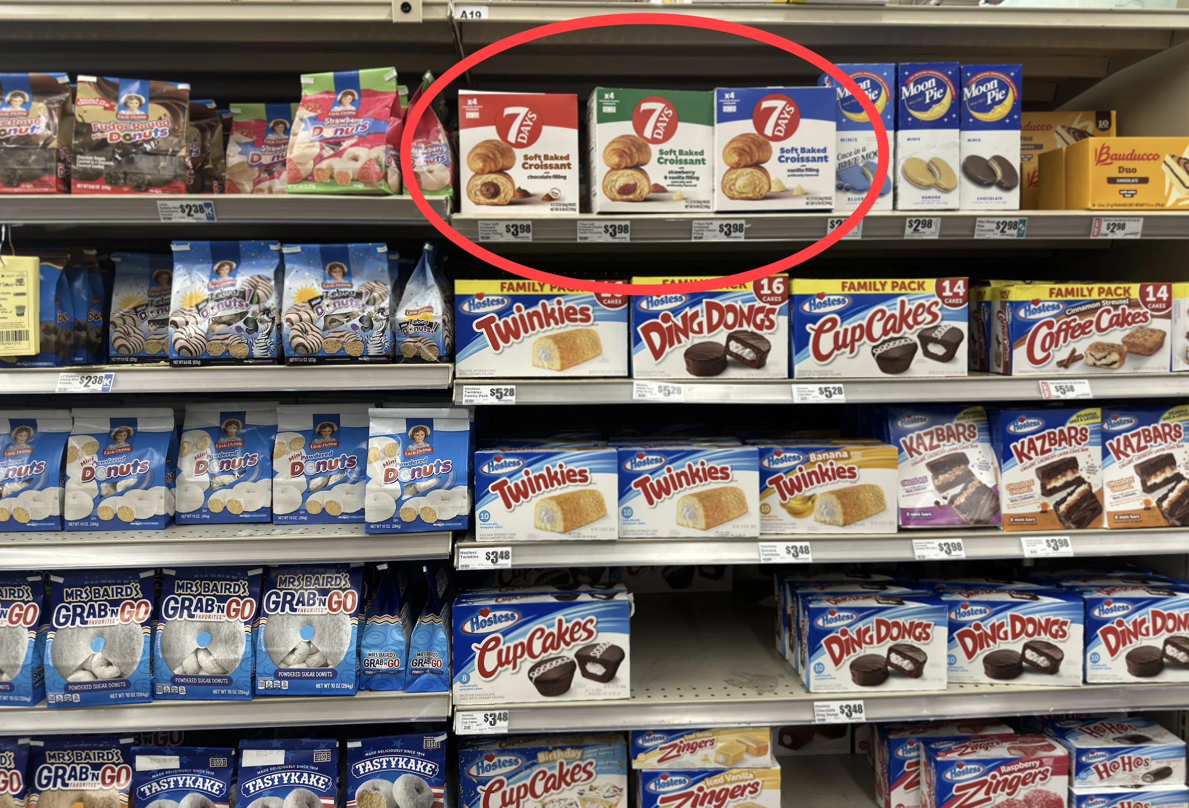
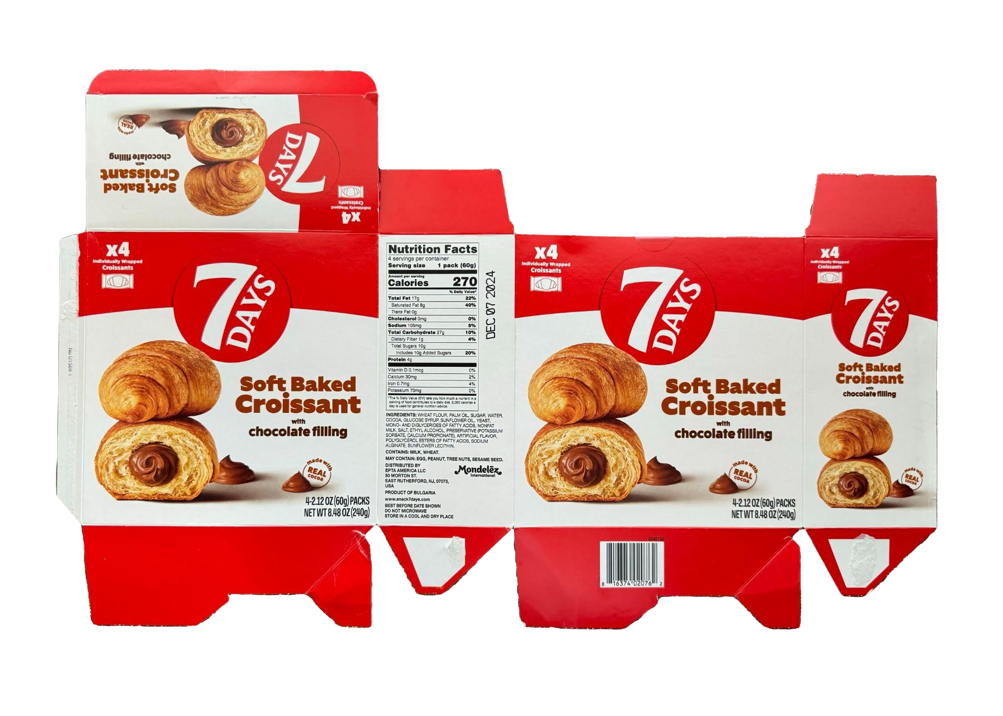
Moodboards
From my research, I developed three distinct visual directions to explore: playful, bold, and decadent. Each mood board represents a different approach to how the brand could show up on the shelf, ranging from bright and approachable, minimal and attention-grabbing, and more elevated and indulgent. These directions helped guide the next round of sketches and allowed me to test how different tones could communicate quality and joy.


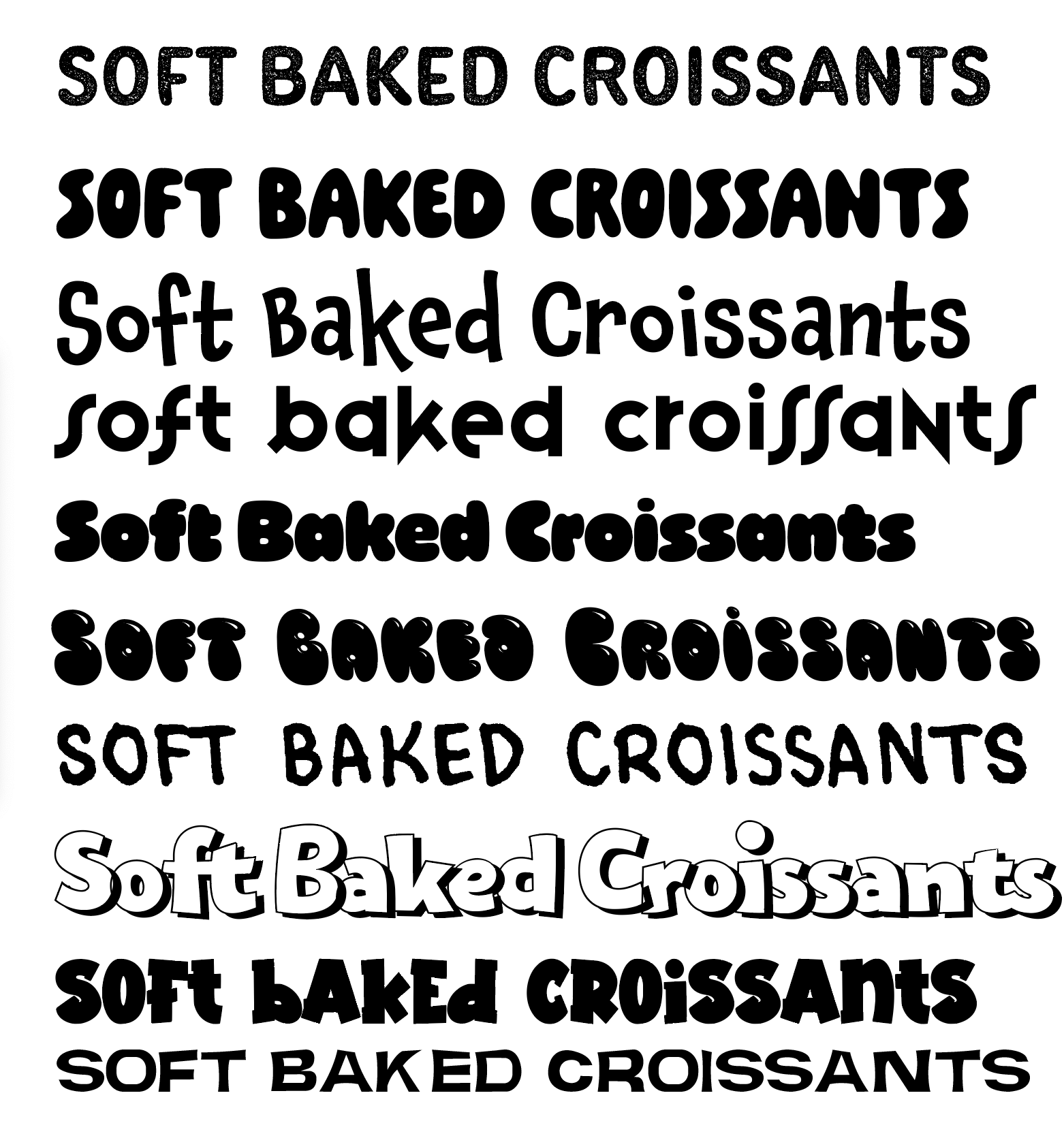
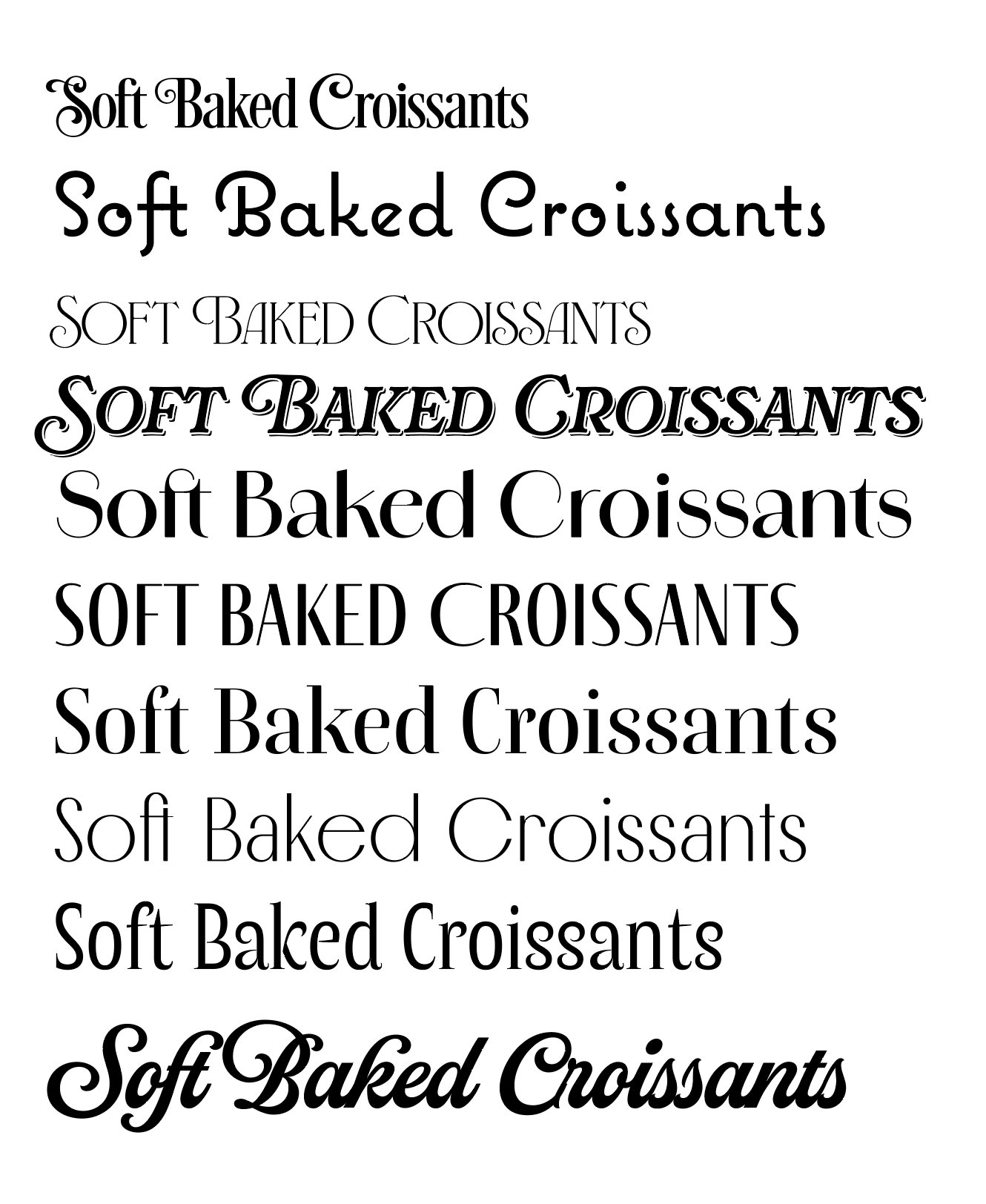
Sketches and Type Exploration
I explored each direction through sketches and type studies, trying out a wide range of typography, hierarchy, and layouts. This stage helped me quickly test ideas and determine which concepts felt the strongest before moving into digital drafts.
Playful

Bold
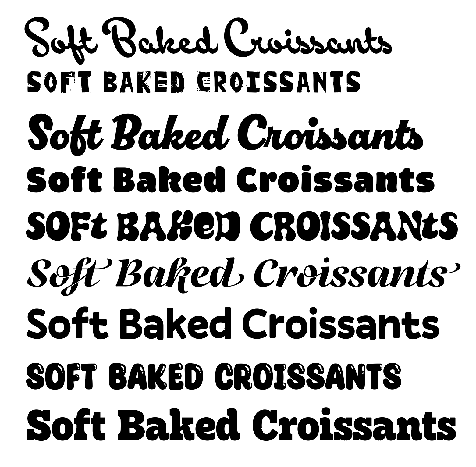

Decadent

Digital Logo Drafts
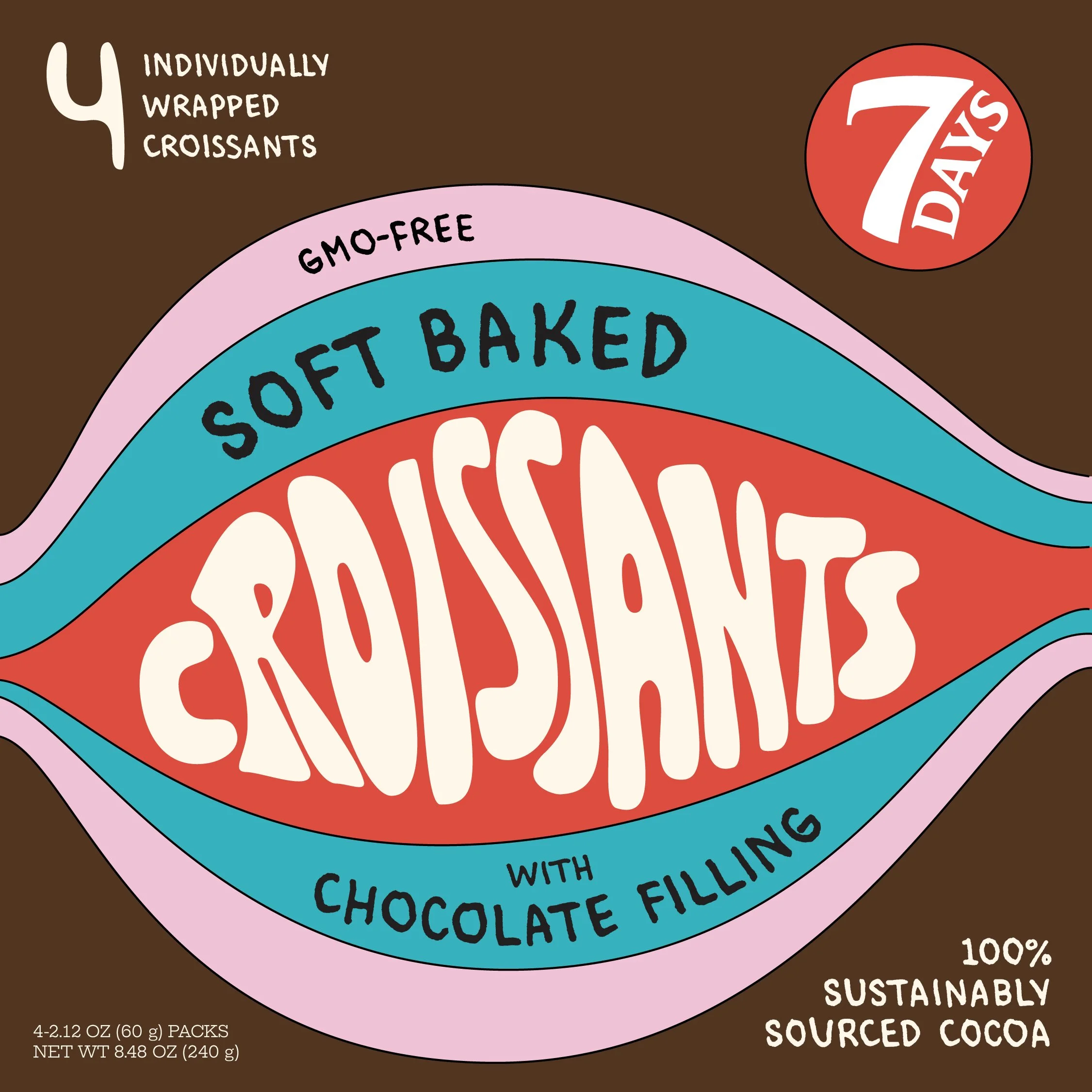
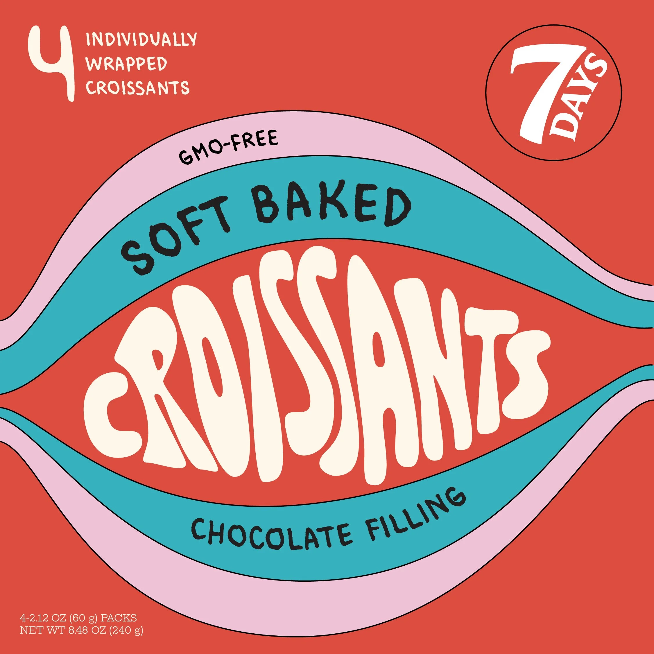
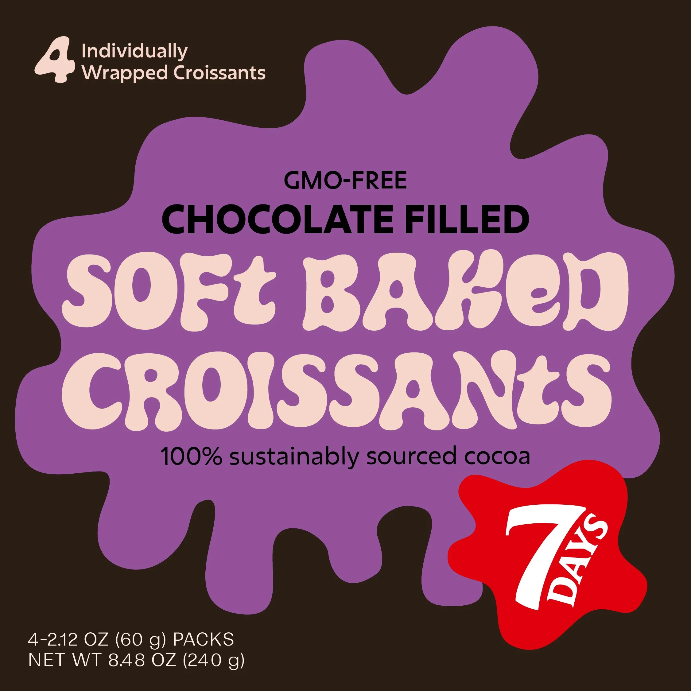
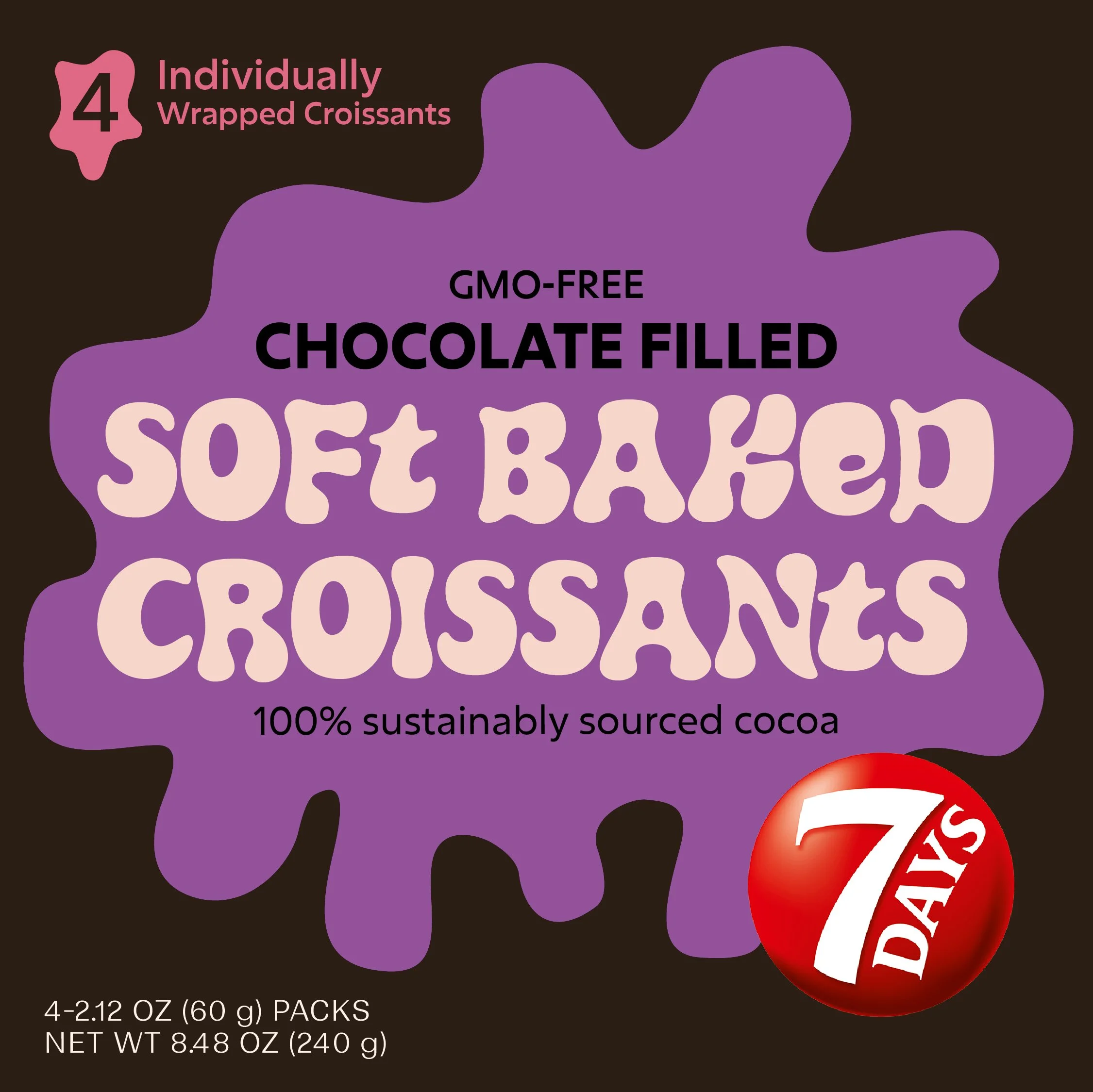
For this round, I moved forward with one layout from each mood board. I explored a combination of type, graphics, hierarchy, and color. This stage helped reveal what felt most effective on the shelf and which direction best communicated the intended tone.
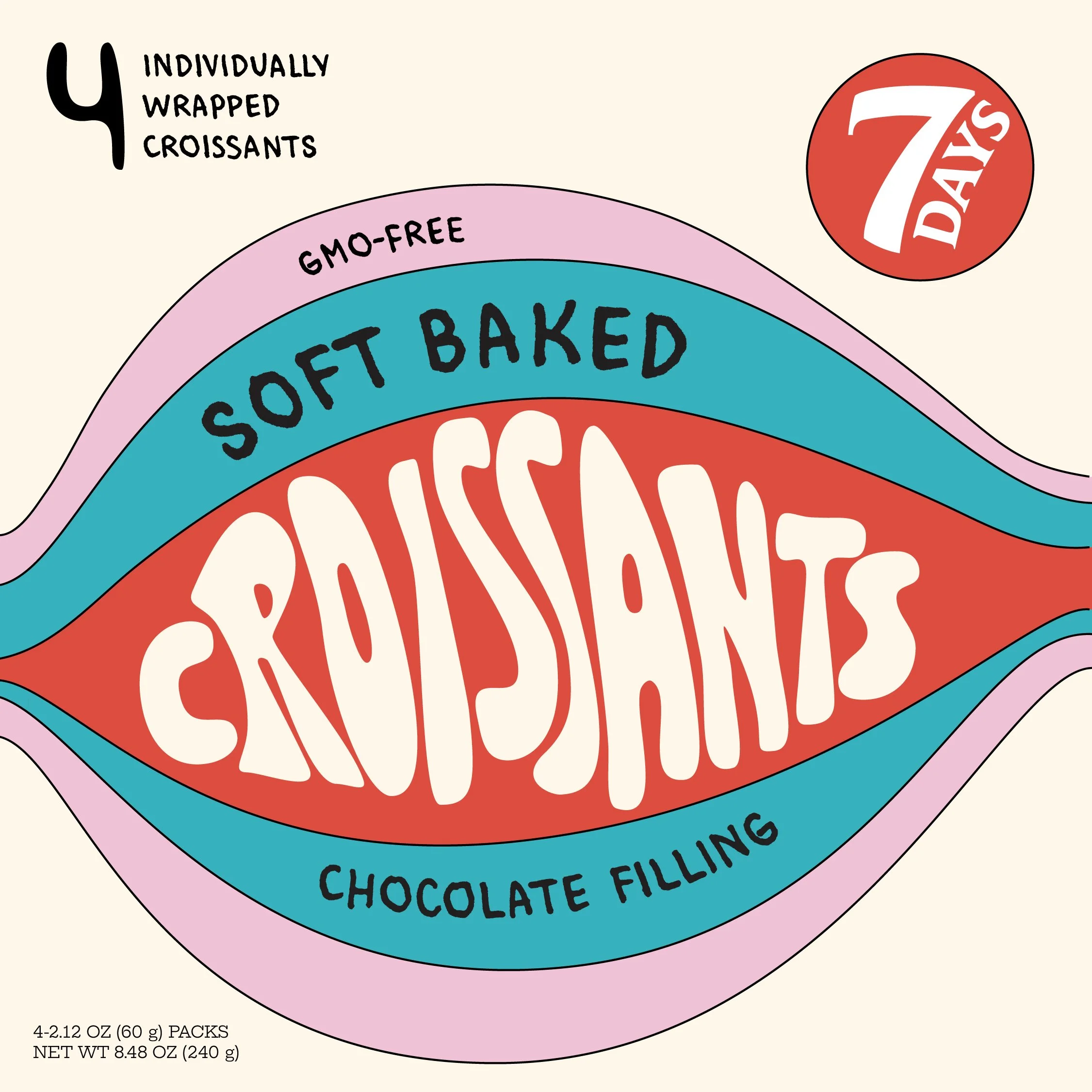
The first option was playful, using the full shape to suggest a cream-filled interior. The second direction also leaned playful, but ultimately read more like ice cream packaging and didn’t clearly communicate what was inside.
I chose to move forward with the third option, which felt more elevated and better reflected the quality of the ingredients. The croissant icon suggests the contents without being overly literal, striking a balance between clarity and restraint.
Bold
Decadent
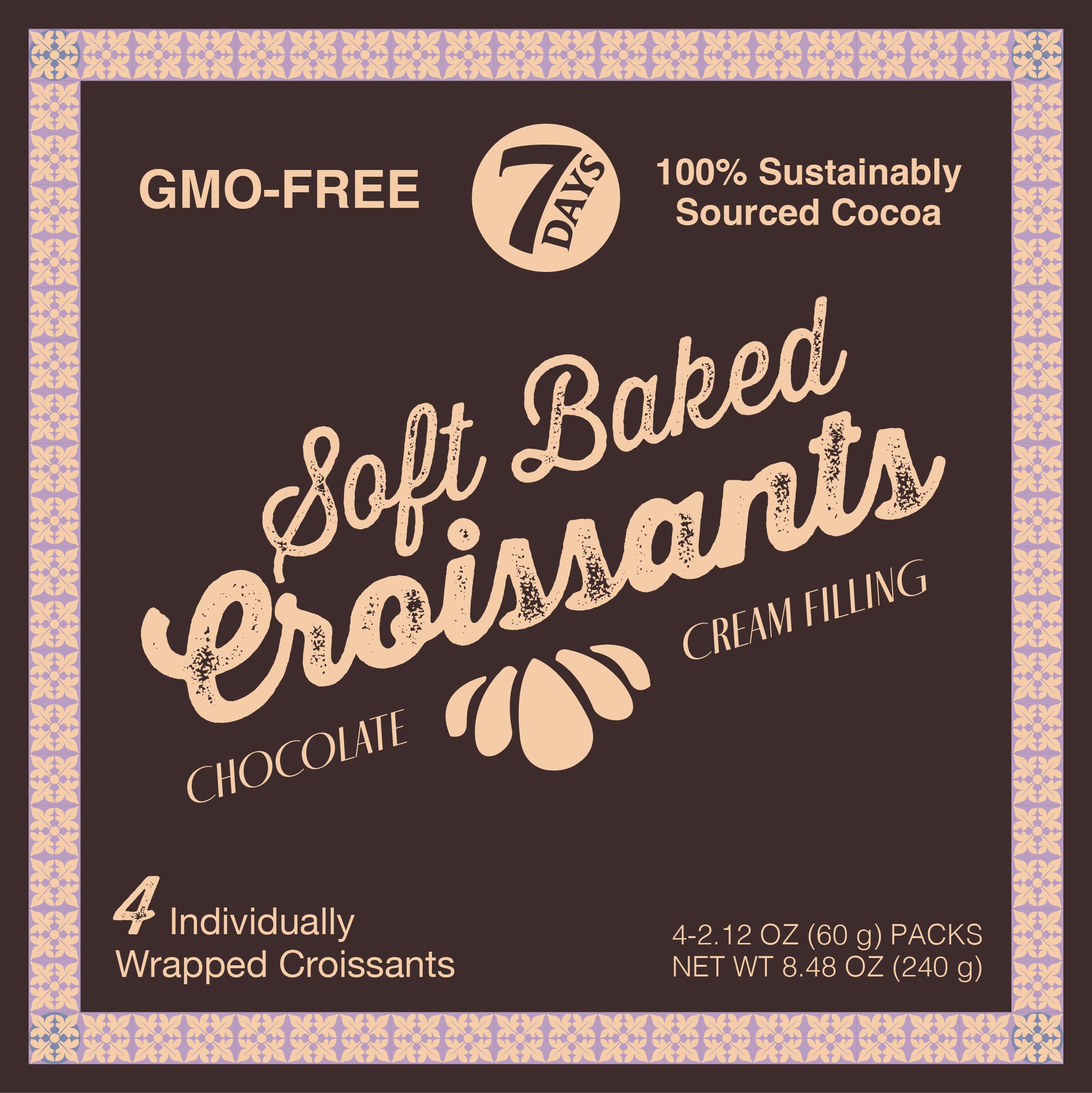
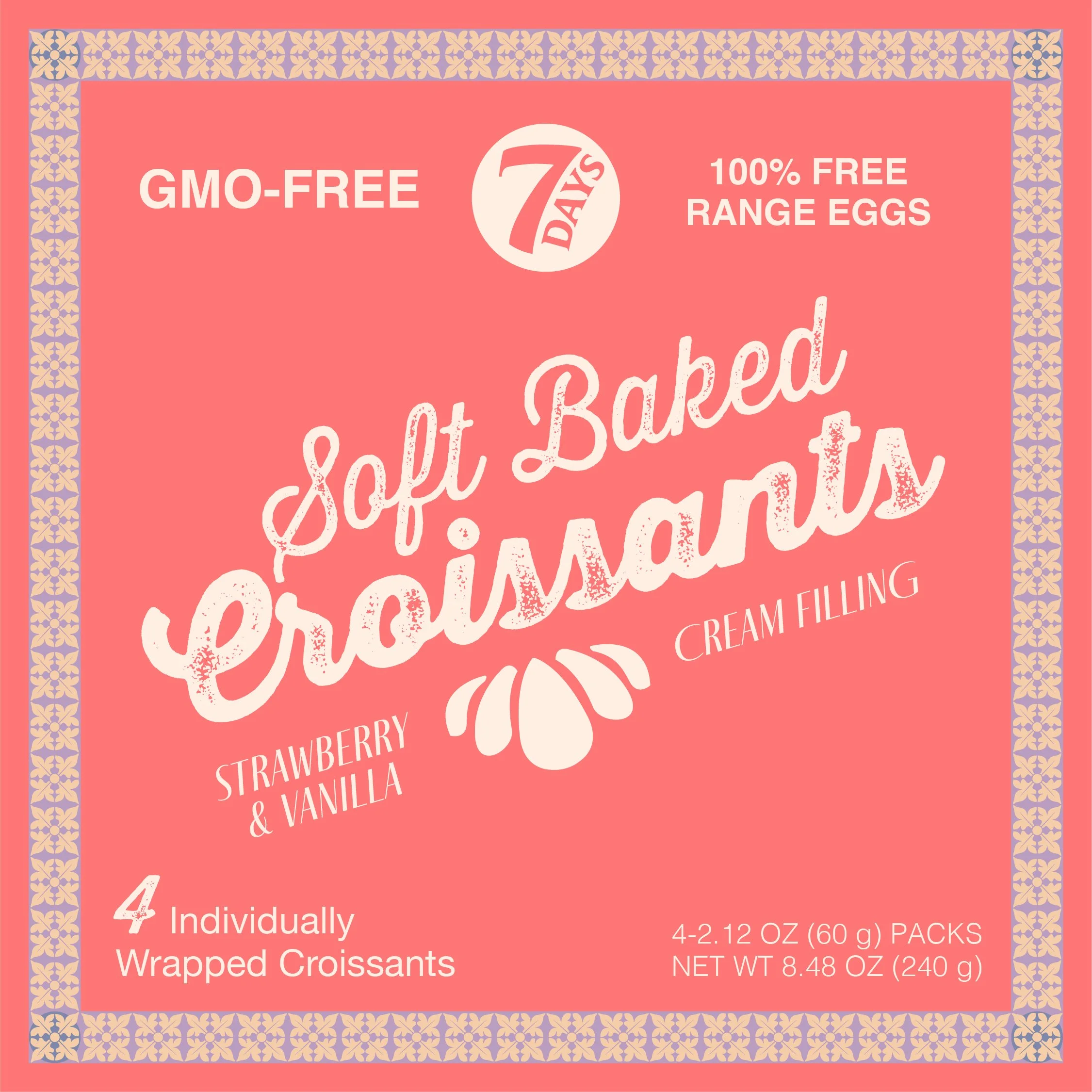
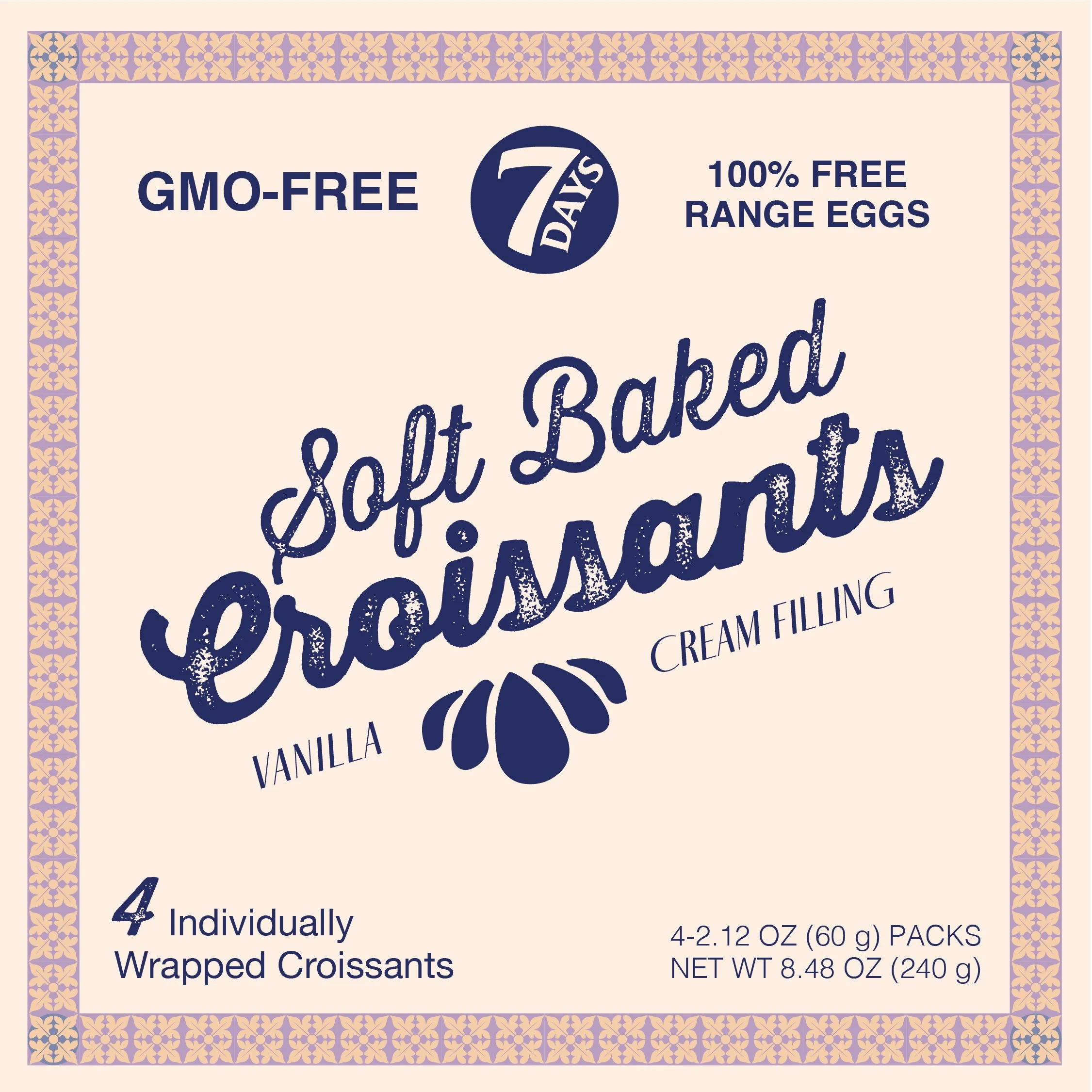
Prototype
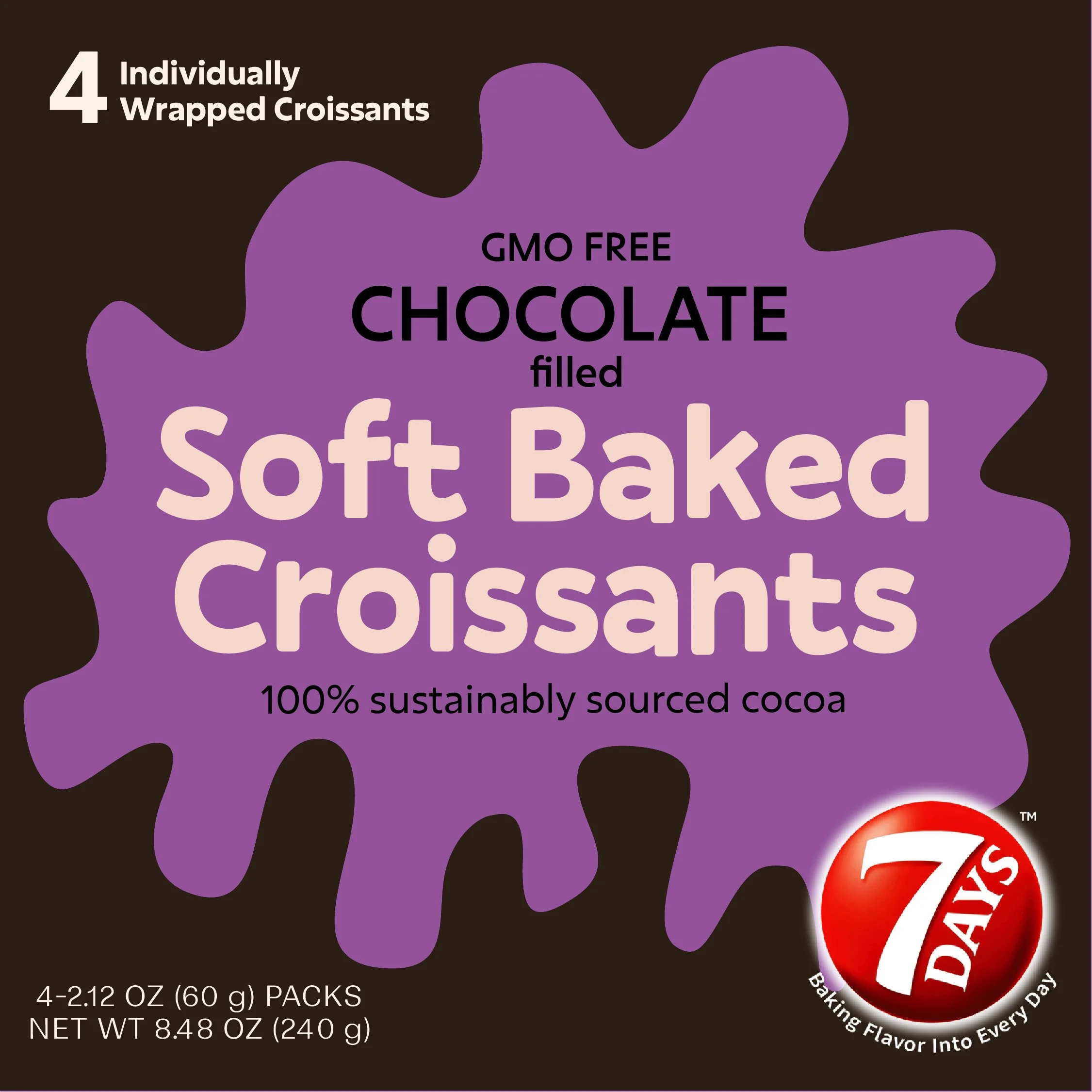
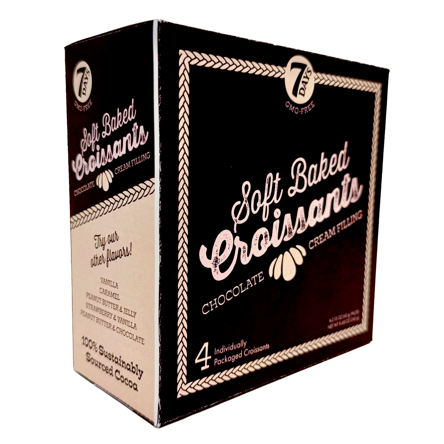
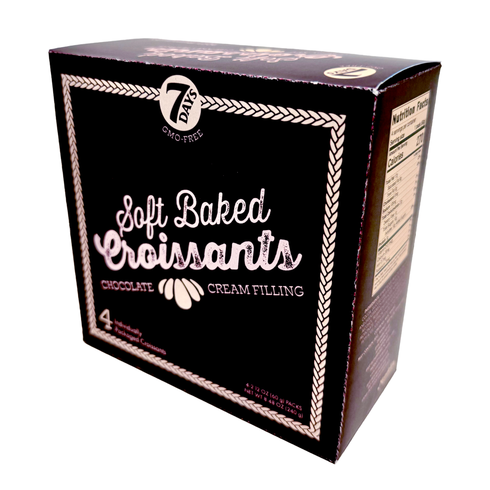
For the prototype stage, I created a dieline and designed the rest of the box, highlighting additional flavors and qualities like sustainably sourced cocoa. I also changed the “cream filling” typeface to a slab serif to add a more classic, playful feel, and simplified the border to hint at the fluffy dough inside.
Final Design
For the final design, I replaced the “Croissant” script with a more legible and accessible sans serif. I also added a flavor illustration to the front of each box to give each variation a more distinct, special feel. On the side panel, I removed the reverse color block around the nutritional facts, which was drawing too much attention, and expanded the surrounding space to create clearer margins and improve readability.



Reflection
This project pushed me to think strategically about how packaging functions on the shelf and how design can shift a product’s perceived value. By leaning into a more elevated and joyful direction, I was able to better communicate the quality of the product.
I also gained a much stronger understanding of working with dieline templates, including how to design across multiple panels and how to think about the package coming together as a physical object.
End of an ear
Dept. of Speculation Book Jacket