
End of an Ear
Project Details
Fall 2024 Rebrand
Deliverables:
Logo and Brand Identity
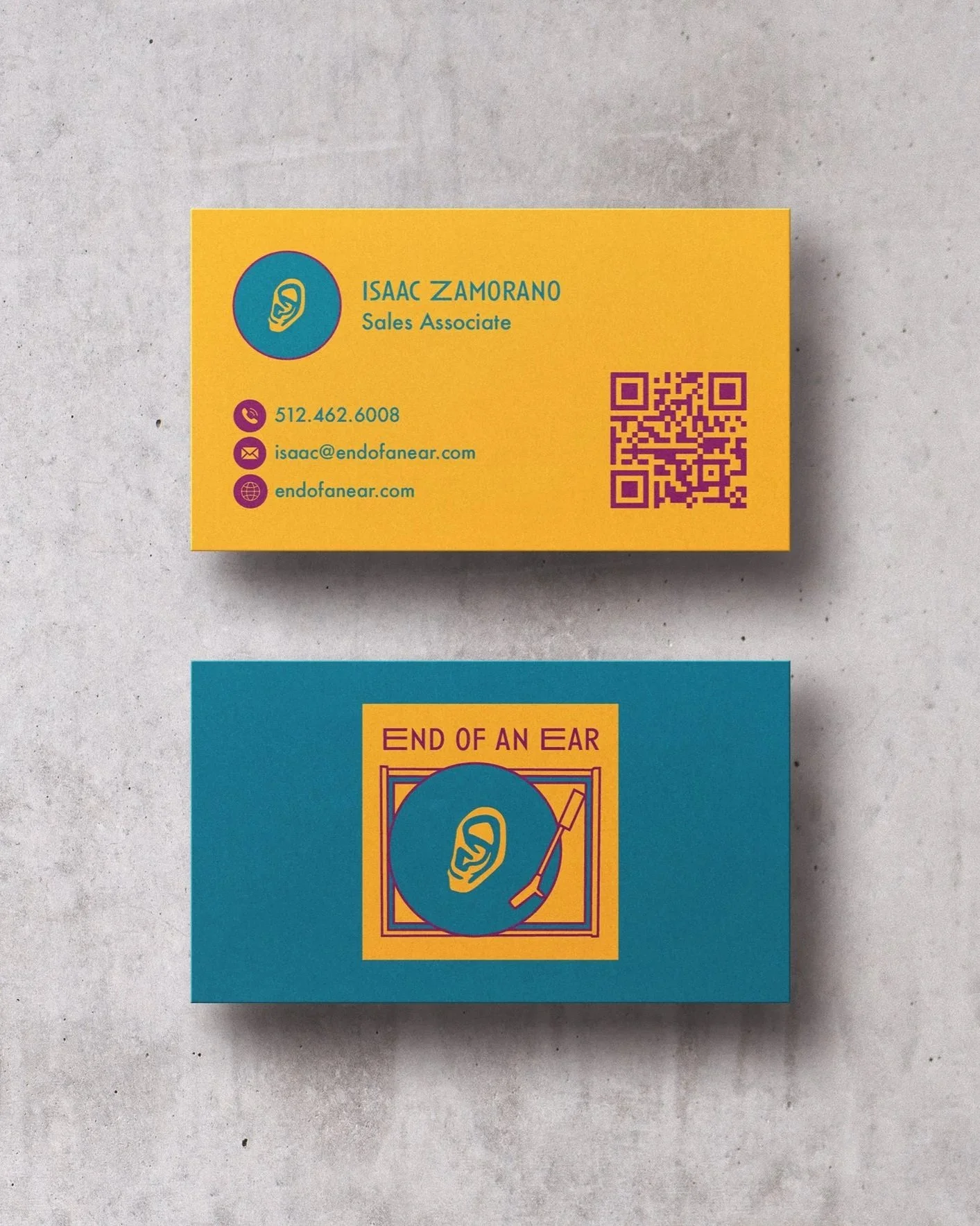
Business Cards
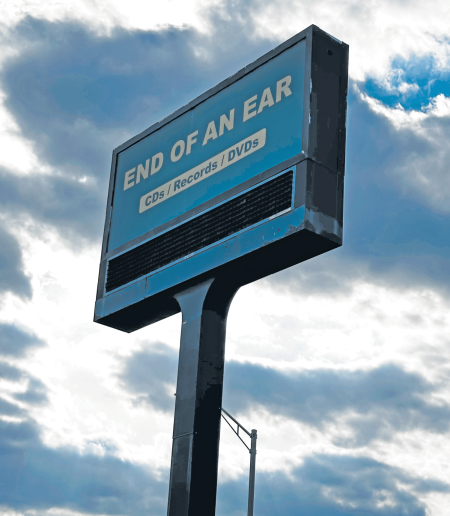
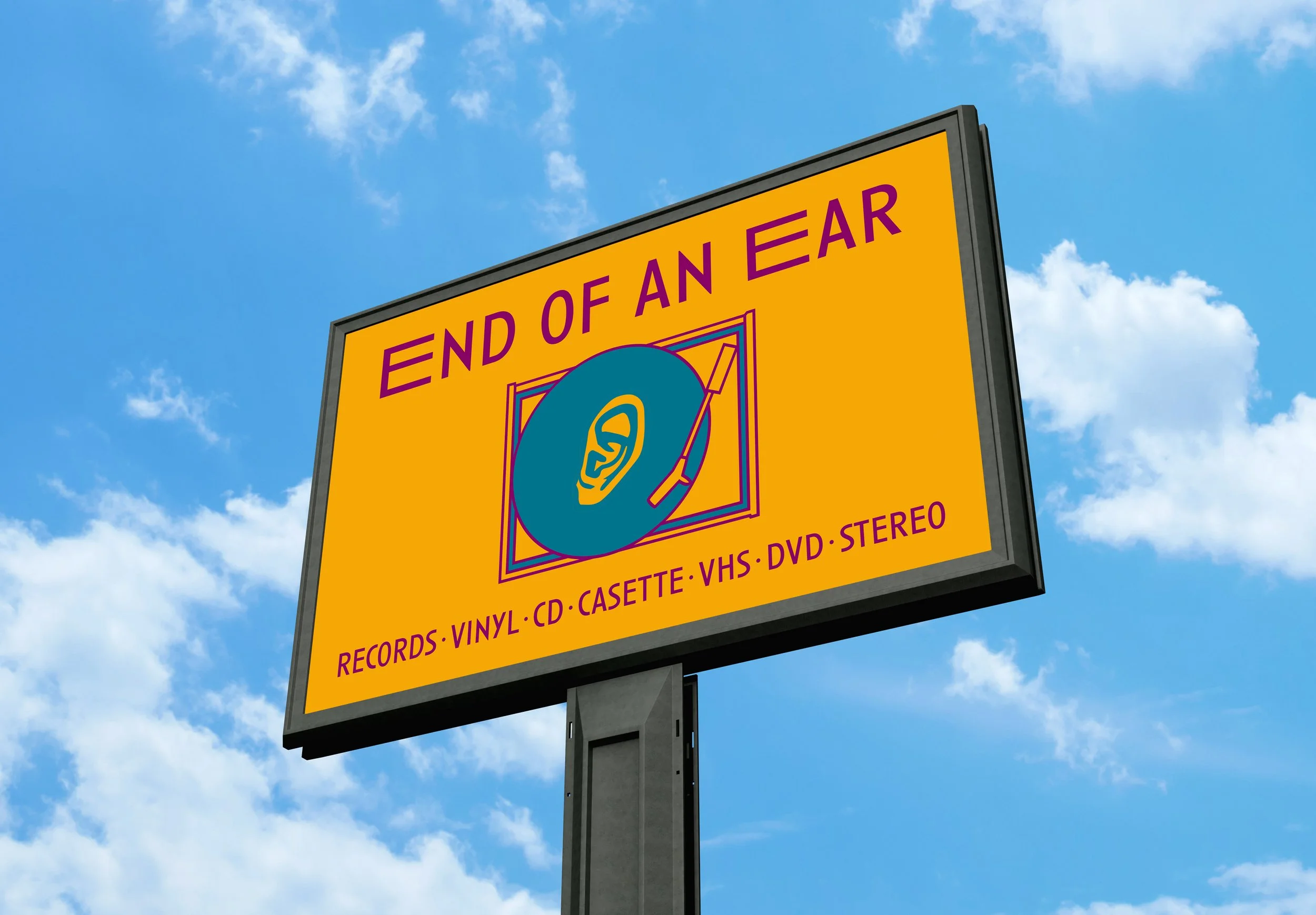
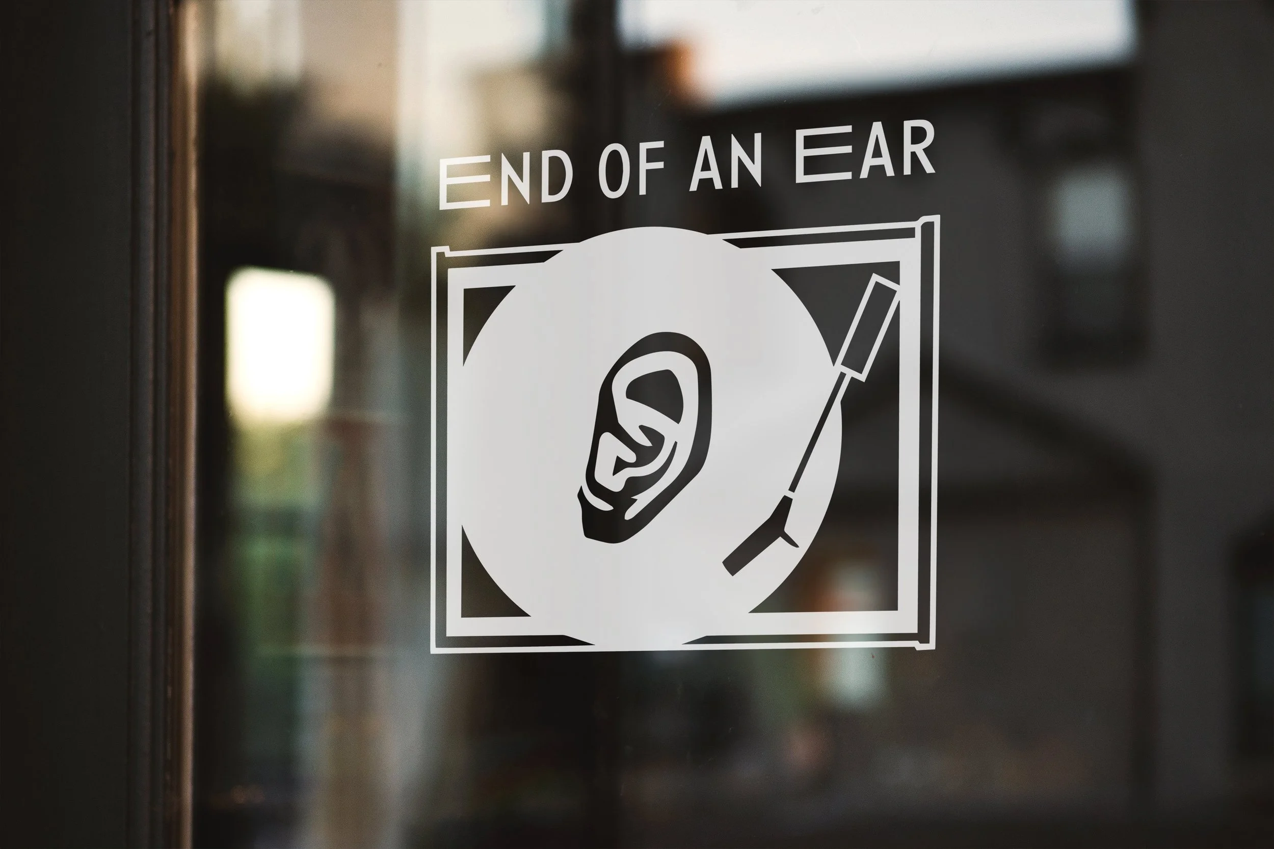
Exterior Signage
A-frame Sidewalk Sign
Window Vinyl Decal
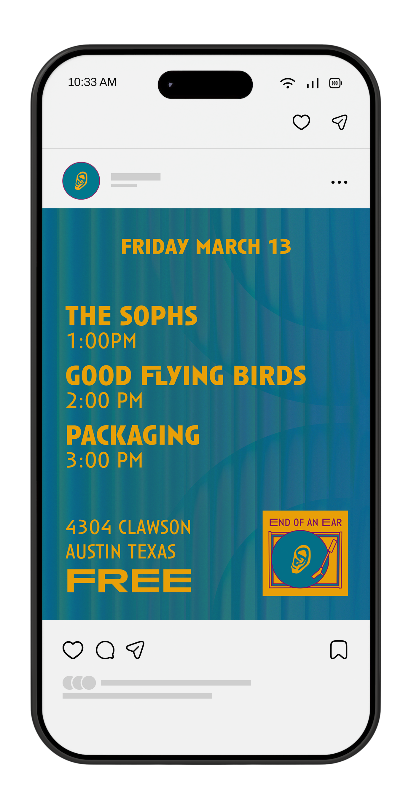
Social Media Event Graphic
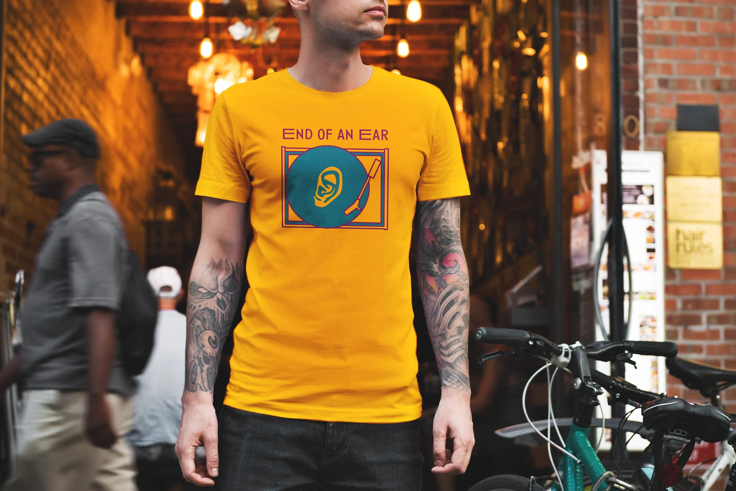
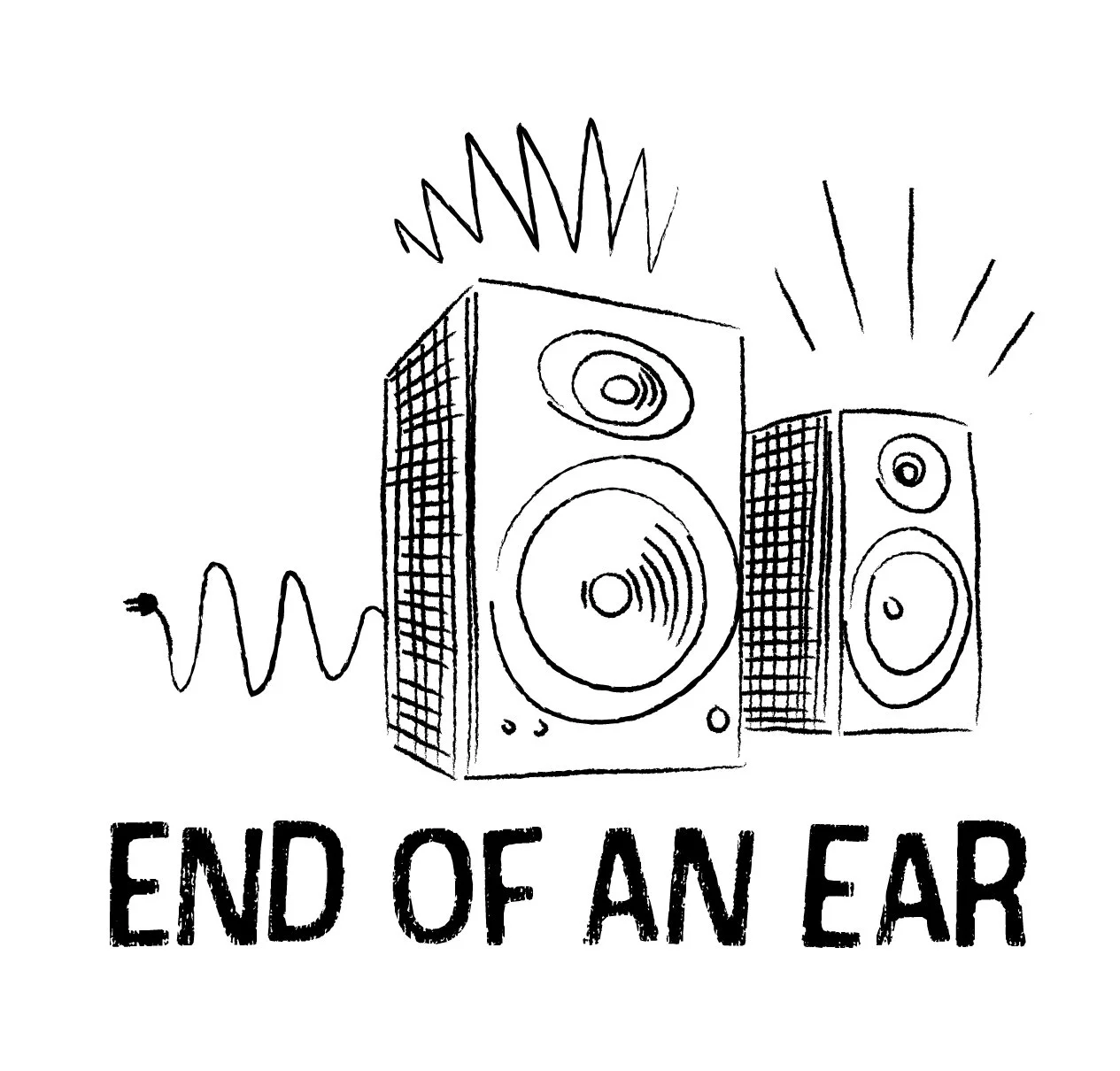
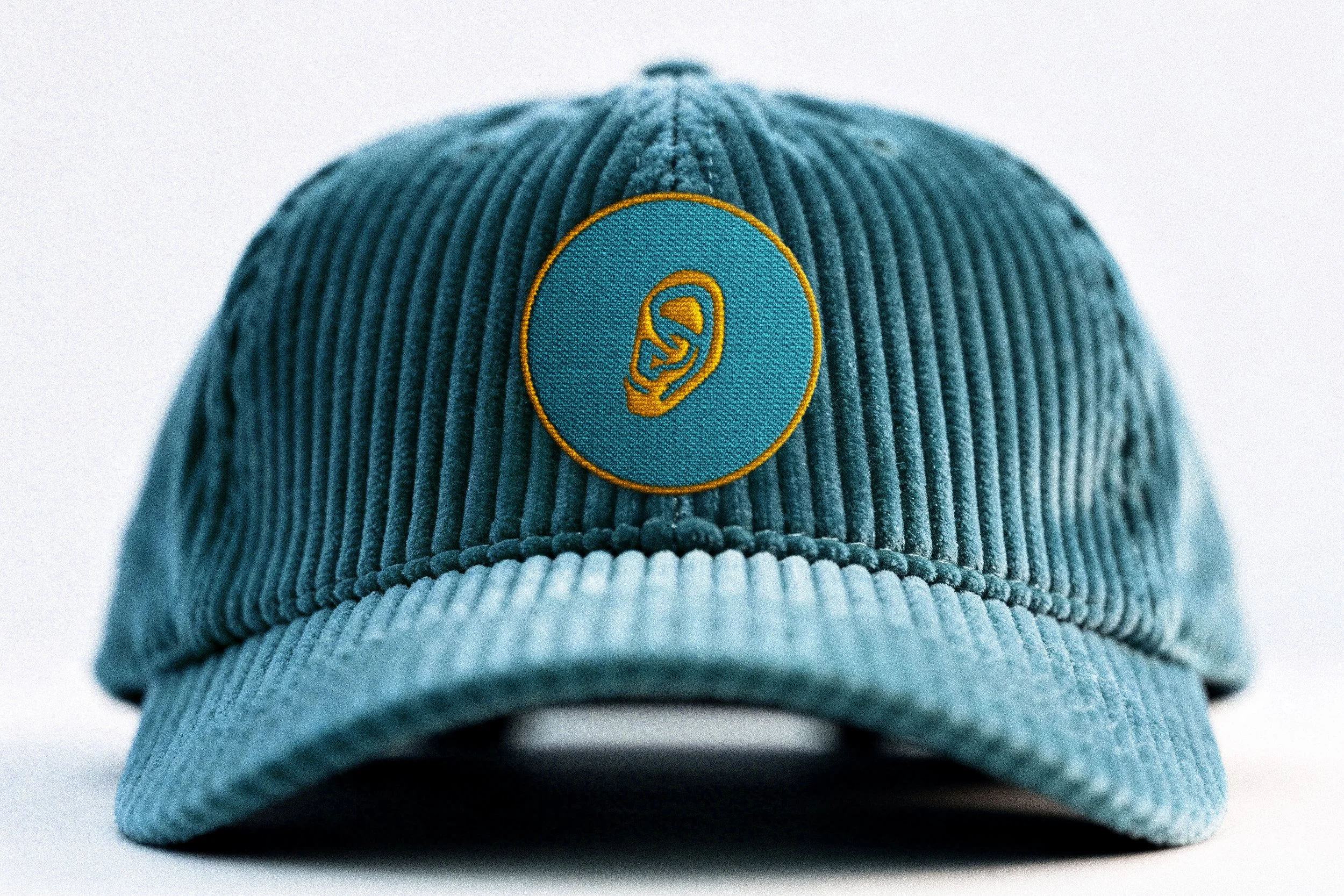
Merch Designs
Summary
End of an Ear is a local Austin record store known for its wide selection and approachable, no-fuss atmosphere. For this rebrand, I explored visual connections between ear and music imagery to create a playful yet grounded identity. The project includes a logo, type system, color palette, and supporting brand applications designed to reflect the store’s friendly, knowledgeable character.
Discovery
For research, I explored the character of End of an Ear and how it compares to other local record stores like Waterloo, Antone’s, and Breakaway Records. As a well-loved Austin shop, it stands out for its authenticity, knowledgeable and approachable staff, and wide-ranging selection.
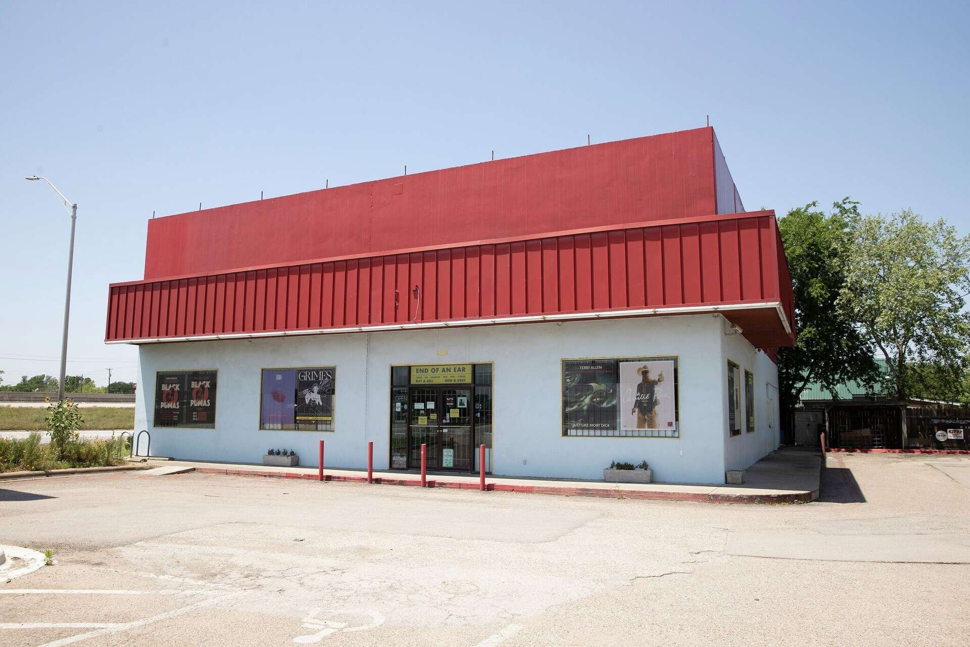
While research End of an Ear, I noticed a lack of visual consistency across its signage, storefront, and materials. This revealed an opportunity to create a more cohesive identity that reflected the store’s personality while maintaining the charm that makes it feel approachable.

Sketches
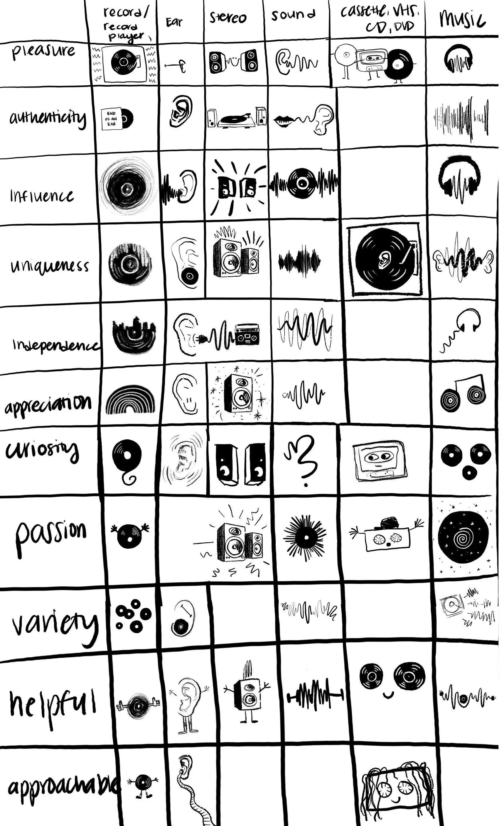
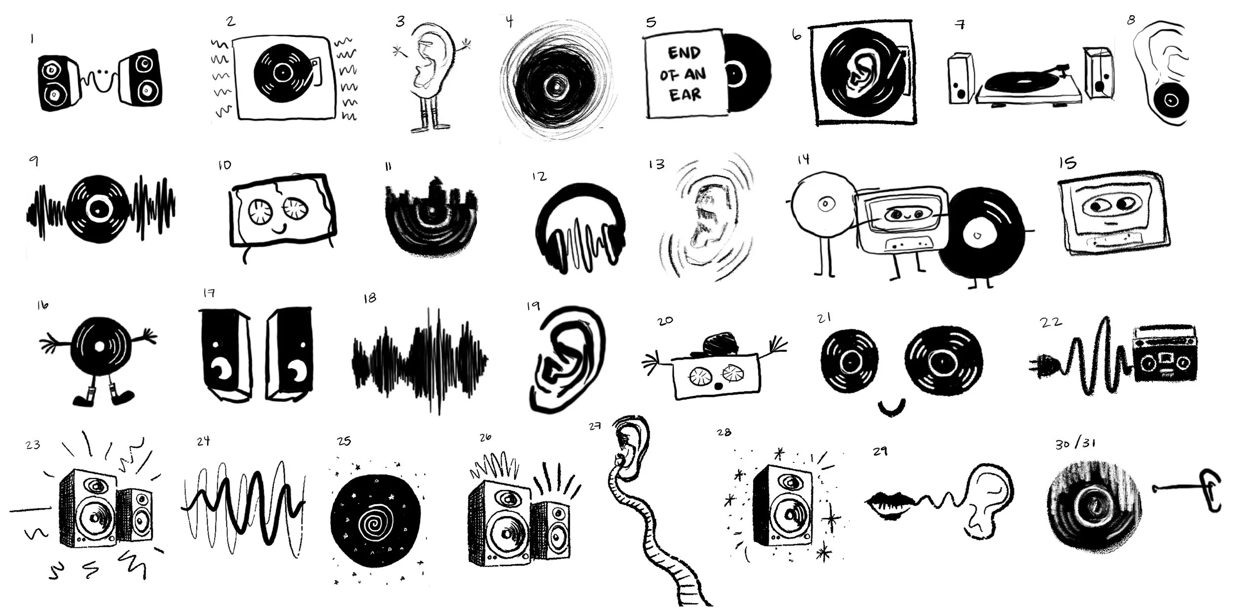
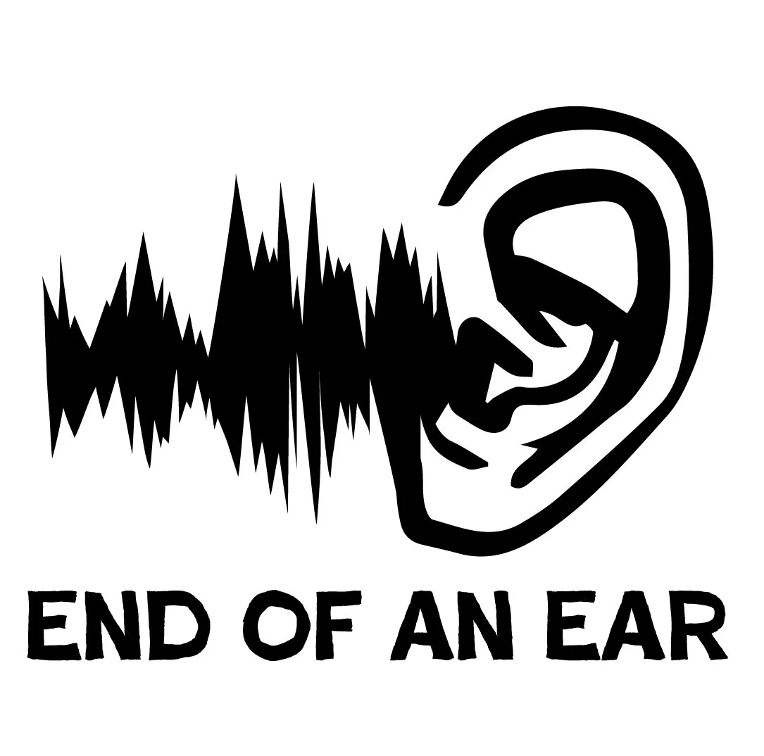
Using a structured ideation process, I created a matrix of keywords to guide early exploration and generate a wide range of visual concepts rooted in ear and music imagery. This approach helped push beyond obvious ideas and led to more unexpected and playful directions.
Typographic Explorations
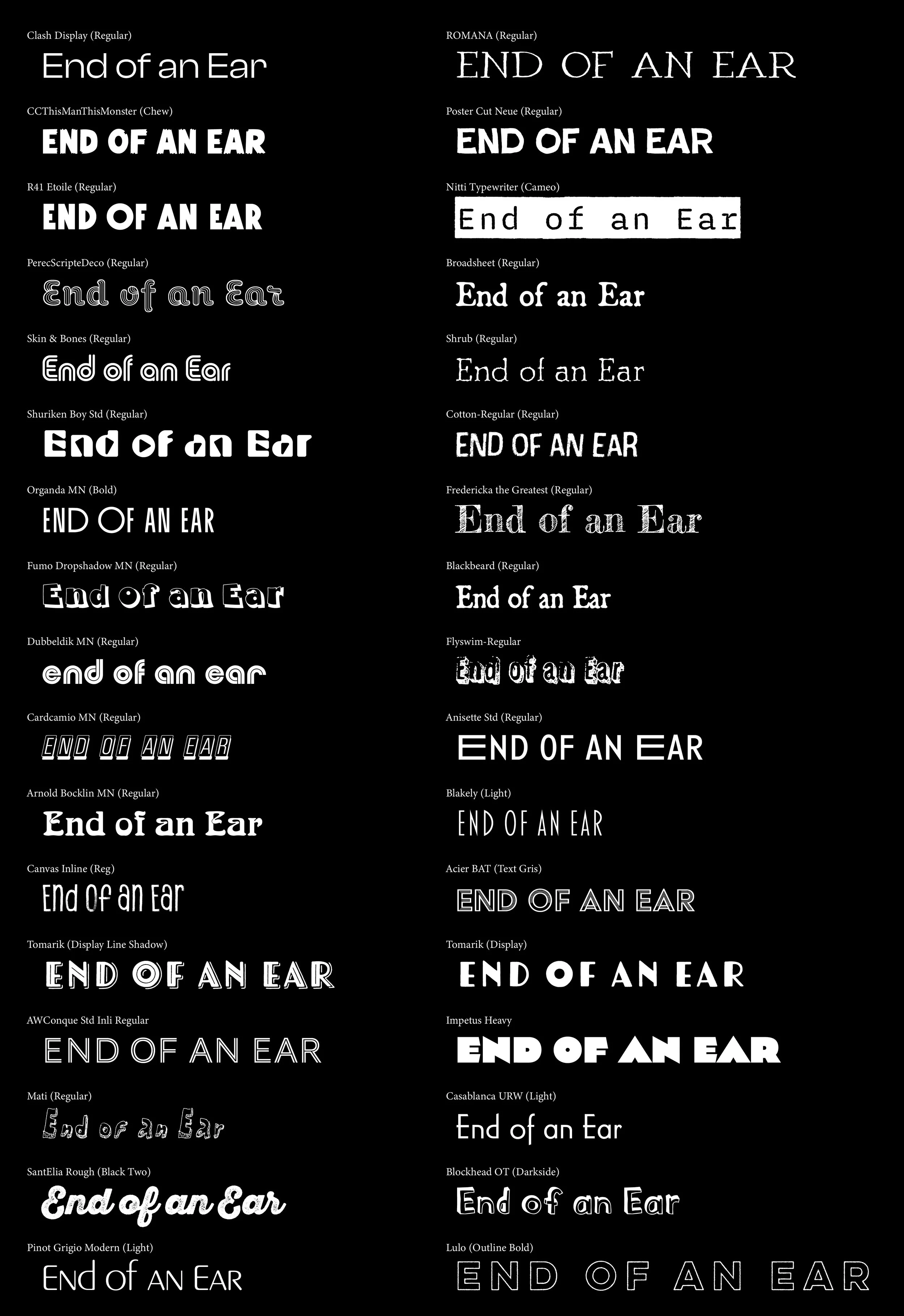
I explored a wide range of typefaces to understand how different styles could shape the tone of the identity. The goal was to find something that felt expressive and distinctive.
This process helped narrow the direction, highlighting which styles felt expected, overly stylized, or too generic, and which ones better captured the balance of personality and clarity I was aiming for. In the next step, I paired the strongest typefaces with imagery that matched their weight, style, and overall tone.
Digital Logo Drafts
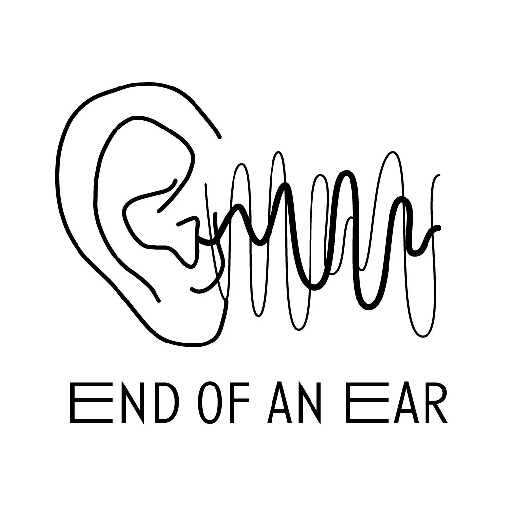
This round of digital drafts explores a range of visual directions, combining typography and illustration. I tried a combination of literal and more abstract concepts, from ear-based illustrations to sound and record-inspired forms, to better understand what felt most aligned with the brand.
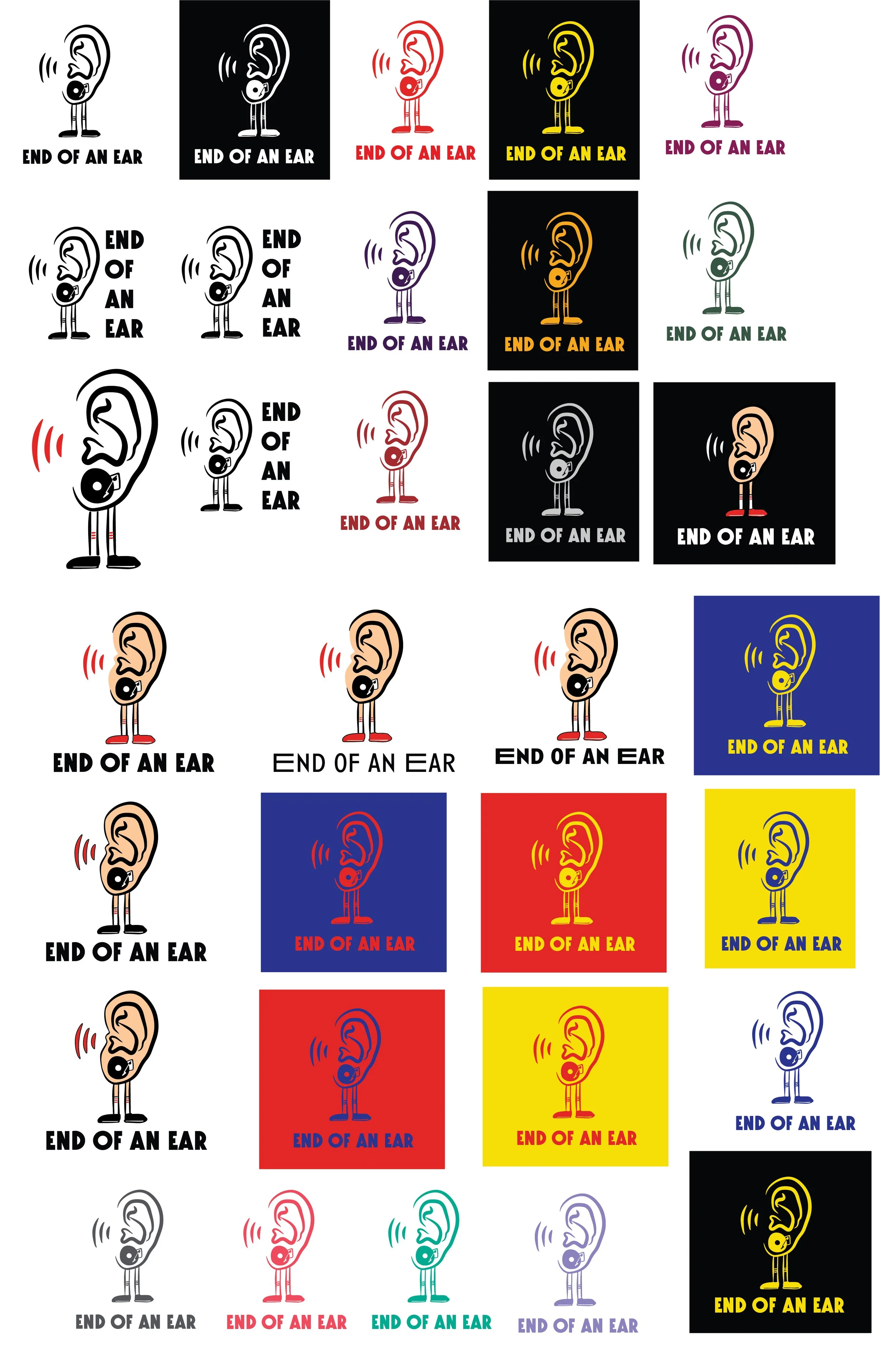
Digital Draft Color Studies
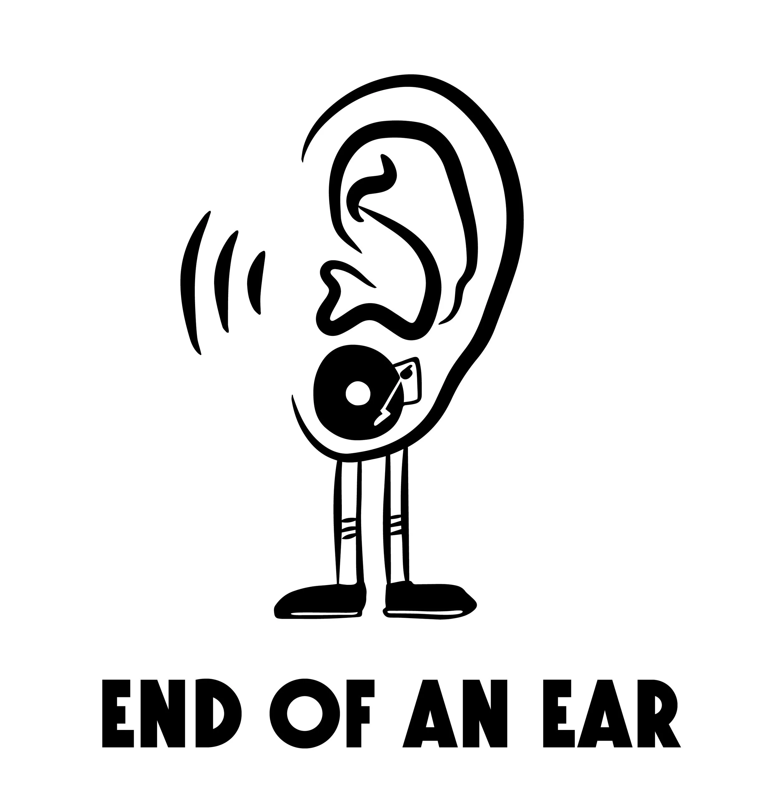
At this point, I had difficulty choosing between two directions, an illustrated “ear man” and an ear record player concept. I used these color studies to explore both final logo directions more fully and better understand how each would function across different color palettes. This process helped clarify the strengths of each concept and guided my final decision.
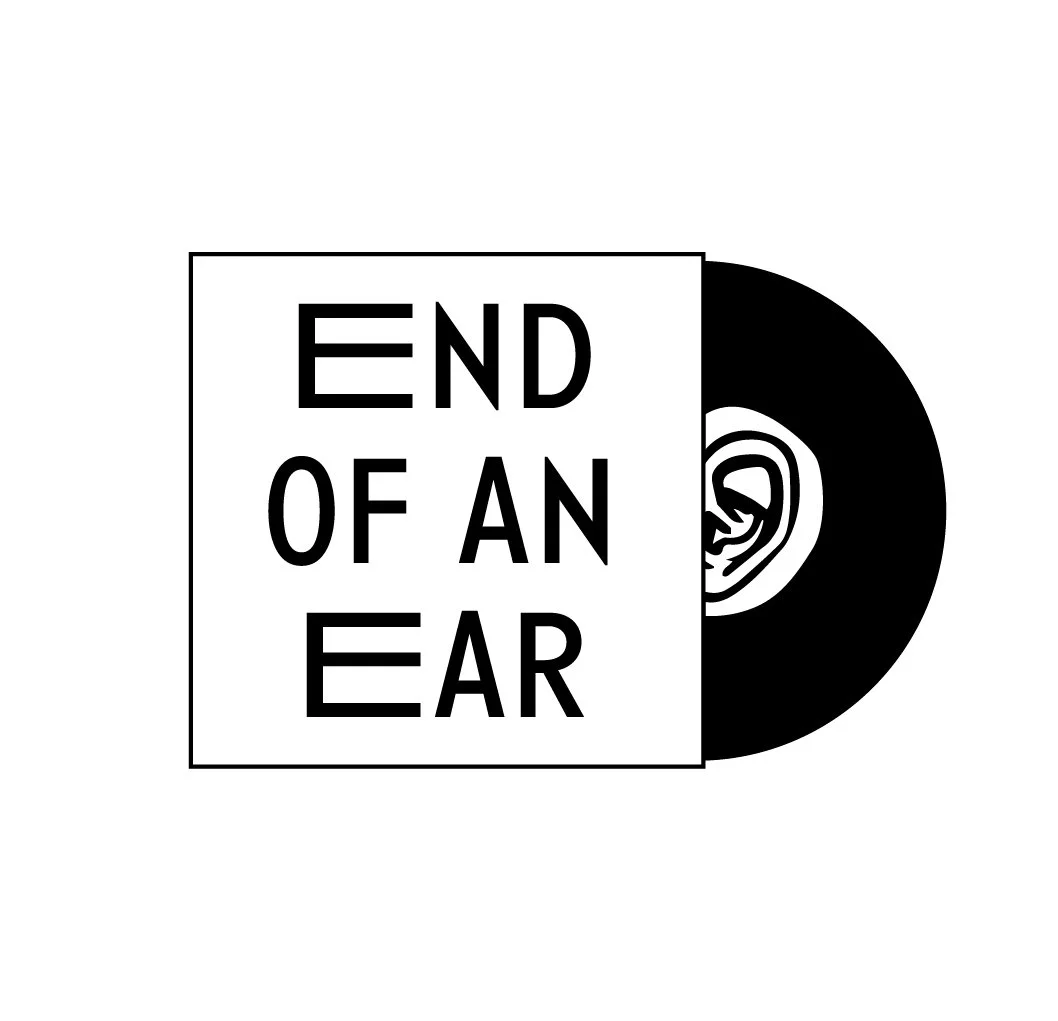
I also updated the typeface for the record player concept, shifting from a more stylized option to one that better matched the cool, straightforward tone of the illustration.
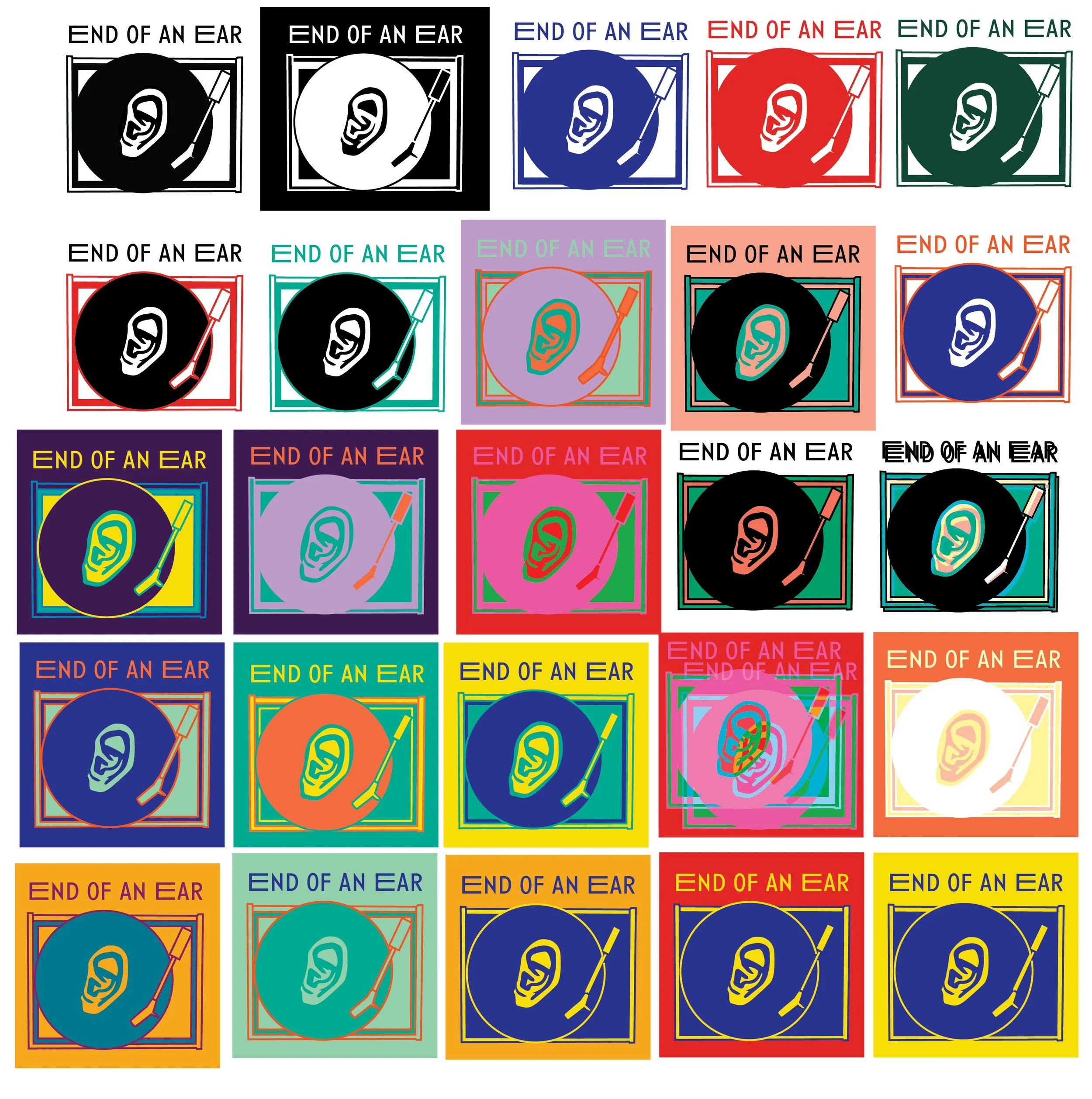
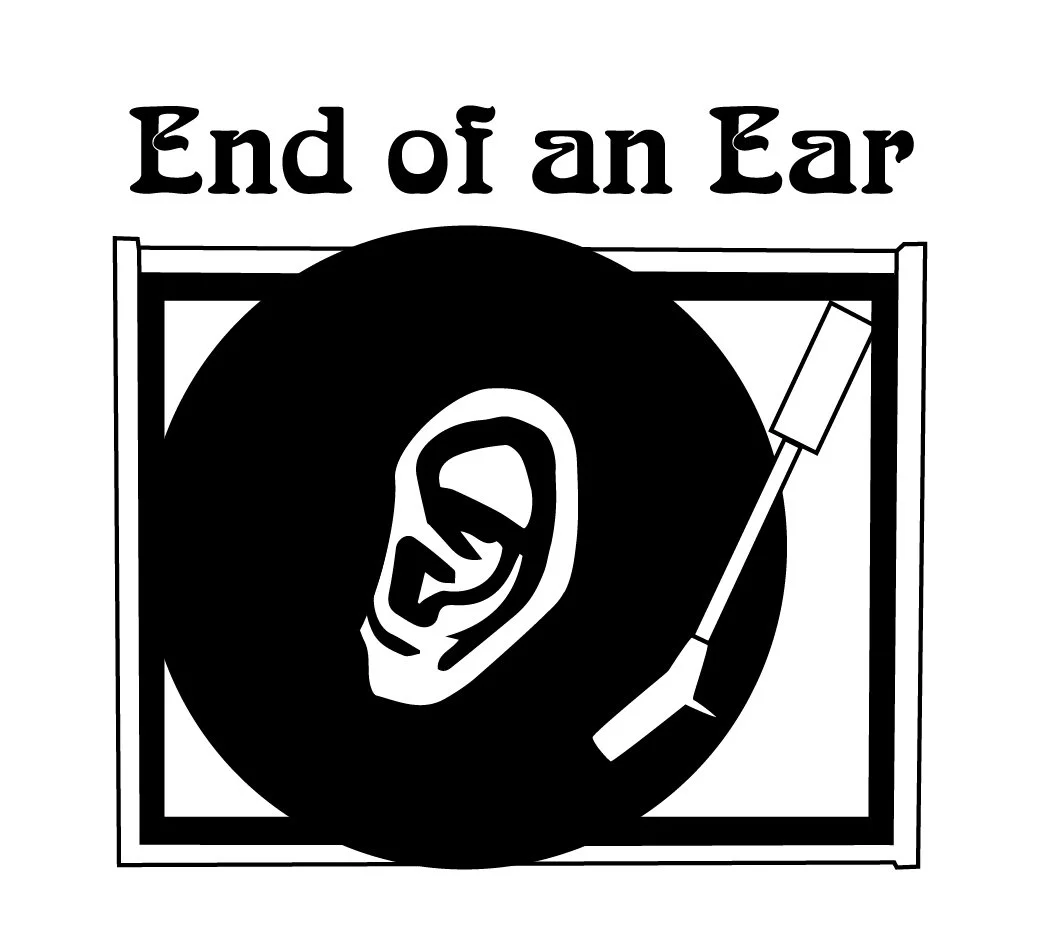
Final Design
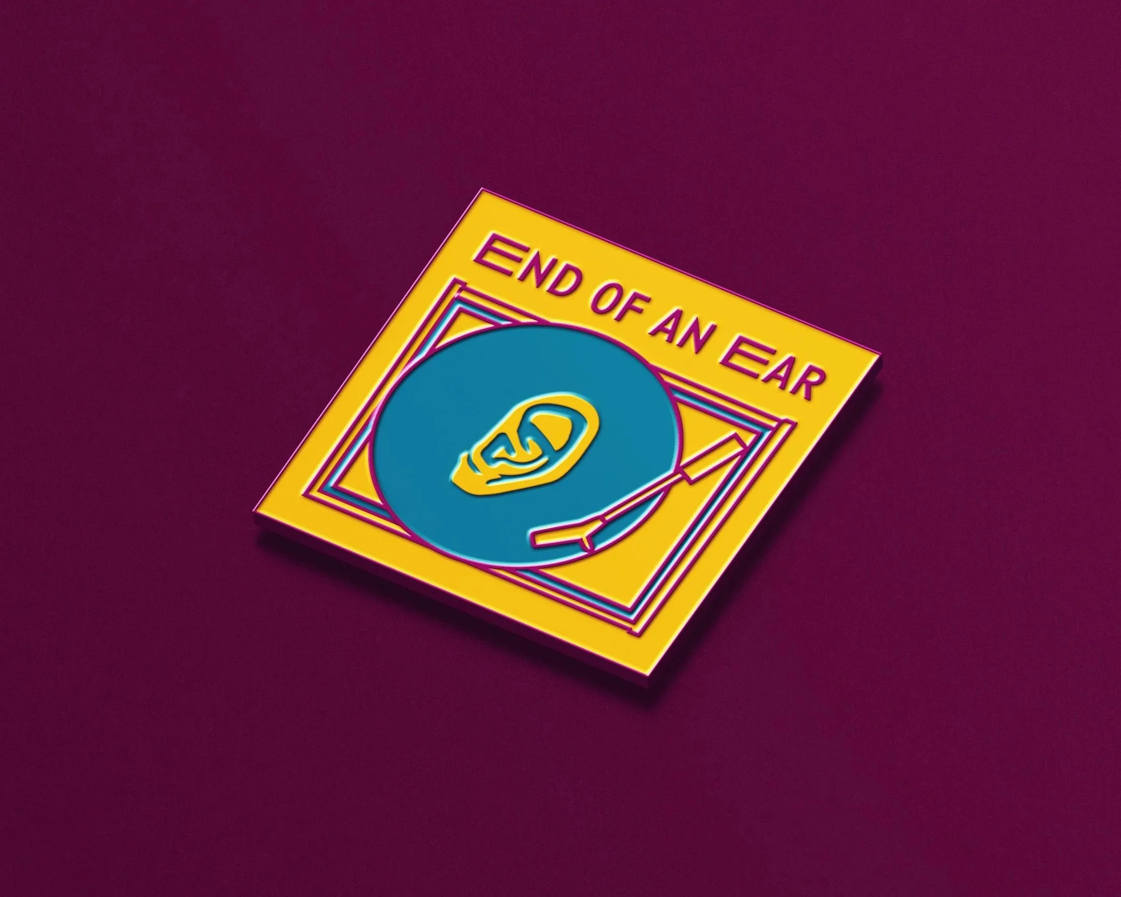
Ultimately, I chose to move forward with the record player concept. The square mark naturally echoes the format of an album cover, strengthening the connection to music and record culture. The color palette brings in a subtle vintage feel while still feeling current, capturing the shop’s balance of authenticity and relevance.


Reflection
This project challenged me to translate a brand’s personality into a cohesive visual system. Through research and iterations, I made intentional decisions about form, color, and typography, carefully choosing elements to contribute to the overall tone of the brand. Working through multiple directions and refining them through feedback helped me develop a clearer sense of what makes a concept feel both distinctive and appropriate.
AUSTIN WOMAN
Croissant Packaging